Physical Address
304 North Cardinal St.
Dorchester Center, MA 02124
Physical Address
304 North Cardinal St.
Dorchester Center, MA 02124
Master sophisticated living room decoration. Learn the 14 expert principles of visual hierarchy, spatial storytelling, and curated luxury design. Start creating your sanctuary today.
Adopting an editor’s eye transforms a living room from a generic showroom into a compelling narrative. When approaching living room decoration, discerning homeowners avoid the “cookie-cutter” look of matching sets by intentionally mixing old and new elements.
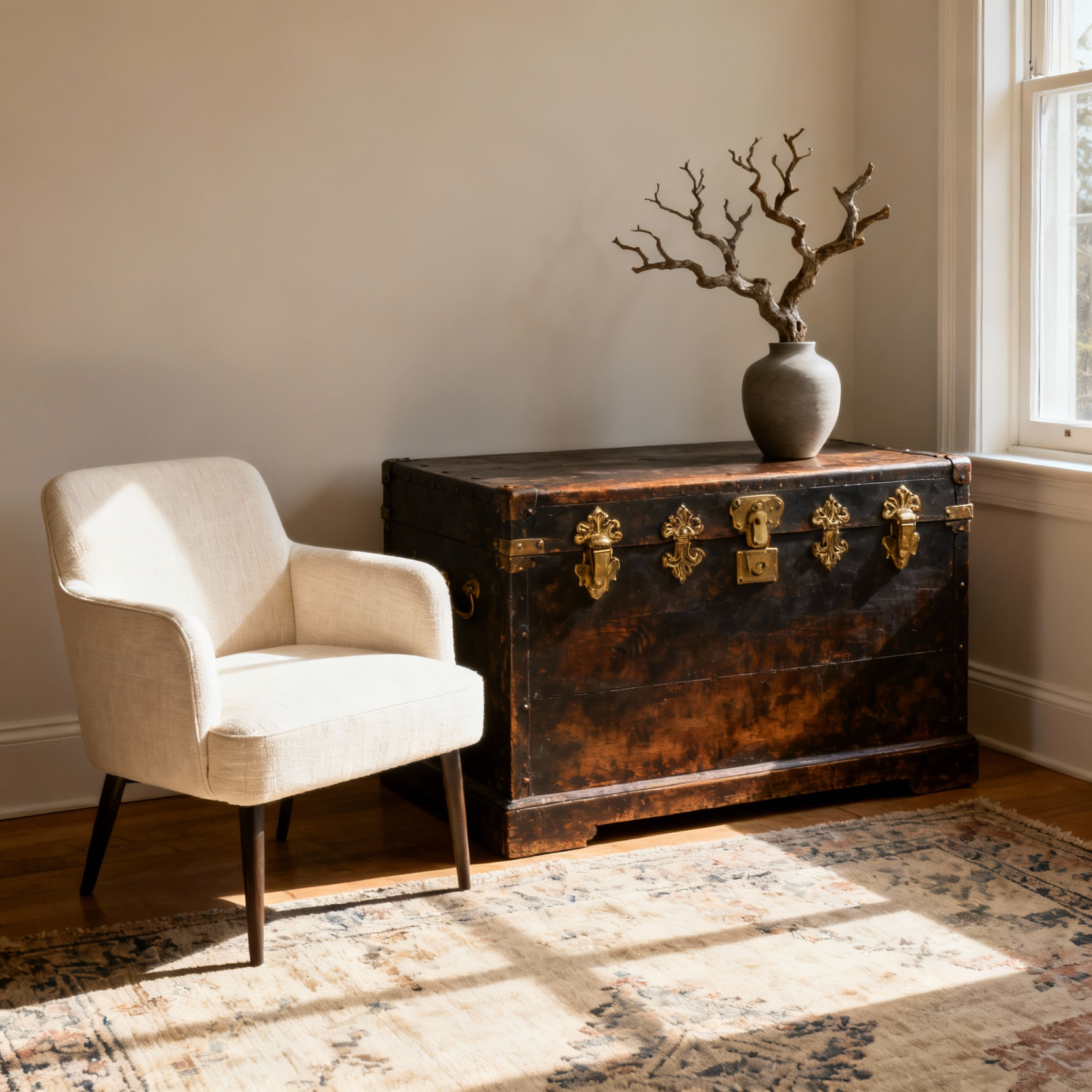
Blend sleek contemporary furniture with vintage or thrifted pieces to inject history into the space. This juxtaposition creates a “collected, not purchased” aesthetic that feels established rather than staged. The contrast between a modern silhouette and an antique patina adds necessary character and depth to the design.
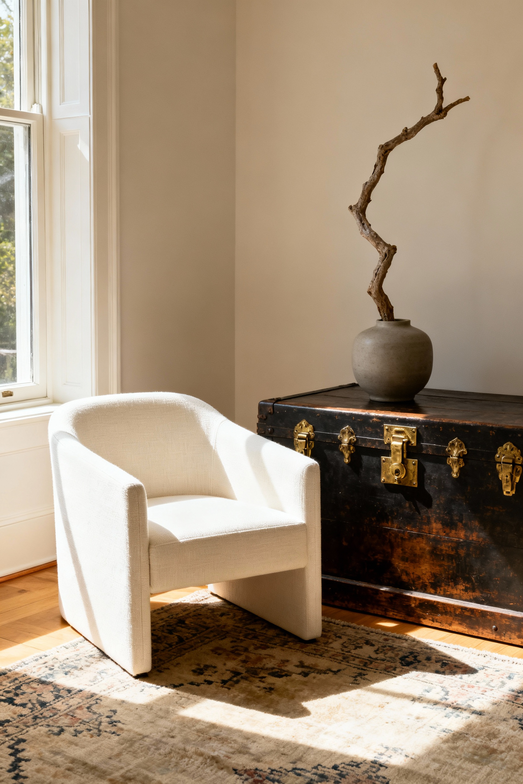
To truly tell a story, prioritize statement pieces and elevate personal artifacts. Invest in quality over quantity by choosing fewer, well-crafted items. A bold rug or a unique work of art anchors the room and establishes a visual hierarchy.
Balance these larger investments by displaying sentimental items with professional precision. Frame handwritten letters or showcase travel souvenirs on a pedestal rather than hiding them in a drawer. Bringing these objects into the light connects the past to the present and ensures the space reflects your specific journey.
Visual richness relies on strategic texture layering. A flat design lacks emotion, so introduce a variety of materials to generate warmth and organic beauty. Incorporate wood, stone, and live plants alongside woven fibers like wool and linen. These elements add rhythm to the room and break up visual monotony. When you layer materials effectively, you create a tactile experience that invites guests to linger.
Many homeowners mistake filling a room for designing one. They often follow a standard checklist—sofa, rug, coffee table—and assume the job is done once the surfaces are covered. This approach creates a “decorated” space, but it frequently results in a static environment that lacks soul. The difference between a house and a sanctuary is not determined by budget, but by the intentional application of spatial storytelling.
We can bridge the gap between a cluttered room and a refined home by borrowing strategies from luxury retail visual merchandising. True curation moves beyond simple aesthetics to embrace principles like intentional scarcity and narrative flow.
By treating your home like a gallery, you allow objects to breathe through negative space and layer textures to build emotional depth. This process uses lighting as a mood director, transforming a collection of items into a cohesive visual autobiography that guides the eye with purpose.
Your living room can transcend “decorated” to become truly “curated.” After analyzing successful commercial display techniques, we identified the principles that separate a generic showroom from a personal sanctuary. For further guidance, explore our guide to refined living and unforgettable living room style. These strategies—ranging from the “Museum Method” to anchoring designs in personal history—are not temporary trends. They serve as the foundational rules of spatial storytelling, ensuring your home reflects who you are before you speak a word.
Think of your living room’s layout as the foundation of your visual story. Start by establishing a clear focal point. Whether focusing on a fireplace, a prominent window view, or a large piece of art, arrange your seating to direct attention toward this feature.
Resist the common impulse to push all furniture against the walls. Instead, “float” your sofa and chairs to create clear pathways and the illusion of a more spacious room. Anchor this arrangement with an appropriately sized area rug, ensuring at least the front legs of major pieces rest on the texture. This technique visually defines the primary conversation zone and grounds the setting within the larger open space.
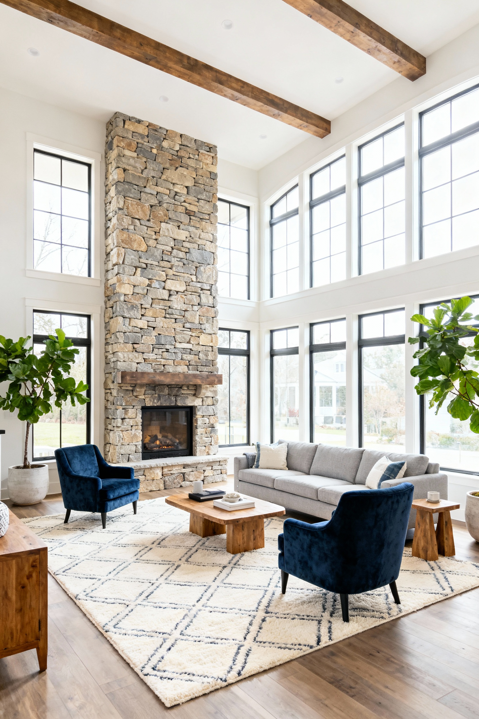
Once the layout is established, define the structural palette. Prioritize neutral or complementary tones for the room’s largest elements, including walls, flooring, and major upholstery. Apply the 60-30-10 color rule by allowing this dominant neutral shade to cover approximately 60% of the space. This strategy creates a calm, cohesive canvas that prevents visual clutter. By keeping the core assets understated, you ensure the room remains timeless and build the necessary flexibility to layer bold accents and personal collections later without overwhelming the eye.
Distinct lighting layers are essential to eliminate dark corners and add professional depth. Start by maximizing natural light through sheer curtains or open blinds. For artificial illumination, avoid relying solely on overhead fixtures. Instead, layer ambient ceiling lights with task lamps and specific accent lighting for art. This combination highlights architectural assets and allows you to control the mood, ensuring the room feels welcoming and multi-functional at any time of day.
In luxury retail, the storefront window captures attention immediately, compelling customers to enter. Your living room requires the same “Anchor Point” to set the tone and provide a visual center. To establish this, assess the sightlines from your main entryway. Select a location that is instantly and clearly visible from the doorway. This ensures the anchor creates the very first impression and directs the eye immediately, establishing a clear hierarchy within the space.
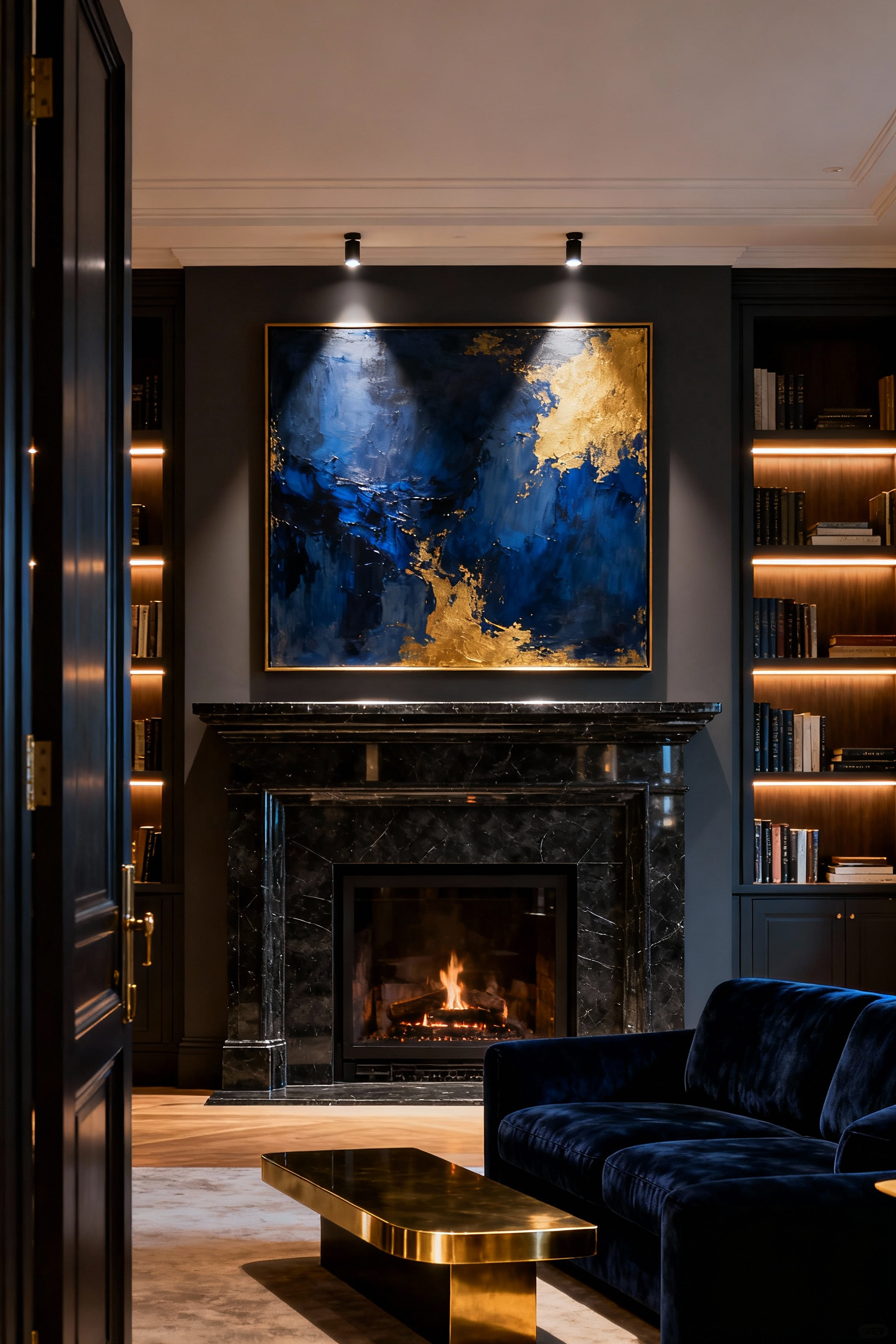
If your room lacks a natural architectural feature like a fireplace or large window, you must create one. Transform a blank wall into a statement using bold paint, textured wallpaper, or floor-to-ceiling built-in shelving. Leverage contrast and scale to maximize impact during this process. A dramatic change in texture or an oversized element distinct from its surroundings demands attention. For instance, a large-scale light fixture drawing the eye upward or a bold color block functions like a spotlighted display, pulling the viewer into the room.
Treat your anchor point as a curated composition rather than a standalone item. Create a “focal zone” by grouping elements for visual weight. You might anchor a large piece of art above a console table, framing it with a pair of tall plants or sconces to widen the visual field. Once established, orient your major seating pieces to face this feature. By directing sofas and accent chairs toward the anchor, you center the conversation area around the visual highlight, creating purposeful flow and sophisticated organization.
Retail designers prioritize the “decompression zone,” the critical first 10 to 15 seconds where a customer transitions into a store environment. You can replicate this to help guests shift from the stress of the outside world to your private sanctuary. If your front door opens directly into the living room, establish a visual cue to pause before entering the main space. Use a low console table, a defined entry rug, or focused lighting to create a subtle psychological barrier. This buffer sets the mood immediately and prevents the energy of the outdoors from spilling directly into your seating area.
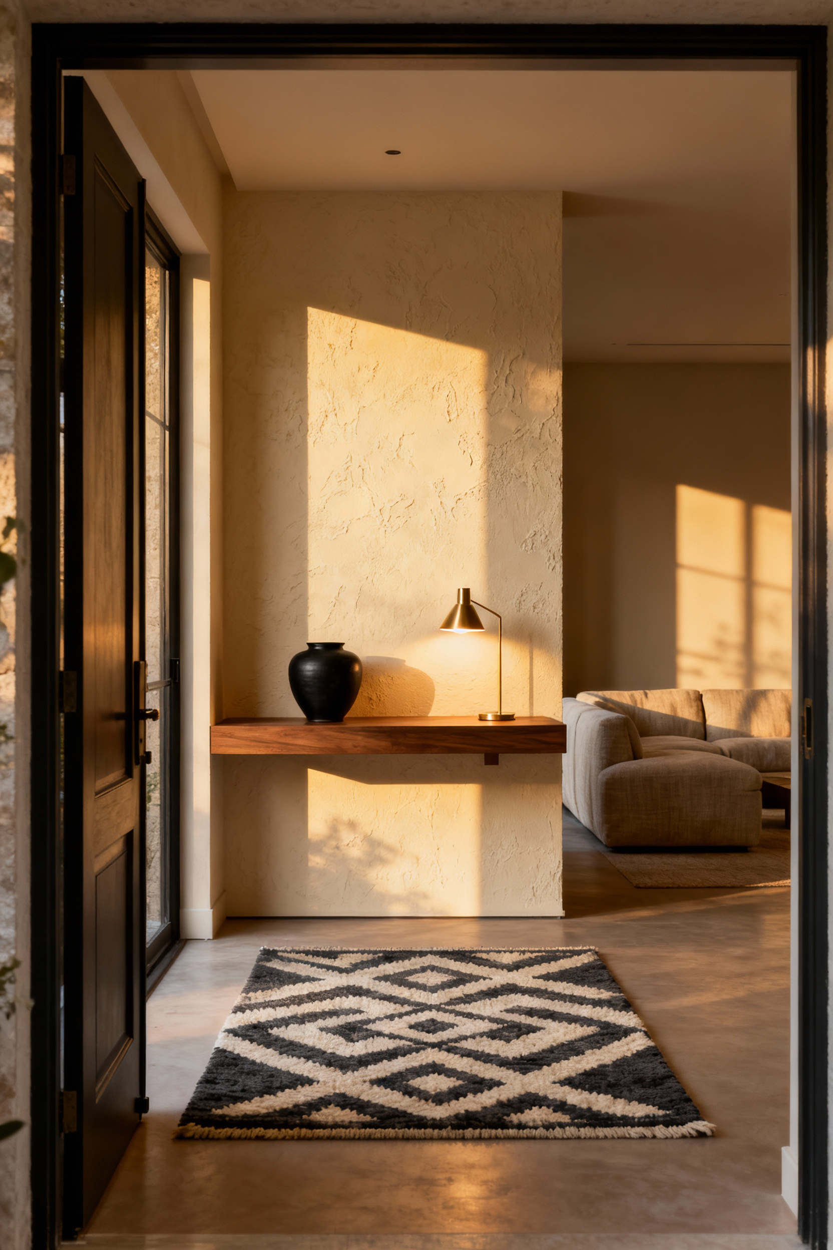
Inside the room, control movement with a “racetrack” layout. This retail concept guides traffic along a perimeter loop, ensuring distinct pathways around the merchandise rather than through it. To apply this, arrange your sofa and chairs to form a cohesive “island” centered on a rug. Maintain clear pathways of 30 to 40 inches around the perimeter of this group. This prevents foot traffic from cutting through the conversation area, which protects the intimacy of the space and treats your furniture arrangement as a distinct visual display.
Use “speed bumps” to regulate the pace of the room. Just as retailers use eye-catching displays to slow down shoppers, you can use accent pieces to manage flow. Place a statement lamp, a unique side table, or an angled accent chair at the edge of a seating group. These items break up the natural line of travel, forcing guests to slow their pace. This tactic draws attention to your furniture selection and encourages guests to pause and engage with the environment you have curated.
Great interior design relies on balancing filled and empty space to let luxury items shine. To showcase investment pieces without creating clutter, apply the 60/40 rule for floor space. Aim to occupy approximately 60% of the room with furniture while keeping 40% as negative space. This open area provides essential “visual breathing room” and ensures comfortable traffic flow. By respecting this ratio, you prevent high-end furnishings from feeling cramped and allow each piece to command the attention it deserves.
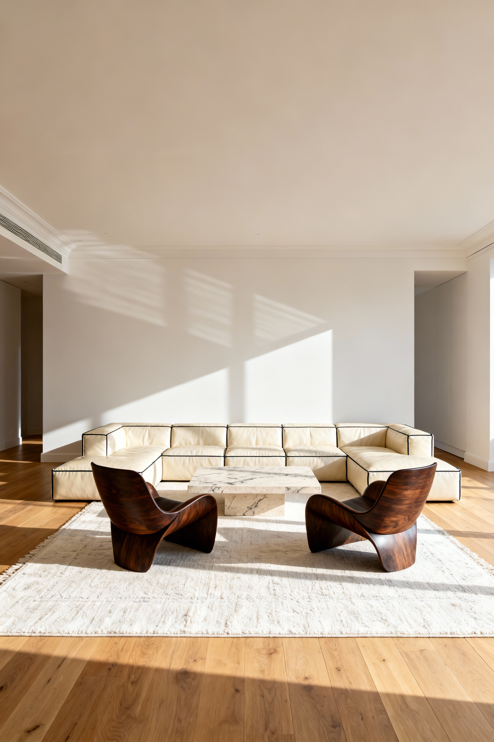
It is also important to distinguish between physical dimensions and visual weight. Dark colors and solid forms increase visual heaviness, while light colors and transparent materials reduce it. Balance a heavy investment piece, such as a deep, bulky sectional, by pairing it with visually lighter elements like glass tables or furniture with exposed legs. Additionally, achieve balance through asymmetrical distribution rather than grouping all substantial items on one side. Counterbalance a heavy feature, like a large entertainment center, with an equally weighted element on the opposite wall, such as a bold gallery wall or a tall bookcase.
Precision in sizing creates a polished, professional look. Adhere to proportional rules to ensure accent furniture relates harmoniously to your main investment pieces. For more details on creating showcase-worthy spaces, check our expert tips for creating showcase-worthy living room interiors:
Treat your living space like a high-end retail display by establishing a specific “brand” palette. This approach creates a curated feel and prevents diverse collections from appearing cluttered. Limit your color story to between three and six distinct shades to ensure visual harmony. Start with a unifying neutral base, such as warm white or taupe, for the largest surface areas like walls and sofas. This creates a calm foundation that allows distinct furniture styles and decor from different eras to coexist seamlessly without visual friction.
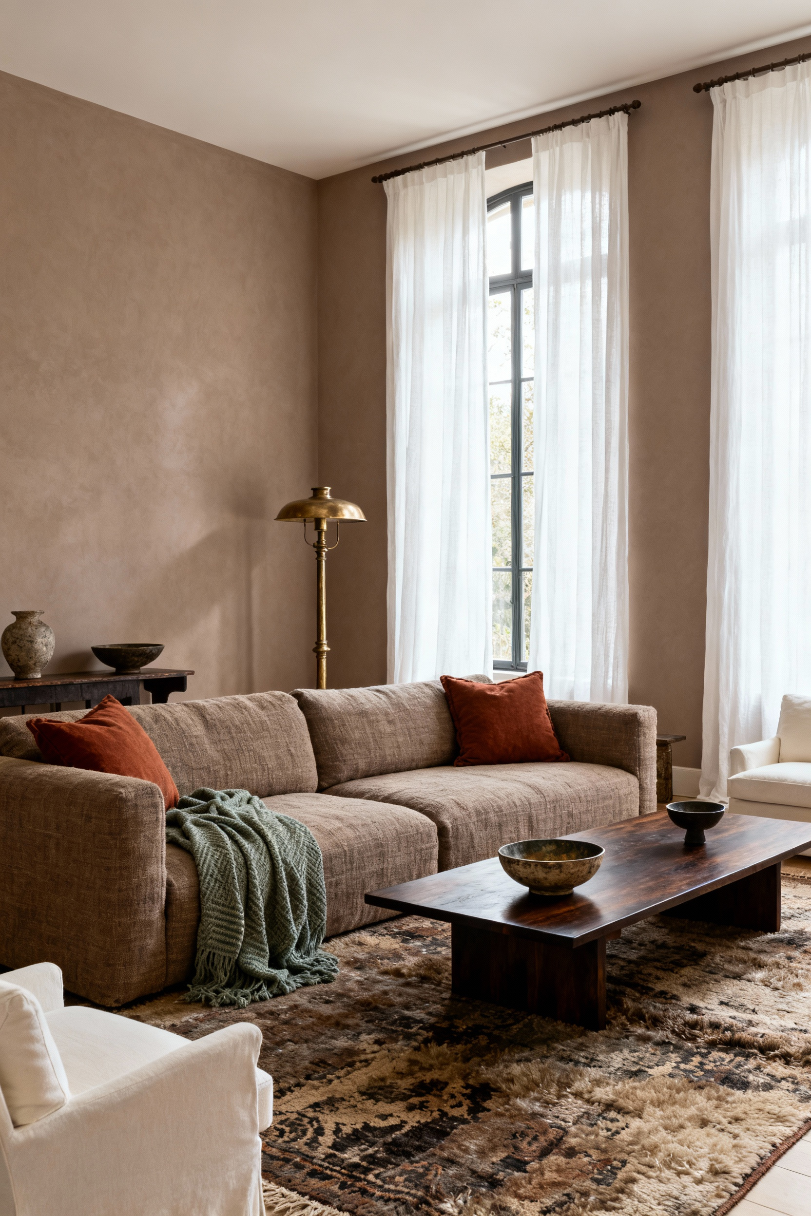
To ensure these colors work together, maintain consistent undertones throughout the room. Stick strictly to either warm or cool tones to make diverse materials look like they belong together. Once your tones are set, structure the application of these colors using the 60-30-10 rule:
Need a blueprint for your scheme? Pull your colors directly from a focal piece. Analyze a multicolored heirloom, a patterned rug, or a specific textile within your collection. Select the dominant, secondary, and accent hues from this item to form your palette. This guarantees that your color story is not only visually harmonious but also deeply personal.
Effective display design begins with the discipline of editing. Move from simply collecting to actively curating by removing “filler” items and prioritizing the pieces that genuinely tell your story. This selection process creates necessary white space, or negative space, which allows each object to stand out as a masterpiece rather than contributing to visual clutter. Once you refine your selection, establish a focal point for your shelf, mantel, or console, such as a large vase or rare artifact. Unify the surrounding pieces through a shared theme, material, or cohesive color scheme to ensure the grouping looks considered.
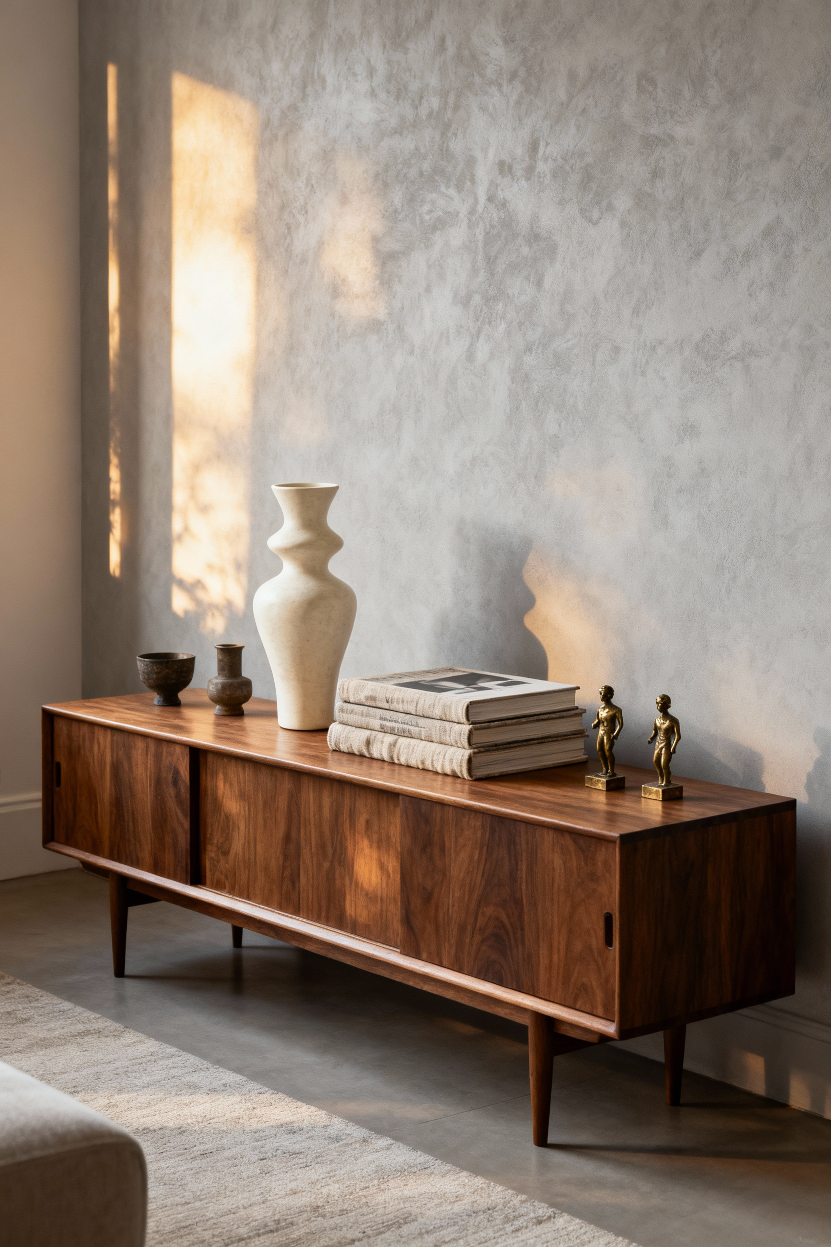
When arranging these items on flat surfaces, harness the power of odd numbers. Group collectibles in clusters of three or five to create a composition that is visually dynamic and naturally engaging. Within these clusters, vary the height and size of the objects—tall, medium, and short—to form a pyramid shape. This triangular arrangement establishes a natural visual flow that guides the viewer’s gaze upward and across the display, preventing the arrangement from looking flat or static.
Use the gallery wall technique to create high-impact, concentrated displays in vertical spaces. This method works exceptionally well for two-dimensional prints as well as three-dimensional objects like decorative plates, mirrors, or baskets. To maintain a professional aesthetic, unify disparate pieces through identical framing or consistent spacing, typically keeping items three to four inches apart. This structured approach transforms a collection of individual items into a singular, powerful design statement.
A vignette transforms a utilitarian surface into a curated narrative. Start with a personal anchor piece to serve as the storyteller. This could be a travel souvenir, a meaningful heirloom, or a framed family photograph that immediately evokes a specific memory. Once you have your anchor, apply the power of odd numbers to create dynamic visual balance. Group items in threes or fives, ensuring you vary the vertical scale. For example, pair a tall architectural element with a medium vase and a low trinket. This variation forms a triangular composition that feels intentional.
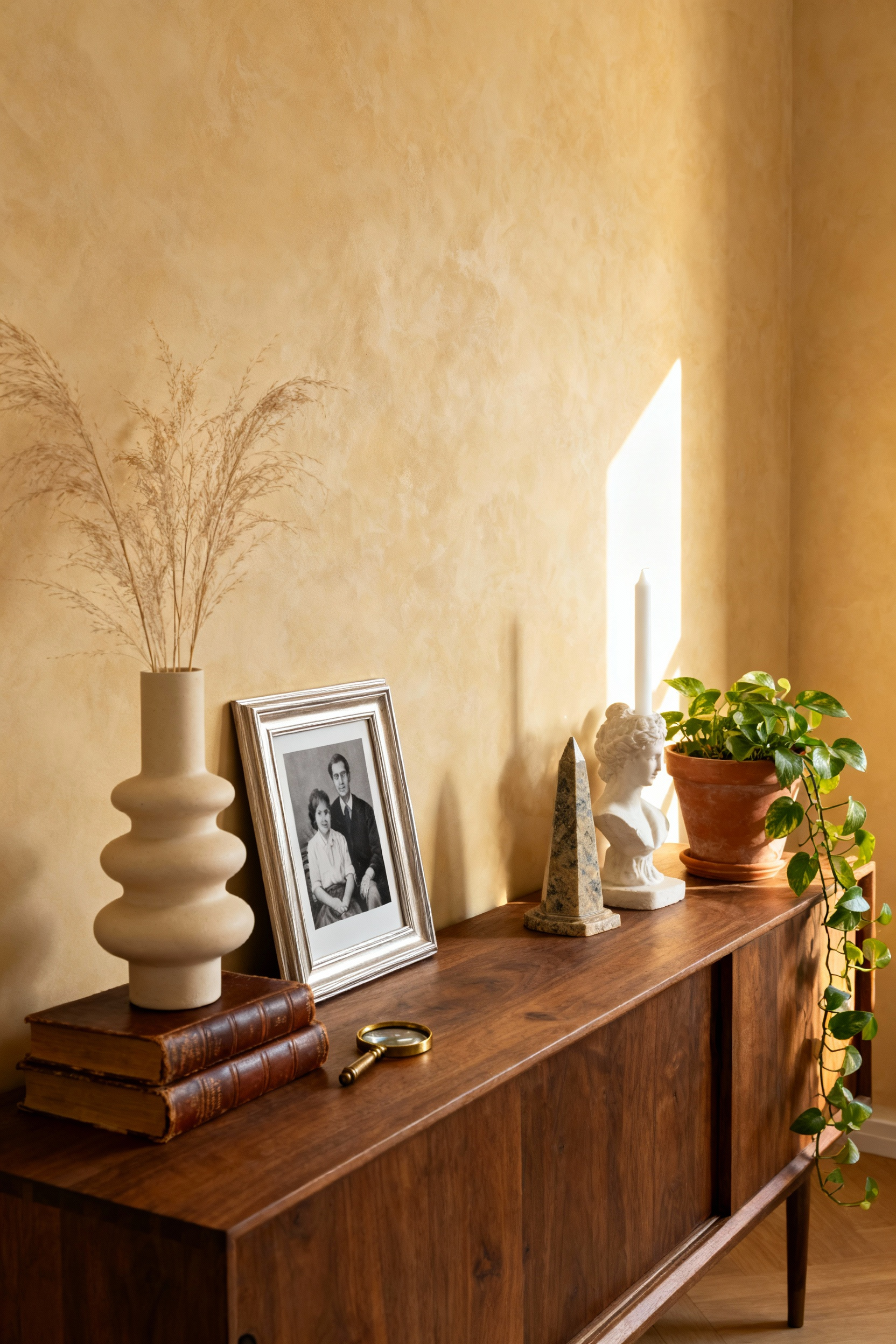
Beyond structure, successful vignettes rely on sensory engagement and atmosphere. Layer diverse textures to prevent the arrangement from feeling flat or static. Combine smooth ceramics with organic wood, or place metallic accents atop linen-bound books to create tactile warmth. Also, consider incorporating dedicated lighting to establish depth. A table lamp or a cluster of candles introduces a soft glow that overhead lighting cannot replicate. This illumination highlights the details of your collection and makes the vignette feel welcoming, turning a simple display into an intimate emotional moment.
The “Bookshelf Wealth” trend reimagines the living room bookcase, transforming it from a utilitarian storage unit into a sculptural library that reflects personal history. To achieve this aesthetic, avoid the “stage set” look of color-coordinated spines. Instead, prioritize authenticity by displaying books you have genuinely read and collected over time. This approach creates a “lived-in” atmosphere where the value lies in the wealth of knowledge and experience on display rather than mere decoration.

To construct a dynamic composition, break the visual monotony of uniform rows. Mix standard vertical shelving with haphazard horizontal stacks to create variation and rhythm. Treat these horizontal stacks as pedestals to elevate decorative objects, such as family heirlooms, travel souvenirs, or pottery. By grouping these items into small vignettes, you interrupt the density of the books and turn a flat wall into an engaging, three-dimensional narrative.
Designers often elevate these displays through unconventional layering and strategic lighting. Consider leaning small framed artwork against the back of the shelf to add depth, or hang a painting directly on the front of the shelving uprights to break the grid. Try installing picture lights at the top of the case or LED strips along the shelf edges. This specific lighting highlights your curated collection and casts a sophisticated, gallery-like glow over the room.
Start your coffee table arrangement with a decorative tray to serve as an anchor. This single element frames your narrative base and groups smaller accessories into one cohesive vignette. Select a material like marble, wood, or mirror that complements the room’s existing aesthetic. Once the tray is positioned, introduce large hardback tomes as the foundation of your design story. Utilize the “Rule of Three” by stacking volumes from largest to smallest. Choose titles that reflect your personal passions, such as art or travel, to infuse the space with personality immediately.
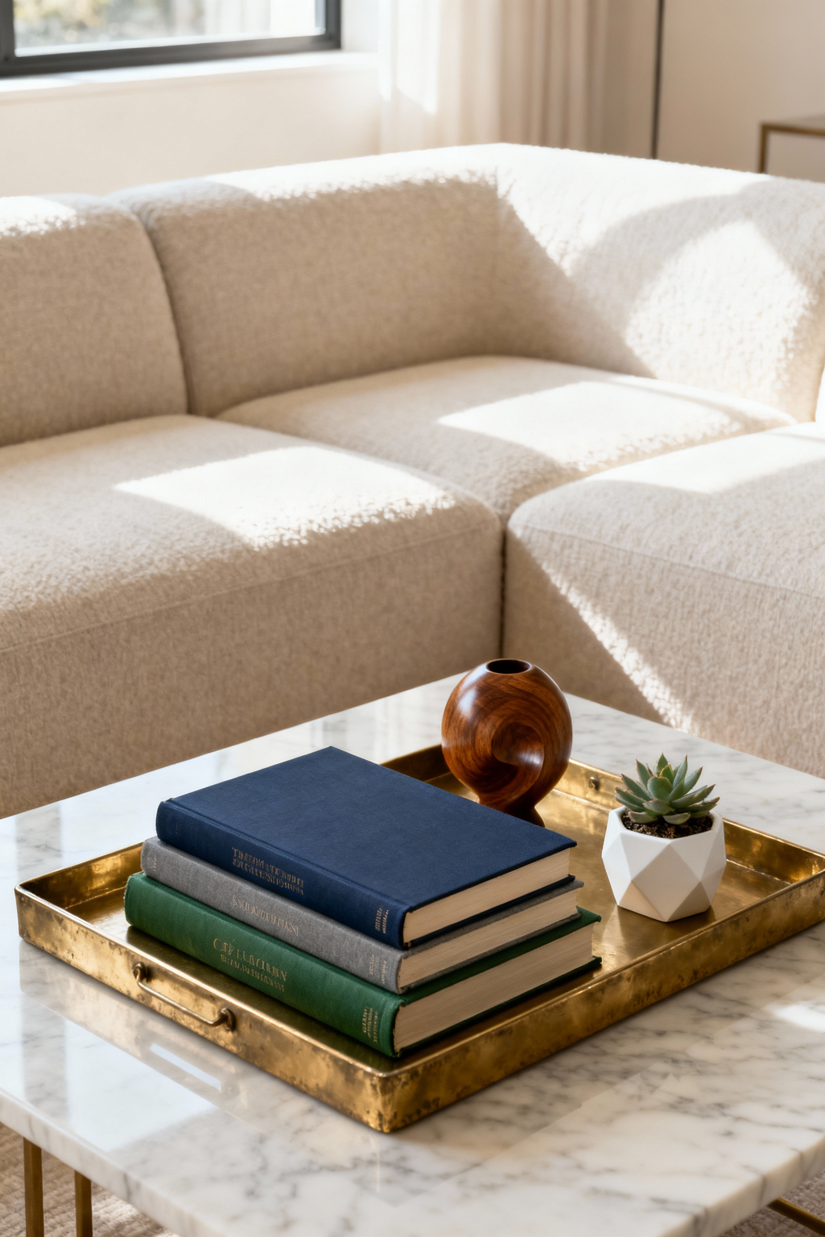
Add visual depth by layering varying heights and textures within the display. Place a specific conversation starter on top of your book stack or nested within the tray. This could be a sculptural paperweight, a souvenir with a backstory, or a scented candle. To keep the arrangement dynamic, mix opposing textures; combine soft elements like flowers or fabric coasters with hard, reflective surfaces like glass or polished stone. Ensure the setup includes a mix of tall vases and low objects to guide the eye upward.
Prioritize functionality by preserving negative space. Avoid covering the entire surface area with decor. Style only the center or one distinct side of the table to leave clear, empty areas for practical use. This ensures the table remains functional for everyday necessities like beverages, keys, or remote controls. If the table is required for full service during a gathering, the tray system allows you to remove the entire styled vignette effortlessly.
Choosing between a single large artwork and a grid of smaller pieces depends largely on the atmosphere you wish to create. Opt for a Statement Solo strategy if your goal is a modern, minimalist aesthetic that reduces visual noise. This approach works best at natural focal points, such as above a fireplace mantel or on a vast blank wall, where a single bold piece anchors the room. Conversely, a Gallery Wall Grid introduces dynamic texture and allows you to showcase a diverse collection. To maintain a professional, high-end look with a grid, consistency is vital; use identical frame sizes and maintain uniform spacing of two to three inches between frames.
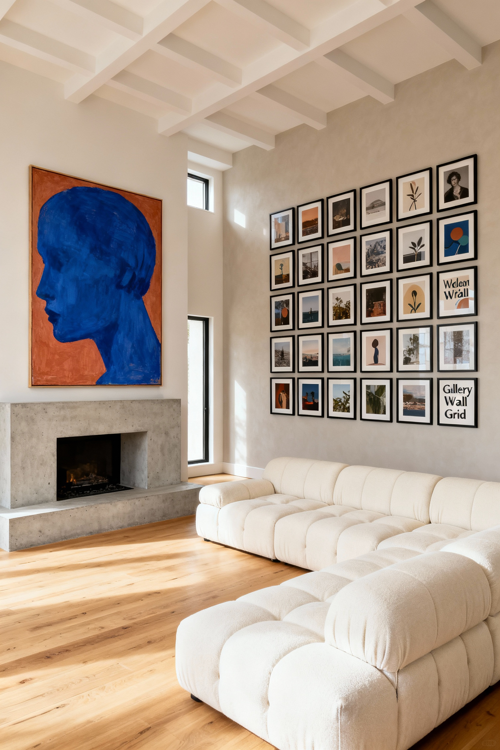
Whichever style you choose, the arrangement must relate mathematically to your furniture to feel intentional. The total width of your art—whether it is one canvas or a full grid—should span approximately two-thirds the width of the sofa or console beneath it. This ratio ensures the art acts as a visual anchor rather than floating aimlessly. Treat a grid arrangement as a single cohesive unit when calculating these measurements.
Height placement is the final step in achieving a gallery-quality display. Always hang the center point of the solo piece or the center of the entire grid arrangement at eye level, which falls between 57 and 60 inches from the floor. If the artwork sits above furniture, position the bottom edge six to eight inches above the furniture’s back. This tight spacing creates a connection between the furnishings and the art, grounding the design within the room’s architecture.
Tactile luxury begins with a grounded foundation. Start your layering process with a substantial base, such as a neutral area rug or heavy sofa upholstery, to prevent the room from feeling top-heavy. From there, create contrast by blending opposites. Place smooth, light-catching materials like velvet or silk directly against nubby, matte textures like chunky wool knits or coarse linen. This juxtaposition adds visual depth and encourages physical engagement with the space.
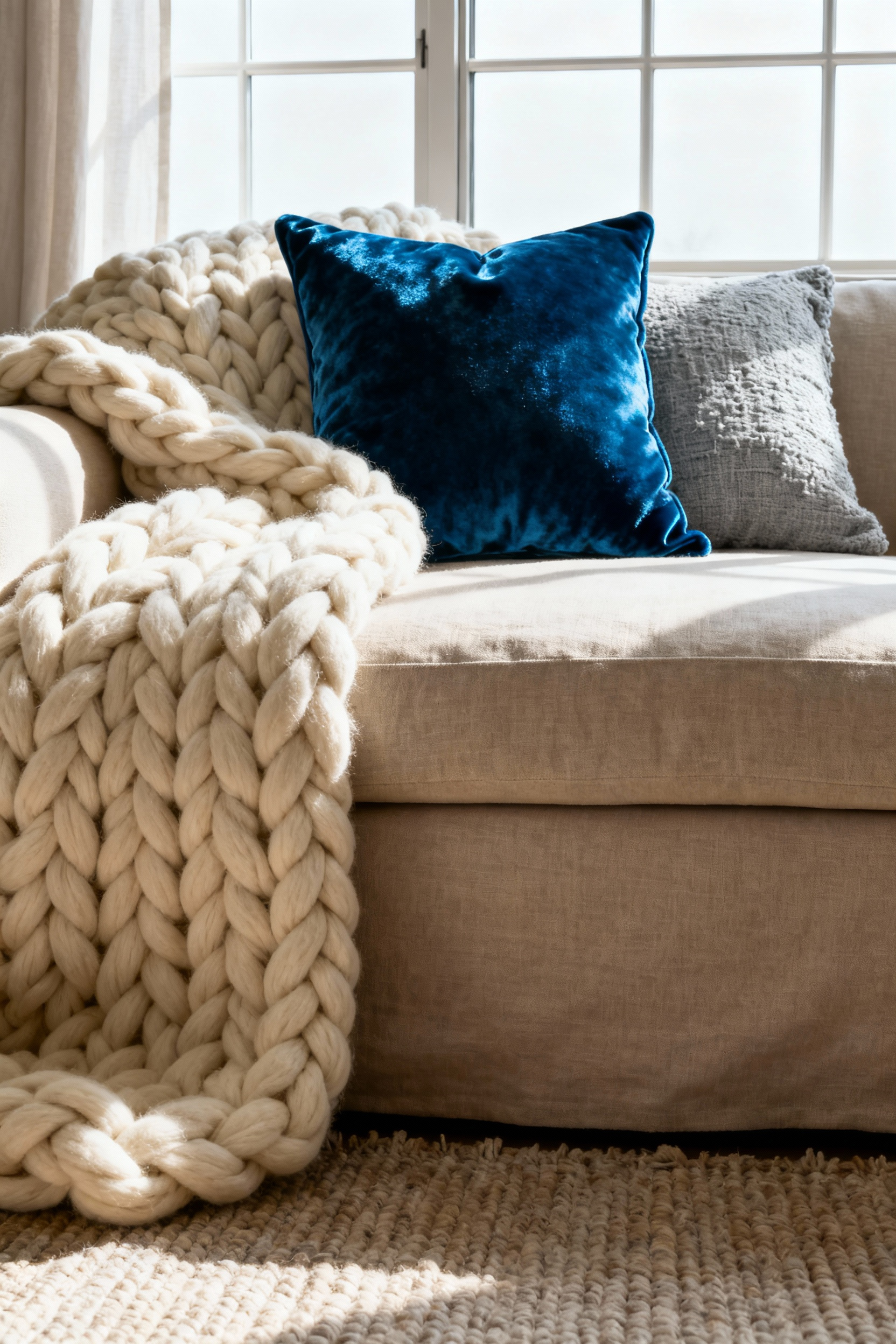
Match fabric weights to the furniture’s function. Reserve durable, heavyweight fabrics like leather, tweed, or tightly woven velvet for primary upholstery that sees heavy use. These materials provide structure and longevity for your anchor pieces. Save your lightweight and delicate fabrics, such as linen, raw silk, or sheer cotton, for low-contact accents. Applying these finer textiles to throw pillows, drapery, and decorative trims introduces elegance without compromising durability.
Keep the look harmonious by weaving a consistent color thread through the room. To avoid a chaotic appearance, select one primary hue—perhaps a deep blue or warm cream—and utilize varying tones across your different patterns and weights. This creates a necessary visual bridge that unifies the disparate textures. When the color palette remains controlled, the richness of the weaves takes center stage, resulting in a sophisticated and curated environment.
Luxury design relies on more than just visual arrangement; it dictates how a space feels and functions on a sensory level. Begin by mastering the lighting temperature and intensity. Skip the single overhead fixture and implement a layered scheme that includes ambient, task, and accent sources. Install dimmers to allow for instant mood shifts, and strictly select bulbs in the warm light spectrum, ideally around 2700K. This specific color temperature creates a flattering, cozy glow that mimics the welcoming atmosphere of high-end hospitality environments.
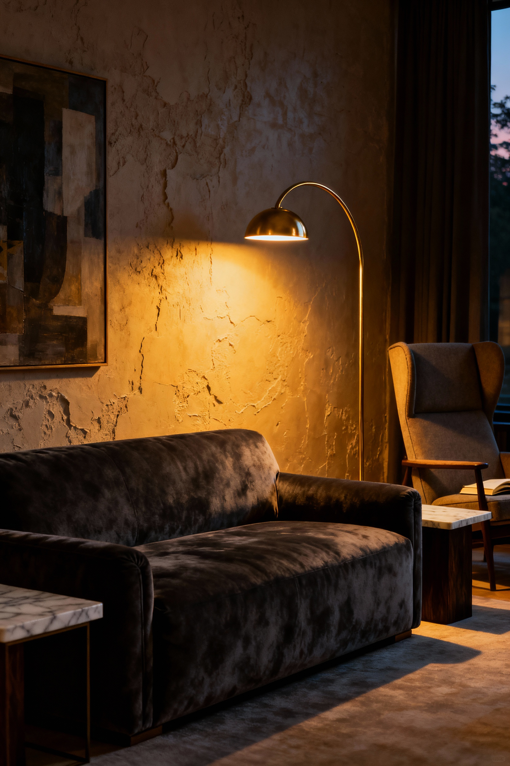
With the mood set, focus on tactile engagement and acoustics. A room without texture feels sterile and uninviting. Layer plush, heavy materials like velvet, chunky knits, wool, or faux fur through your selection of throws, cushions, and area rugs. These soft furnishings serve a dual purpose: they invite physical interaction and act as sound absorbers. Thick rugs and heavy drapes manage acoustics by dampening noise and reducing echo. This acoustic control creates a subconscious sense of calm and privacy essential for a relaxing living space.
Finish the atmosphere by appealing to the sense of smell and connection to nature. Establish an emotional anchor for the room with a signature scent using a high-quality candle or aromatherapy diffuser. Select notes like lavender to induce relaxation or musky wood notes like cedar for a grounded, luxurious feel. Integrate biophilic elements such as fresh flowers or indoor plants. These living additions provide visual signs of life and improve perceived well-being, effectively grounding the room’s design.
Think of your lighting plan as if you are accessorizing a carefully tailored outfit. Your primary ambient fixture should serve as the room’s statement jewelry. Select a central chandelier or a bold task fixture that features sculptural elements, oversized geometric shapes, or unique materials like brass and crystal. These pieces must command attention and act as a visual anchor even when unlit. By treating these fixtures as art objects, you elevate the room’s aesthetic value before you even flip a switch.
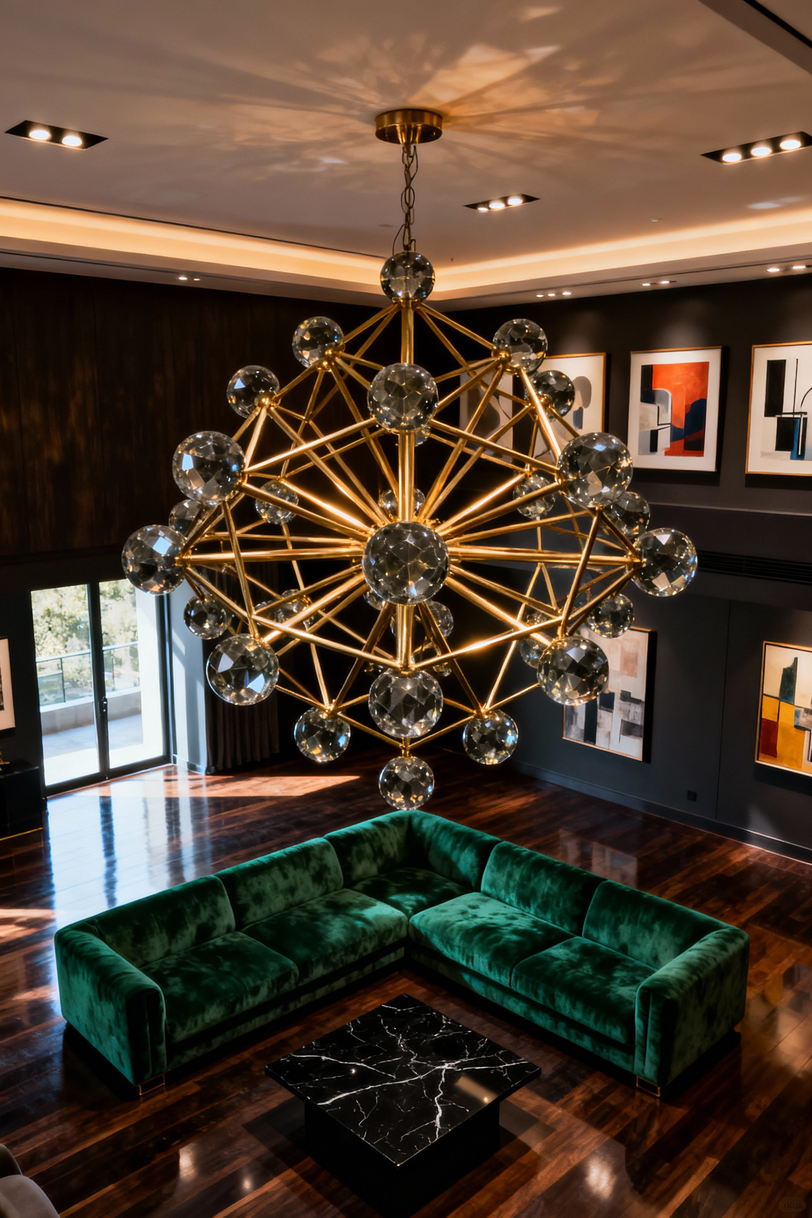
For real drama, look beyond general illumination and embrace accent lighting. Use picture lights, wall sconces, or recessed LED strips in shelving to direct the eye toward specific focal points, such as a textured fireplace or curated artwork. This targeted approach creates a high-contrast interplay of light and shadow, adding the perception of depth and luxury found in high-end retail displays. This layering technique ensures that the room feels dimensional rather than flat.
Technical execution requires total control and temperature consistency. Install dimmer switches on every layer—ambient, task, and accent—to transition instantly from high-energy entertaining to a moody, cinematic atmosphere. Furthermore, always prioritize bulbs with a warm color temperature (2700K–3000K). This creates a soft, golden glow that mimics candlelight, warms wood tones, and prevents your sophisticated design from feeling stark or clinical.
Retailers rotate displays to capture attention and maintain engagement, and your home needs this same rhythm. Seasonal editing prevents visual fatigue by aligning your interior with the natural world. To make this process seamless, anchor your room with a neutral foundation. Large investment pieces like sofas and rugs should remain in versatile shades of gray, beige, or white. This quiet backdrop creates a canvas where small, intentional updates do the heavy lifting without creating visual clutter.
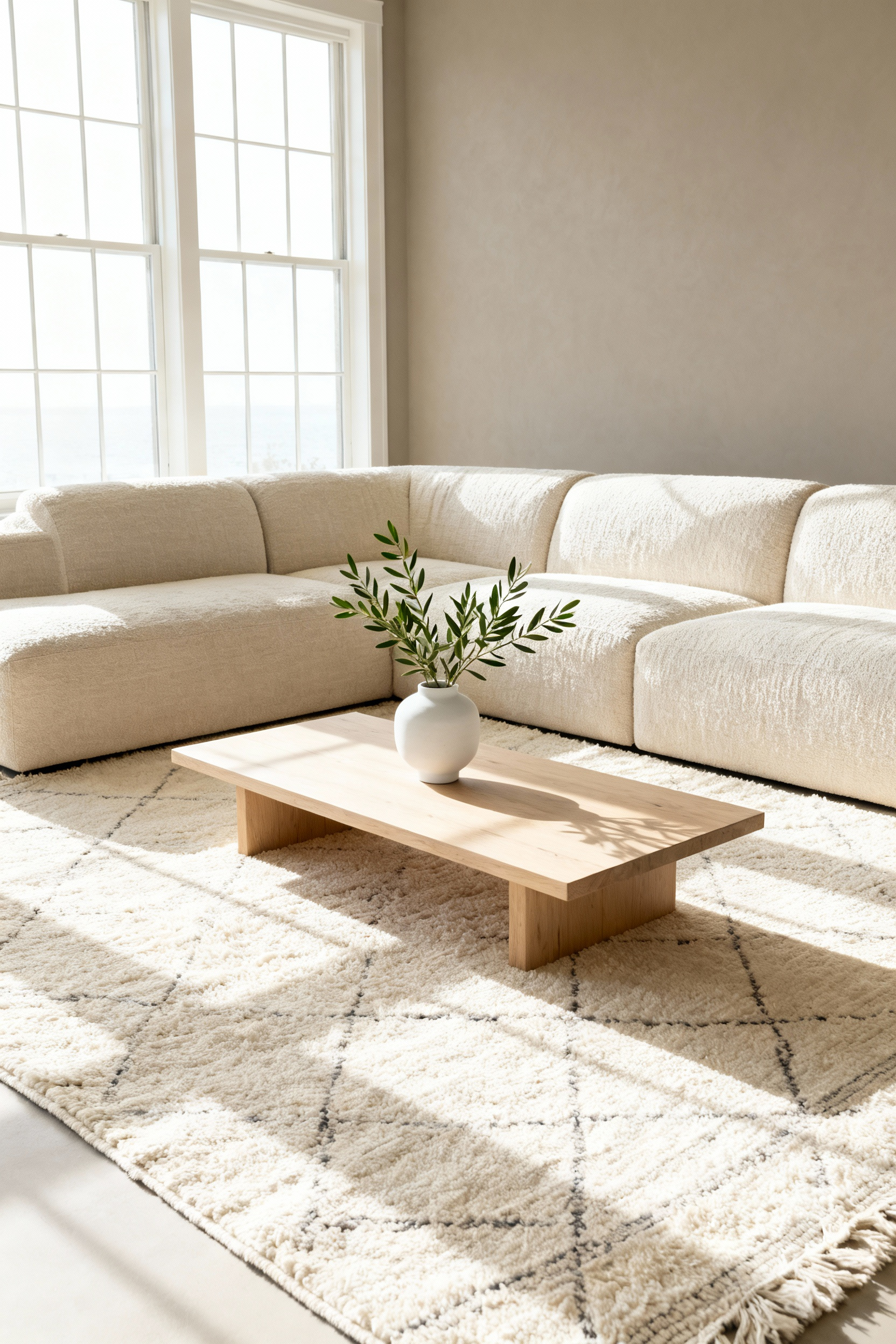
Stick to manageable, high-impact swaps. Change textiles to match the weather; trade light linen pillow covers for rich velvets or chunky wool knits as temperatures drop. This method saves storage space since you retain the original inserts. Mirror the outdoors by updating organic accents. Style fresh florals in spring and swap them for dried botanicals, pinecones, or textural wooden bowls in autumn. You can even rotate framed art to feature cooler tones in summer and warmer landscapes in winter.
Finish the seasonal shift by engaging the remaining senses. Visual changes fall flat without the right atmosphere. Adjust your lighting strategy by maximizing natural brightness in summer and layering warm, ambient lamp light for winter evenings. Specific scents also define the season. Use essential oil diffusers or candles to introduce fresh citrus notes during warmer months and deep, spicy aromas like pine or cinnamon when the air turns crisp.
Effective interior styling relies on editing. Showing every travel souvenir and heirloom simultaneously often leads to visual chaos rather than a personalized narrative. Instead, curate a limited selection of favorite pieces and store the rest. Rotating these collections seasonally keeps the environment fresh and prevents “collection creep.” When placing these items, pair ornate antiques or vibrant cultural artifacts with modern furnishings that feature clean lines. This contrast creates a sophisticated gallery effect, highlighting the unique history of each piece without overwhelming the room with heavy, traditional aesthetics.
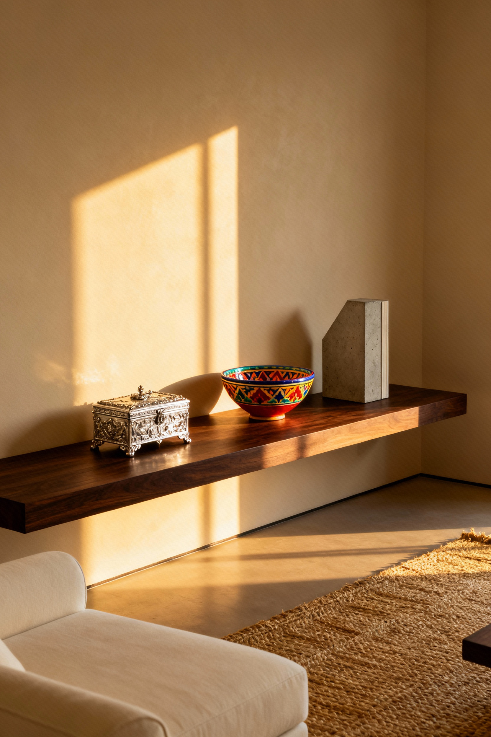
To maintain a polished look, apply professional merchandising techniques to organize smaller objects. Small items often register as clutter when scattered across surfaces, so anchor them using specific containment strategies:
Scentscaping defines a room’s purpose immediately upon entry. For a living room, the primary goal is to cultivate an inviting, grounded atmosphere that encourages conversation. Skip sharp or clinical aromas; instead, select warm, familiar fragrance notes like soft woods—such as sandalwood or cedarwood—balanced with light spice or amber. These elements add an olfactory layer of comfort that complements soft textiles and warm lighting, making the space feel cohesive and settled.
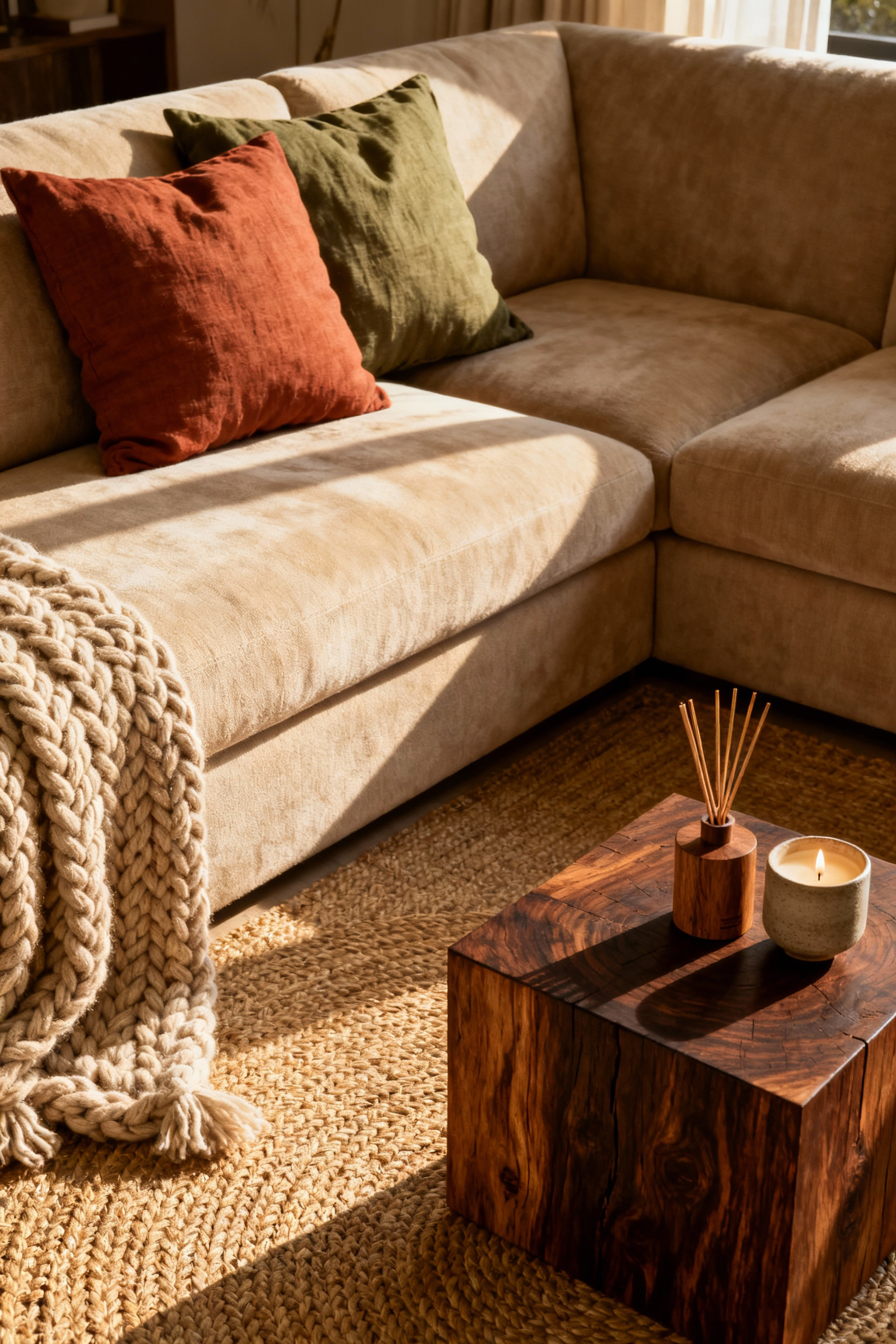
Retailers use fragrance to guide a journey, and you can apply this same principle to manage the “scent throw” in your home. A single candle is often insufficient for an open-plan gathering space. To effectively fragrance the room while enhancing its visual appeal, consider these layering techniques:
Rotate fragrances to match the season or time of day. Swap the rich, spiced, and woody notes used in autumn and winter for lighter fresh or floral profiles during spring and summer. For evening relaxation, transition to a lavender-based scent to signal a shift from high-energy socializing to a calm wind-down. This curatorial approach ensures your home feels responsive and alive.
Sophistication is often about what you omit rather than what you add. The “Remove One Thing” rule serves as the critical final step in the styling process, ensuring your design feels curated rather than cluttered. By deliberately creating negative space, or “breathing room,” you allow your finest pieces to command attention. This discipline transforms a room from simply decorated to professionally polished.
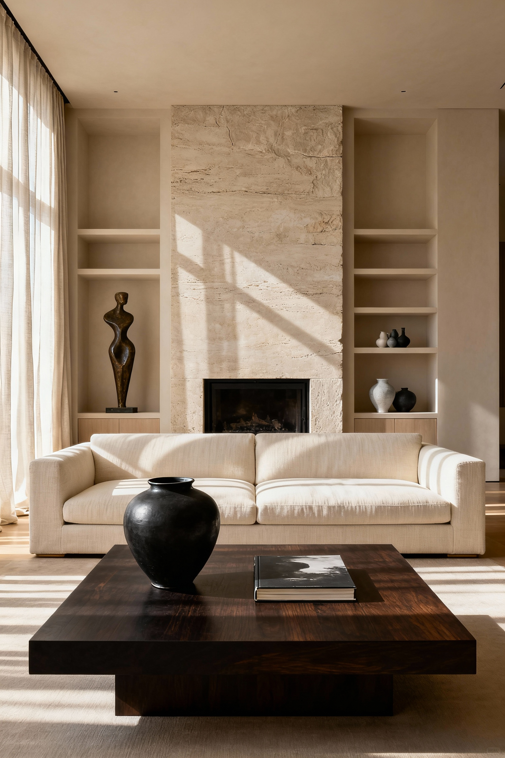
Try a ten-percent edit on every styled surface, including coffee tables and shelving units. Once you believe a vignette is complete, step back and remove one accessory, typically the smallest or busiest item. Prioritize visual impact by favoring a few substantial objects over a volume of small trinkets. A single sculptural form paired with a lamp and a stack of books offers more luxury than a collection of minor distractions.
Apply this editing mindset to your furniture layout for a truly elevated feel. Luxurious spaces require that major pieces have generous space surrounding them. Avoid crowding furniture or pushing sofas flush against the walls. Pulling seating arrangements slightly inward creates better flow and mimics the spaciousness found in high-end design environments.
Great design goes beyond static display; it cultivates an environment that breathes alongside you. By establishing a timeless, neutral foundation and prioritizing flexible elements, you move away from chasing fleeting trends and toward building a sanctuary. Your home stops feeling like a staged showroom and begins to function as a living gallery of your experiences. This holistic approach to living room decoration ensures that every texture, light source, and curated object serves a purpose, supporting your emotional well-being while authentically reflecting your personal narrative.
As life changes, your space must possess the agility to adapt without losing its sophisticated character. View your home not as a finished project, but as a responsive backdrop for your future chapters. Begin by auditing your current collection today; identify one generic item that simply fills space and replace it with a piece that holds genuine history or provides sensory comfort. Let your design choices honor where you have been, while remaining open to where you are going.
The key is intentional editing and leveraging negative space. Follow the “Remove One Thing” rule on all styled surfaces. Prioritize investment pieces and unique artifacts, grouping them in odd numbers (threes or fives) on trays or pedestals. This practice ensures objects have “visual breathing room” and read as curated collections rather than random clutter.
The 60-30-10 rule is a formula for achieving color harmony in design. Apply 60% of the room to a dominant neutral color (walls, major upholstery), 30% to a secondary color (side chairs, drapes, accent furniture), and 10% to a bold accent color (pillows, artwork, small accessories). This ratio ensures visual balance and prevents the color scheme from becoming overwhelming.
Tactile luxury refers to creating a rich sensory experience through texture. Incorporate it by layering contrasting materials: pair smooth fabrics like silk or velvet with matte, rougher textures like chunky wool knits, linen, or raw wood. These intentional material contrasts invite physical interaction and add deep visual sophistication, moving beyond basic aesthetics.