Physical Address
304 North Cardinal St.
Dorchester Center, MA 02124
Physical Address
304 North Cardinal St.
Dorchester Center, MA 02124
Transform your dining space with our expert guide to choosing the perfect dining room paint. Uncover 20 secrets for color, finish, and mood-setting.
Can we talk about the most expensive mistake I see people make? It’s not buying the wrong sofa or a rug that’s too small. It’s choosing the perfect dining room table, splurging on gorgeous chairs, finding a stunning light fixture… and then ruining the entire effect with the wrong paint color. I’ve seen it happen dozens of times. A beautiful room falls flat because the walls are working against it, not for it.
Paint isn’t just decoration; it’s the foundation of the entire room’s story. In luxury retail, we call it the “first read.” It’s the immediate emotional cue that tells a customer how to feel before they’ve even looked at the product. Your dining room is no different. The wall color is the backdrop for every laugh, every celebration, every quiet Tuesday night dinner. Getting it right is everything. Forget the trends and the noise. Here is what actually matters.
Before you even think about looking at a single color chip, we need to do the strategic work. This is the part everyone skips, and it’s why so many paint jobs end in disappointment. This is the difference between a room that feels “fine” and a room that feels intentionally, breathtakingly right.
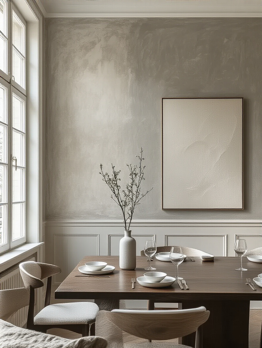
Please, I’m begging you, stop looking at paint chips in the sterile, fluorescent lighting of the hardware store. It is the single fastest way to choose the wrong color. The paint color you see there has absolutely zero relationship to how it will look in your home. Light is the secret ingredient that activates color, and the light in your dining room is completely unique.
I had a client who chose what she thought was a lovely, warm greige for her north-facing dining room. On the walls, that “warm” color turned into a sad, purplish-gray by 10 AM. Why? North-facing light is cool and blue-toned, and it completely altered the paint’s undertones. We had to repaint the entire room. Don’t learn this lesson the hard way. Spend a full day, from morning to night, just watching how the light moves across your walls. This isn’t wasted time; it’s the most important research you will do.
Your homework, then, is to become a light detective. Note the direction of your windows and observe how the intensity and warmth of the light change with the time of day.
Now for the fun part. What is the story of this room? Don’t just say, “a place to eat.” Get specific. Are you hosting energetic brunches with friends where conversation flows like mimosas? Or are you creating an intimate, cozy haven for lingering dinner parties that last for hours? The answer dramatically changes your color strategy.
This is the exact same process we use when designing a luxury boutique. Is the mood exclusive and dramatic, or is it fresh and accessible? A vibrant, warm color might encourage lively conversation, while a deep, moody hue will envelop your guests, making them feel like they’re in a private club. Forgetting to define the mood is like getting dressed without knowing where you’re going. You might end up in a ballgown at a barbecue.
Once you have a handle on the light, you can start layering in the emotional component that will truly make the room sing.
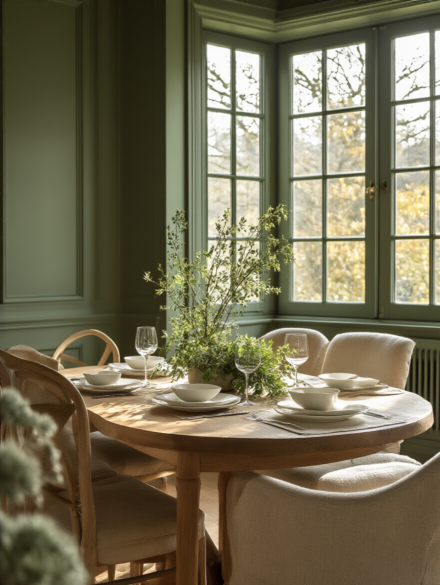
A home is a collection of experiences, not a series of disconnected boxes. The color you choose for your dining room has to speak to the colors in the rooms it touches—the living room, the kitchen, the hallway. They don’t have to match, but they absolutely must be in conversation with one another. A sudden, jarring color change is a visual stop sign. It breaks the flow and makes your entire space feel smaller and more chaotic.
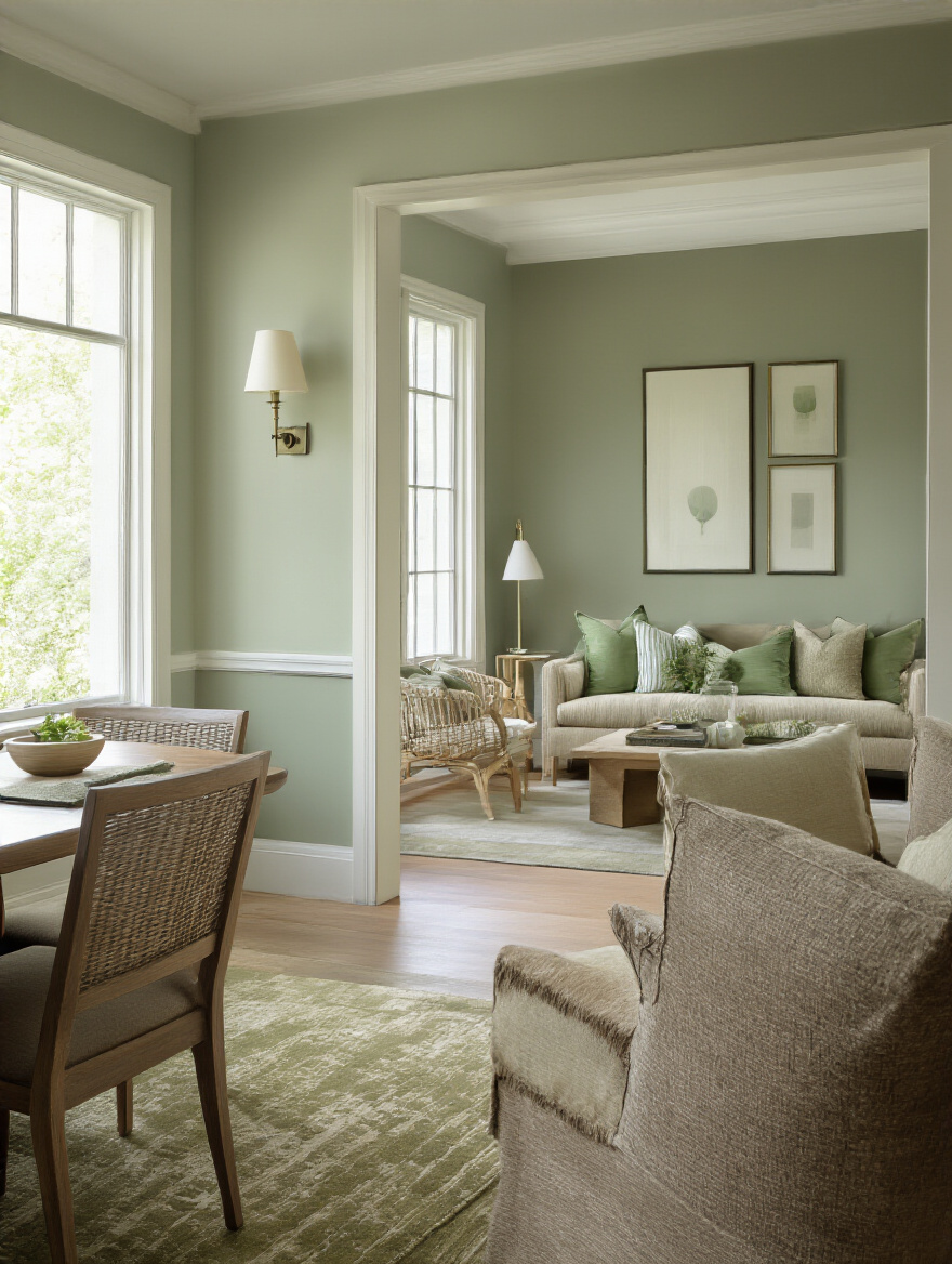
The secret everyone misses is looking at the undertones. Think of undertones as the secret ingredient in the color’s recipe. A gray with a green undertone will feel serene next to a living room with sage accents. A beige with a warm, golden undertone will flow beautifully into a kitchen with warm wood cabinets. The noise is worrying about exact matches; what matters is ensuring the underlying tones are compatible. It’s the difference between a curated collection and a random assortment.
It’s this attention to the subtle transitions between spaces that creates a truly high-end, cohesive feeling throughout your home.
Your dining room furniture, rug, and art have already made decisions for you. Your job is to listen to them. Choosing a paint color in isolation is a recipe for disaster. I once had a client who fell in love with a bold emerald green. It was stunning on the chip. But in her dining room, against her warm, rustic oak table and beige linen chairs, it was a catastrophe. The green was cool and jewel-toned, while her furniture was warm and earthy. They screamed at each other.
Think of your walls as the supporting actor. They are there to make the star—your beautiful furniture, your cherished art—look its absolute best. Before you go to the paint store, take a “visual inventory.” What are the dominant colors and undertones in your wood finishes, your upholstery, your rug? Your new wall color needs to complement this existing palette. It should be the thing that ties everything together, not the thing that introduces a new conflict.
With our strategic foundation in place, it’s time to talk about the physical one. This step is about ensuring the canvas itself is perfect, because even the most exquisite paint color will look cheap on a flawed surface.
Here’s a trade secret: a high-end paint job is 70% prep and 30% painting. You can buy the most expensive paint in the world, but if you put it on a wall that hasn’t been properly prepared, it will look terrible and it won’t last. In luxury retail, a display wall has to be glass-smooth because any imperfection distracts from the product. Your dining room is the same; a lumpy, flawed wall distracts from the beautiful experience you’re trying to create.
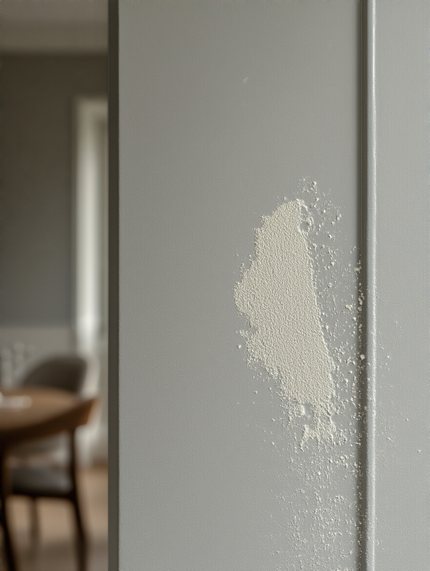
This means you must wash the walls to remove any grease or grime. You have to fill every single nail hole and crack, then sand it perfectly smooth. I know it’s tedious, but this is non-negotiable. Here’s a shortcut you might not know: after you’ve patched and sanded, take a bright portable lamp and hold it at a sharp angle to the wall. This will reveal every tiny bump and imperfection your eye would normally miss. Fixing these now will give you that flawless, professional finish that makes a room feel truly luxurious.
Alright, we’ve planned and prepped. Now we can finally—and intelligently—start thinking about the actual paint. This is where we fine-tune the details that elevate the entire project.
Choosing the finish is just as important as choosing the color. A finish, or sheen, determines how light reflects off the wall, and it dramatically impacts both the mood and the durability of your room. Think of it like fabric: matte is like velvet—rich, deep, and light-absorbing. It hides imperfections beautifully and creates a very sophisticated, cocooning effect. But, just like velvet, it’s not very durable and can be a nightmare to clean.
For a dining room, where chairs scuff walls and food can splatter, I almost always recommend an eggshell or satin finish. This is your silk blouse. It has a subtle, soft glow that reflects a bit of light, giving the color life without looking shiny. More importantly, it’s scrubbable. You can actually wipe off a smudge without ruining the finish. High-gloss is like patent leather—use it sparingly for high-impact accents on trim or furniture, but almost never on all four walls. It’s incredibly durable but shows every single flaw.
The balance of beauty and practicality is key, and getting the finish right is half the battle.
Color sends subconscious signals. It’s not just about what looks pretty; it’s about what feels right. Warm colors like reds and oranges are known to stimulate conversation and appetite. This can be fantastic for creating a lively, energetic dining space. But be careful—too much intense red can also make people feel agitated and even eat faster. It’s why you see so much red in fast-food chains!
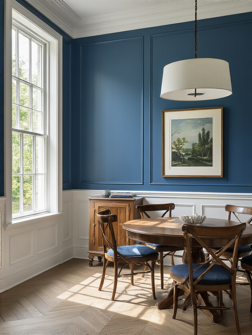
Cool colors like blues and greens, on the other hand, have a calming effect. They encourage people to relax and linger. A deep, moody blue can be incredibly chic for a formal dining room where you want drawn-out, intimate conversations. Just be sure to balance it with warm lighting and textures so it doesn’t feel cold or suppress appetites. You’re not just painting walls; you’re programming an emotional response.
Before you commit, think back to the mood you defined in step two and choose a color family that supports that specific story.
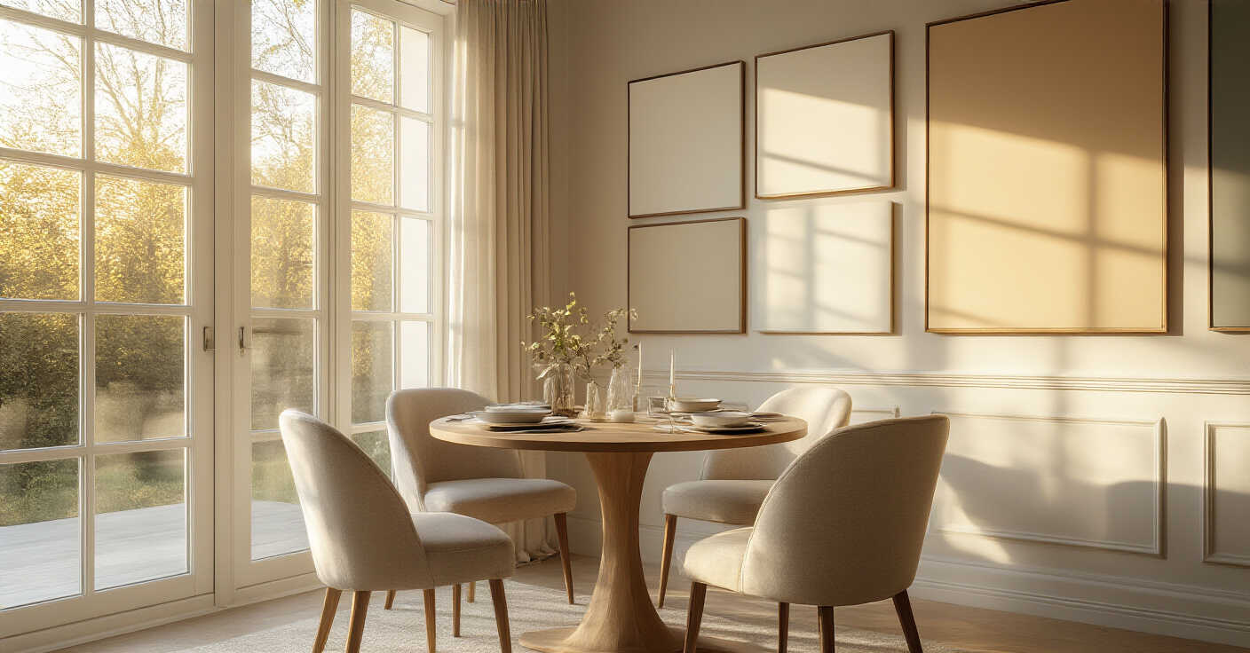
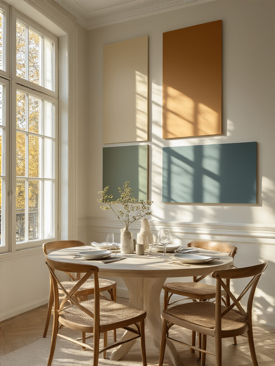
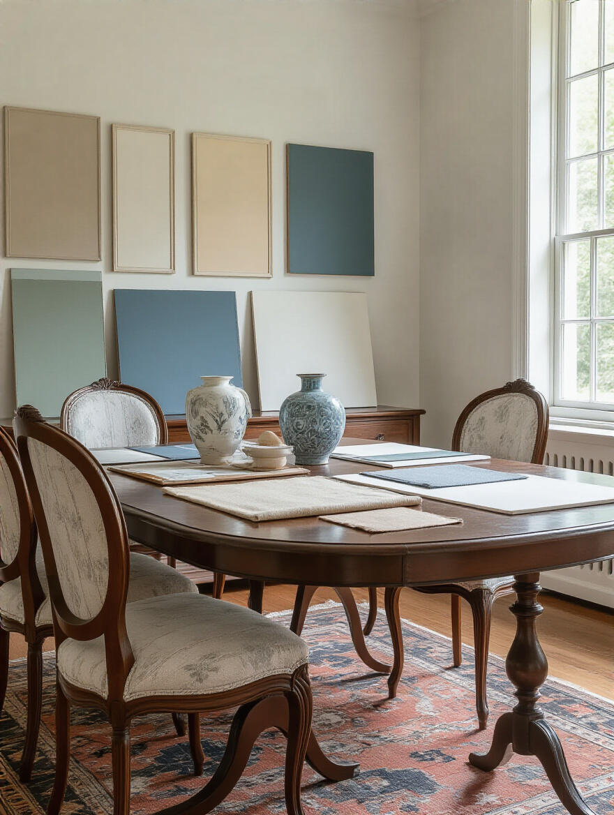
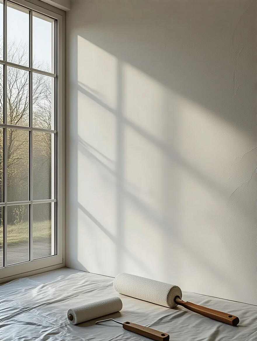
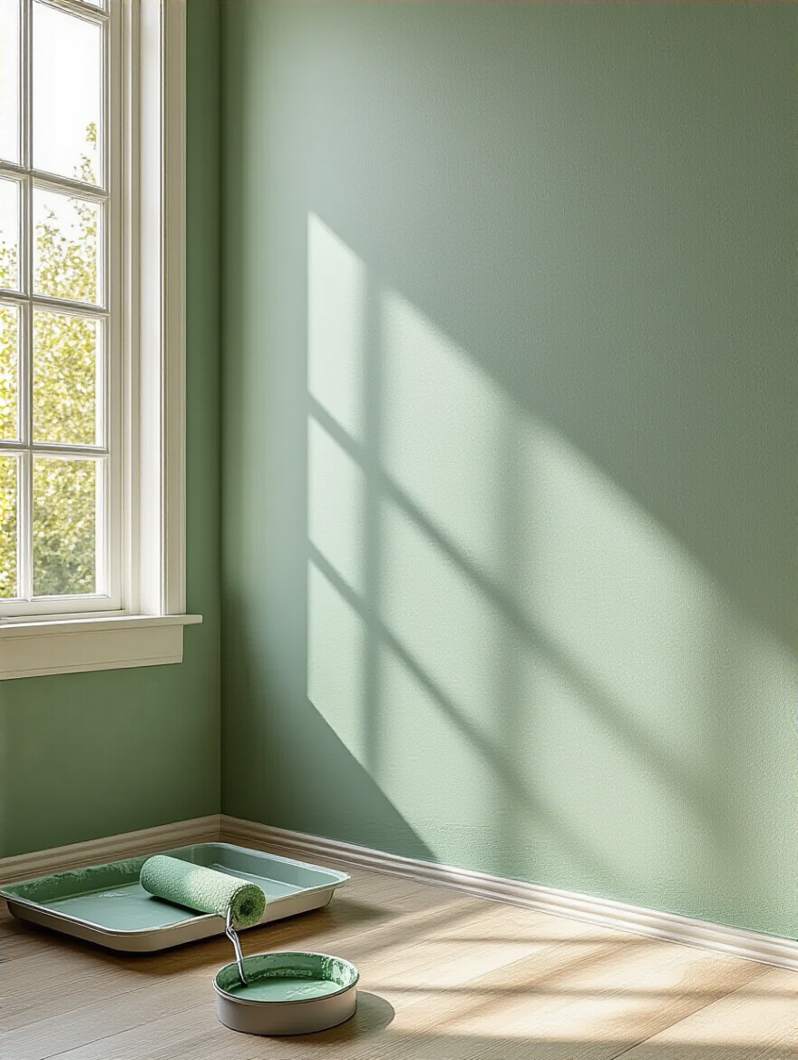
I cannot stress this enough: do not, under any circumstances, make a final decision based on a tiny 2×2 inch paint chip. It’s malpractice. That little square can’t possibly tell you how a color will feel when it’s covering an entire wall and bathed in your home’s unique light. You absolutely must test your top contenders with large samples.
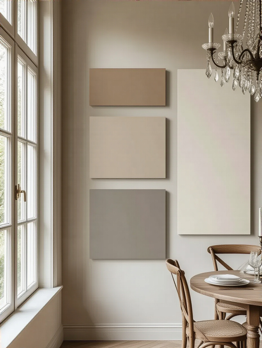
Here’s the pro move: never paint your test swatches directly on the wall. The existing wall color will influence how you perceive the new one. Instead, paint a large poster board (at least 2×2 feet) with two coats of your sample paint. You can then move this board around the room throughout the day, holding it up on different walls, next to the window trim, behind your dining chairs. This is the only way to see how the color truly behaves in its intended environment. Live with it for a few days. You’ll be shocked at how it changes from morning to night.
This is where most people get tripped up. The undertone is the subtle, underlying color within a color. It’s the hint of yellow in a warm white, or the touch of blue in a cool gray. Getting the undertones wrong is what leads to that nagging feeling that a room just feels “off.” If your dining table has a warm, honey-toned wood finish and you paint the walls a gray with a cool blue undertone, they will clash.
The easiest shortcut to see a color’s true undertone is to hold the paint chip against a sheet of pure white printer paper. Suddenly, that beige will reveal its pinkish undertone, or that greige will show its green cast. Once you know your undertone, you can make sure it harmonizes with the undertones of the other major elements in your room—your flooring, furniture, and any adjacent wall colors. This is the secret language of a well-designed space.
We’re moving from theory to practice. A great strategy is useless without flawless execution. Here’s how to ensure the vision you’ve worked so hard on comes to life perfectly on your walls.
Skipping primer is like building a house on a shaky foundation. It might look fine for a little while, but eventually, problems will show up. A high-quality primer does three essential jobs: it ensures the paint sticks properly, it creates a uniform surface so your final color is true and even, and it blocks old stains or dark colors from bleeding through.
Think of it as the insurance policy for your paint job. It will save you from having to apply a frustrating third or fourth coat of paint, and it makes the final finish much more durable and long-lasting. If you are making a dramatic color change (like painting a light color over a dark one) or if you have patched a lot of spots on the wall, primer is not optional. It is the critical step that guarantees a professional result.
Investing in a good primer now will save you a world of headaches later.
Nothing screams “amateur DIY” louder than fuzzy, bleeding paint lines along the ceiling or trim. Achieving those razor-sharp, satisfyingly crisp lines is all about your taping technique. First, use a high-quality painter’s tape (like FrogTape) and take the time to press the edge down firmly with a putty knife or a credit card to create a perfect seal.
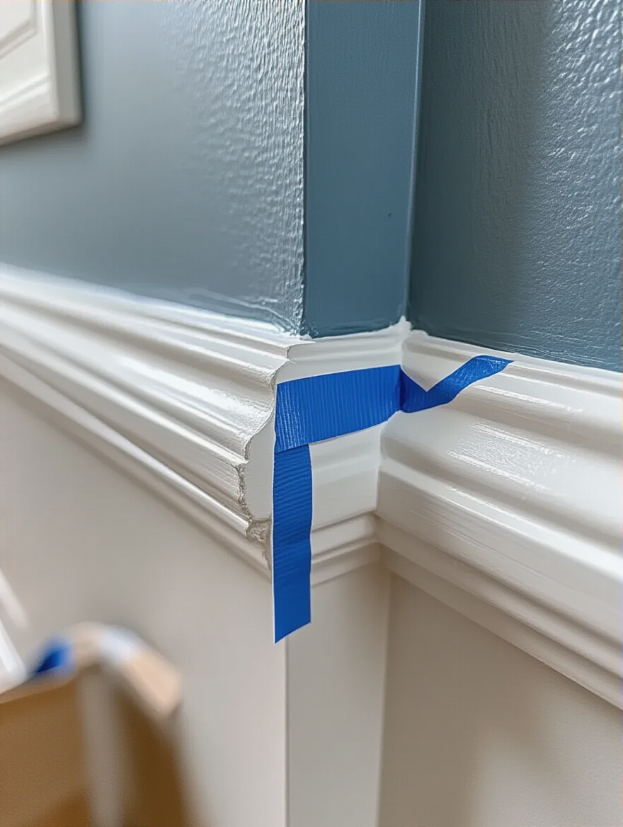
But here is the game-changing trick the pros use: After you’ve applied your tape, paint a very thin layer of your base color (the color of the ceiling or trim you’re taping off) along the edge of the tape. Let it dry completely. This “seals” the edge, so if any paint is going to bleed under the tape, it’s the color that’s already there. Then, paint your new wall color. When you pull the tape off (do it while the last coat is still slightly damp, at a 45-degree angle), you will have the cleanest, sharpest line imaginable. It’s an extra step that makes all the difference.
Good tools are not a splurge; they are a necessity. A cheap roller will leave lint on your walls and create an uneven texture. A poor-quality brush will leave streaks. Invest in a good 2.5-inch angled brush for cutting in (painting the edges) and a quality microfiber roller with the right nap (thickness) for your wall’s texture (a 3/8-inch nap is perfect for most smooth walls).
When you roll, don’t just go up and down. Apply the paint in a “W” or “M” pattern, about three feet at a time, then go back and fill it in without lifting the roller. This distributes the paint evenly. And the most important rule is to always maintain a “wet edge,” meaning you should always overlap your strokes with the section you just painted before it starts to dry. This is how you avoid those dreaded lap marks and get a seamless, beautifully uniform finish.
Now that we have the fundamentals down, we can talk about using paint not just to color a room, but to shape it. These are the more advanced techniques that can add a truly custom, designer feel to your space.
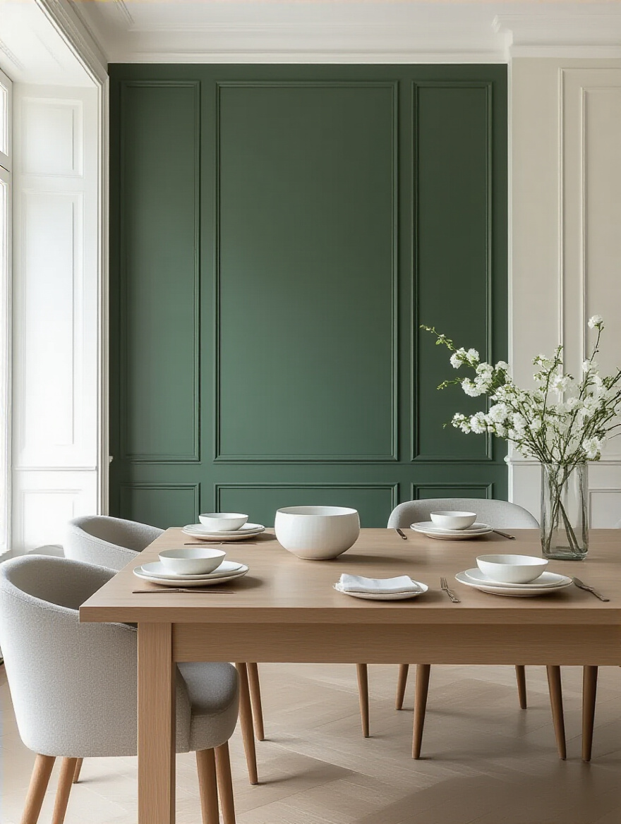
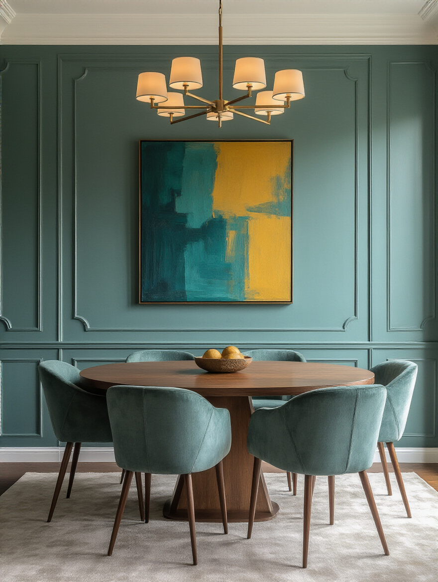
An accent wall is a powerful tool when used correctly. Its purpose is to create a clear focal point and add depth to a room. In a dining room, the ideal accent wall is usually the one behind your dining table or a beautiful buffet—it provides a backdrop that grounds the main event. It’s the “hero” moment we create in retail to draw the eye to a key product.
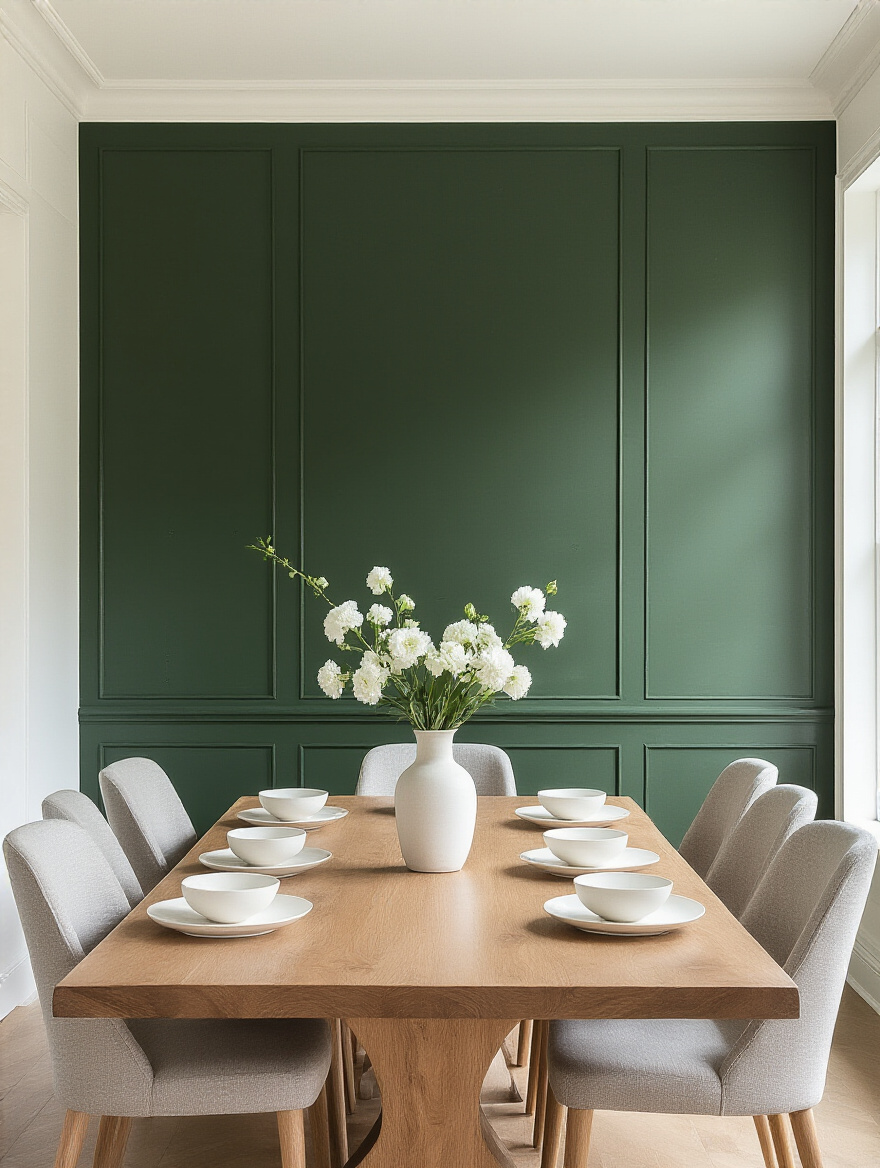
Don’t just pick a random wall. And don’t pick a wall that’s broken up by too many doors or windows, as this will dilute the impact. A darker or more saturated accent color can make a long, narrow room feel wider, or it can simply add a dose of drama and intimacy to the space. Just be sure the color you choose has a clear relationship to the other colors in the room, perhaps by picking up a hue from your artwork or rug.
A well-executed accent wall adds instant sophistication and character, making the whole room feel more curated.
I love this technique for adding architectural interest where none exists. A two-tone wall, often with a darker color on the bottom third and a lighter color above, can mimic the effect of elegant wainscoting for the cost of a can of paint. This approach is fantastic for grounding a room and adding a layer of visual complexity.
The key is getting the dividing line at the right height. A good rule of thumb is to place it at about chair-rail height, or roughly one-third of the way up the wall. Using a laser level is a must here to ensure your line is perfectly straight. This technique works beautifully in dining rooms, as the darker, more durable bottom color can handle scuffs from chairs, while the lighter top color keeps the room feeling airy and open.
This is a perfect example of using paint strategically to add character and custom detail without a renovation budget.
If you want your dining room to have a truly unique, artisanal feel, consider a decorative paint technique. Finishes like limewash or Roman clay add subtle texture and movement to the walls, creating a soft, velvety appearance that changes beautifully with the light. This is not about a faux-finish from the 90s; modern textural paints create a very organic, high-end look.
This is the equivalent of choosing a hand-loomed silk over a machine-made polyester. The subtle imperfections and variations are what make it beautiful. It’s a fantastic way to add warmth and character, especially in a more minimalist space, and it’s also incredibly forgiving for walls that have minor imperfections. These finishes transform your walls from a simple colored surface into a work of art in themselves.
A word of caution: these techniques often require specific application methods, so do your research and practice on a sample board first.
This is a more refined take on the traditional accent wall. Instead of choosing a bold, contrasting color, select a color that is pulled directly from a dominant piece of artwork or a patterned rug in your dining room. For example, if you have a beautiful landscape painting, you could paint the wall it hangs on a soft, muted green drawn from the trees in the painting.
This creates an incredible sense of cohesion. The wall and the art become one integrated visual moment. The wall color acts as a frame, enhancing the artwork and making it feel even more important and intentional. This technique makes your decor the star of the show and demonstrates a very sophisticated eye for design. It’s a quiet but incredibly powerful way to create a harmonious and curated space.
Don’t forget to look up! The surfaces beyond the four main walls offer incredible opportunities to subtly manipulate the feel and proportions of your dining room, adding that final layer of professional polish.
The ceiling is your “fifth wall,” and it’s a shamefully underutilized design tool. Everyone defaults to plain white, but there’s a world of opportunity up there. To make a room feel taller and more expansive, paint the ceiling a color that is one or two shades lighter than your wall color, or a crisp white with a flat finish. This tricks the eye into seeing the ceiling as higher than it actually is.
For a bit more drama, especially in a room with high ceilings, painting it a dark, moody color can create an incredibly intimate and cozy feeling, perfect for evening dinner parties. Another pro tip is to use a “tinted white” – simply add a tiny drop of your main wall color into your can of white ceiling paint. This creates a subtle harmony between the walls and ceiling for a very cohesive, high-end feel without being obvious.
A beautiful result is only half the goal. The other half is ensuring that beauty lasts. A dining room is a workhorse, and your paint needs to be able to stand up to real life.
As I mentioned when we talked about finishes, durability is paramount in a dining room. It’s worth every extra penny to invest in a high-quality, “scrubbable” or “washable” paint line. These are formulated to withstand gentle cleaning without the color fading or the finish wearing away.
A standard flat paint will show every fingerprint, and if you try to wipe off a smudge, you’ll likely leave a permanent shiny spot—a problem called “burnishing.” In a room where spills and scuffs are inevitable, choosing a paint that can handle a damp cloth is essential. Look for paints labeled for kitchens and baths, or premium lines like Benjamin Moore’s Regal Select or Sherwin-Williams’ Emerald, which are designed for real-world wear and tear.
Inevitably, you will need to do a touch-up. A chair will scrape the wall, or you’ll move a piece of art and need to fill a nail hole. Having properly stored, perfectly matched paint on hand is a lifesaver. First, clean the rim of the paint can thoroughly to get a good seal. Place a piece of plastic wrap over the opening before hammering the lid on tight.
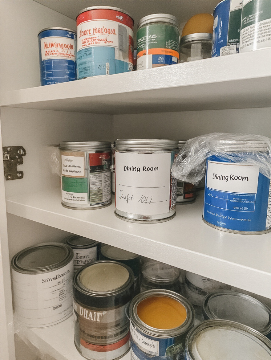
The key is to store it in a cool, dry place where it won’t freeze or get too hot—never in a garage or attic. For an even better solution, transfer a small amount of leftover paint into a small, airtight glass jar. This minimizes the air exposure, which is what causes paint to go bad. And please, label it clearly with the color name, the sheen, and the room where it was used. You’ll thank yourself later.
The best way to maintain your beautiful paint job is with proactive, gentle care. Don’t wait for stains to set. If you see a splatter, wipe it up immediately with a soft, damp microfiber cloth. For routine cleaning, avoid harsh chemical cleaners or abrasive sponges. A simple solution of warm water with a tiny drop of mild dish soap is all you need.
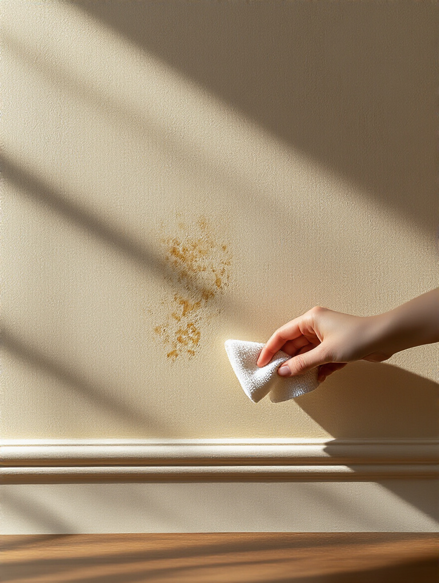
When you do wash a wall, work from the bottom up to avoid streaking, and then rinse with a clean, damp cloth from the top down. Taking five minutes for a quick wipe-down every so often is far less work—and far better for your paint—than a marathon scrubbing session once a year. This gentle maintenance will keep your dining room looking fresh and pristine for years, protecting the investment of time and money you’ve made.
There you have it. Choosing your dining room paint isn’t a simple weekend task; it’s a strategic design decision. It’s about merchandising the experience you want to create for your family and guests. By understanding light, defining your mood, testing meticulously, and executing with care, you’re not just applying color to a wall. You’re crafting an atmosphere, a backdrop for memories, and a room that feels not just decorated, but truly and intentionally designed. Now you have the insider knowledge. Go create a dining room that you love to live in.