Physical Address
304 North Cardinal St.
Dorchester Center, MA 02124
Physical Address
304 North Cardinal St.
Dorchester Center, MA 02124
Discover soulful bedroom paint ideas to create a serene, modern sanctuary. Blend beautiful colors and meaningful design for a truly personal space.
You know, people often ask me how to begin creating a bedroom that feels like a true retreat. They see beautiful images, but they’re overwhelmed. They wonder where to even start. And my answer is always the same: it begins not with the furniture or the textiles, but with the color that surrounds you. It is the very air you breathe within the space.
So much of what we see online is about chasing trends. But a bedroom, your most private space, your sanctuary, should be timeless. It should be a reflection of your spirit. I’ve seen clients try to force a color into their room because it was popular, only to find it felt cold and impersonal. We’re not doing that here. We are going to talk about color with intention, choosing hues that create a backdrop for peace, reflection, and deep rest.
Before a single drop of paint touches the wall, we must lay the groundwork. This is the silent, thoughtful phase where the soul of the room is decided. It’s where we move beyond just picking a color and begin to understand how that color will live and breathe in your personal space.
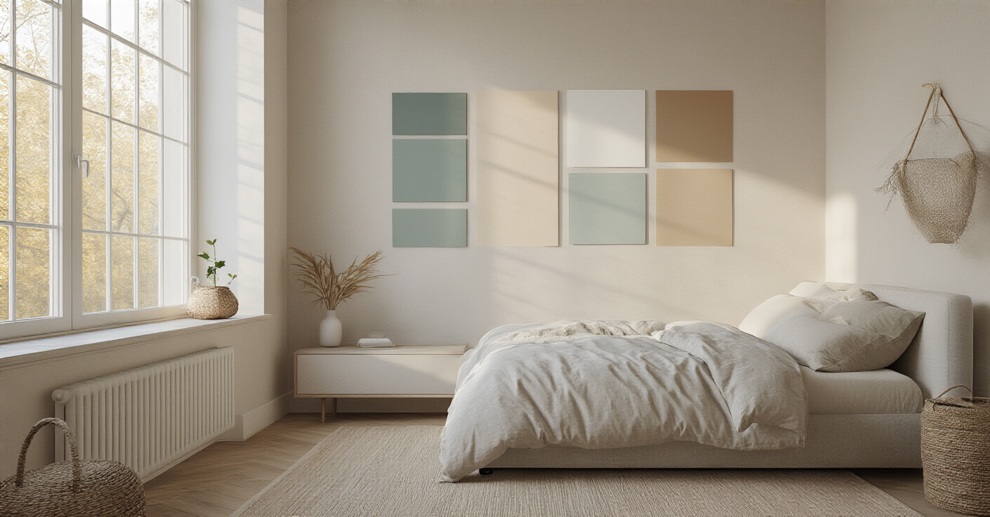
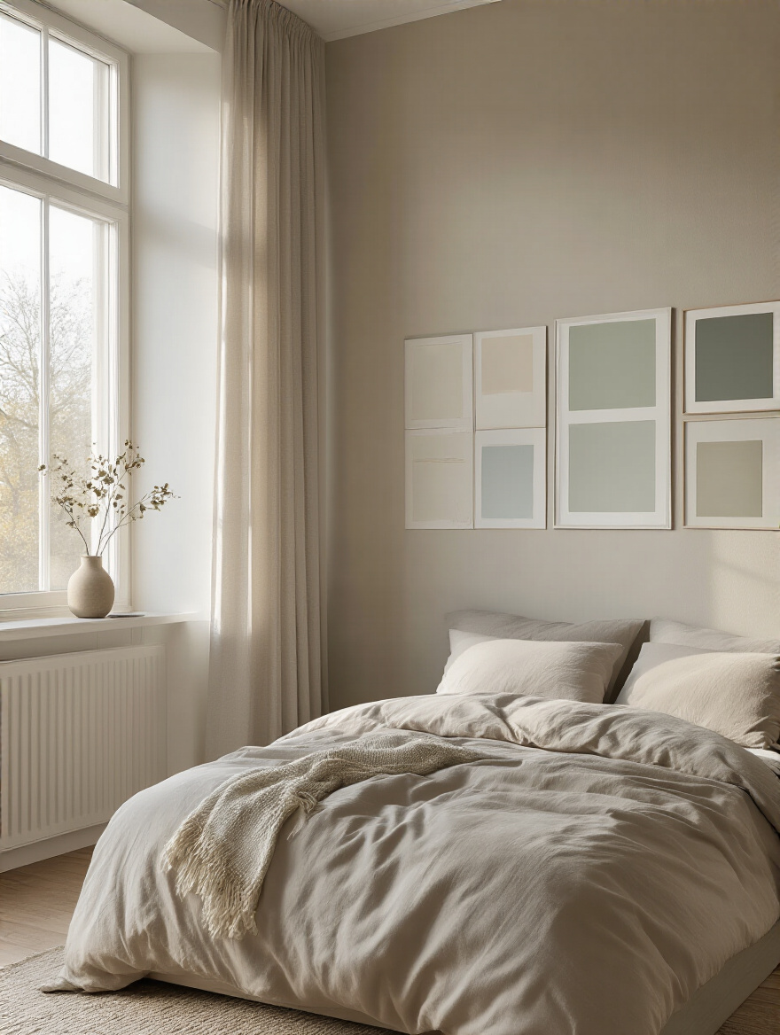
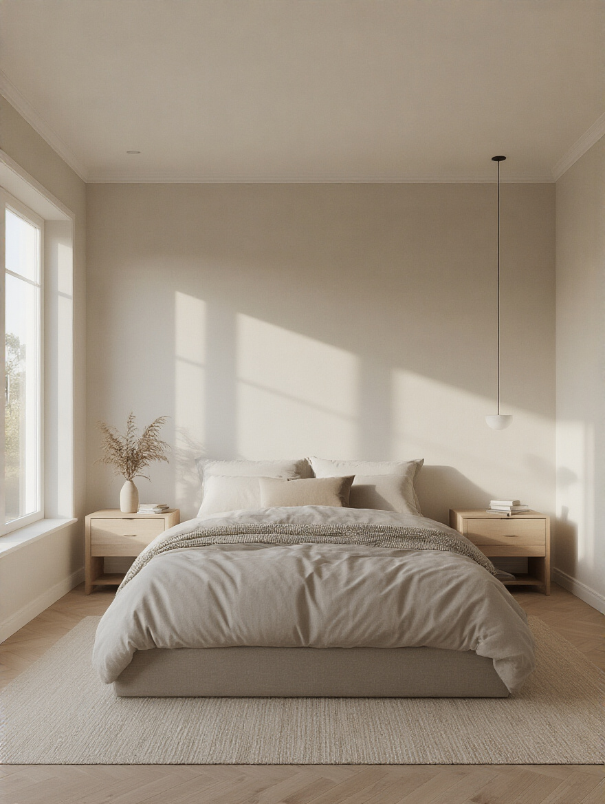
Forget the tiny paint chip under the harsh fluorescent lights of a hardware store. That is the first and greatest mistake. The real designer in your room is the sun, and its light is a gift we must honor. How the light enters your room—the direction of the windows, the time of day—will completely transform any color you choose.
I once worked with a client who fell in love with a soft, warm “greige.” On the chip, it was perfect. But her bedroom faced north, receiving only cool, indirect light all day. The moment we put a sample on the wall, the cool light stripped away all the warmth and pulled out a sad, lavender undertone. The color she dreamed of was lost. We had to pivot to a creamier, warmer tone just to counteract the light’s natural coolness. This is what I mean by honoring the light—it will always have the final say.
Observe your room at dawn, at midday, and as the sun sets. The color will shift, and you must love it in all its iterations. This single step is the difference between a room that feels alive and one that simply feels… painted.
Now, close your eyes and ask yourself: how do I want to feel in this space? Is this a room purely for rest, a serene sanctuary to quiet the mind after a long day? Or does it also need to be a space where you wake up feeling gently energized, ready for your morning prayers and the day ahead? The intention behind the room must guide the palette.
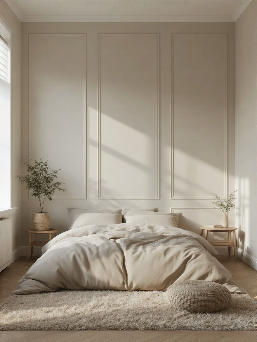
A common misconception is that “calm” must mean white or beige. But calm can be a deep, velvety blue that quiets the soul, or a soft sage green that connects you to the tranquility of a garden. These cool tones are known to lower the heart rate, physically preparing the body for rest. If you need a more uplifting energy, a touch of terracotta or a muted gold can bring the warmth of the sun into your space without being jarring. Thinking of the mood first prevents you from choosing a color that works against the very purpose of the room.
Please, do not choose your paint color in isolation. That’s just noise and will lead to a space that feels disconnected. Your walls are the backdrop, the unifying canvas for the beautiful things you already own. The best shortcut I can give you is to find your “anchor.”
Look around your room for an object you love. It might be the intricate pattern in a prayer rug, the warm wood grain of an antique chest, or a piece of calligraphy that speaks to you. Pull your colors from there. These objects already hold your story and your taste. By drawing a color from a textile or piece of art, you ensure harmony from the very start. It’s a trick that designers use constantly—we don’t invent a color palette, we uncover the one that is already there.
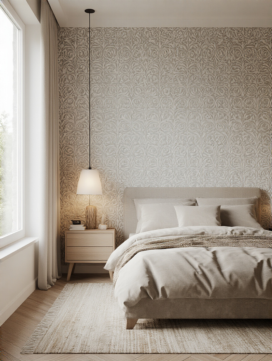
The finish of the paint is just as important as the color. This is the detail that adds quiet sophistication. So much of the world screams for attention with high gloss and shine, but in a sanctuary, subtlety is everything. A matte or eggshell finish is what I almost always recommend for bedroom walls.
A matte finish is like velvet. It absorbs light, which creates a sense of depth and tranquility. It’s incredibly forgiving, hiding minor imperfections on the wall and wrapping the room in a soft, quiet embrace. Eggshell has a barely-there sheen, just a whisper of light. It’s slightly more durable than matte, good for a family home, but still maintains that elegant, muted feel. The higher shines, like satin or semi-gloss, are best saved for trim and doors. They create a beautiful, subtle contrast, like the delicate inlay of mother-of-pearl against rich wood.
With a vision in mind, we now move to the practical steps that ensure our dream becomes a flawless reality. This is the bridge between idea and execution, and it demands patience and precision. These steps are non-negotiable for a result that honors your effort.
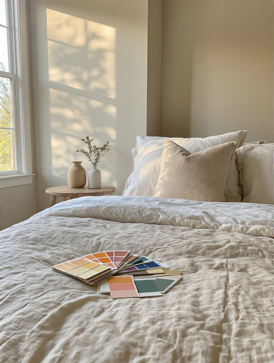
The tiny paint chip has failed us, so now we correct its mistake. You must see your chosen colors in a large format, living on the walls where they will stay. Either paint a large poster board or, better yet, paint a two-foot by two-foot square directly onto a couple of different walls in your room.
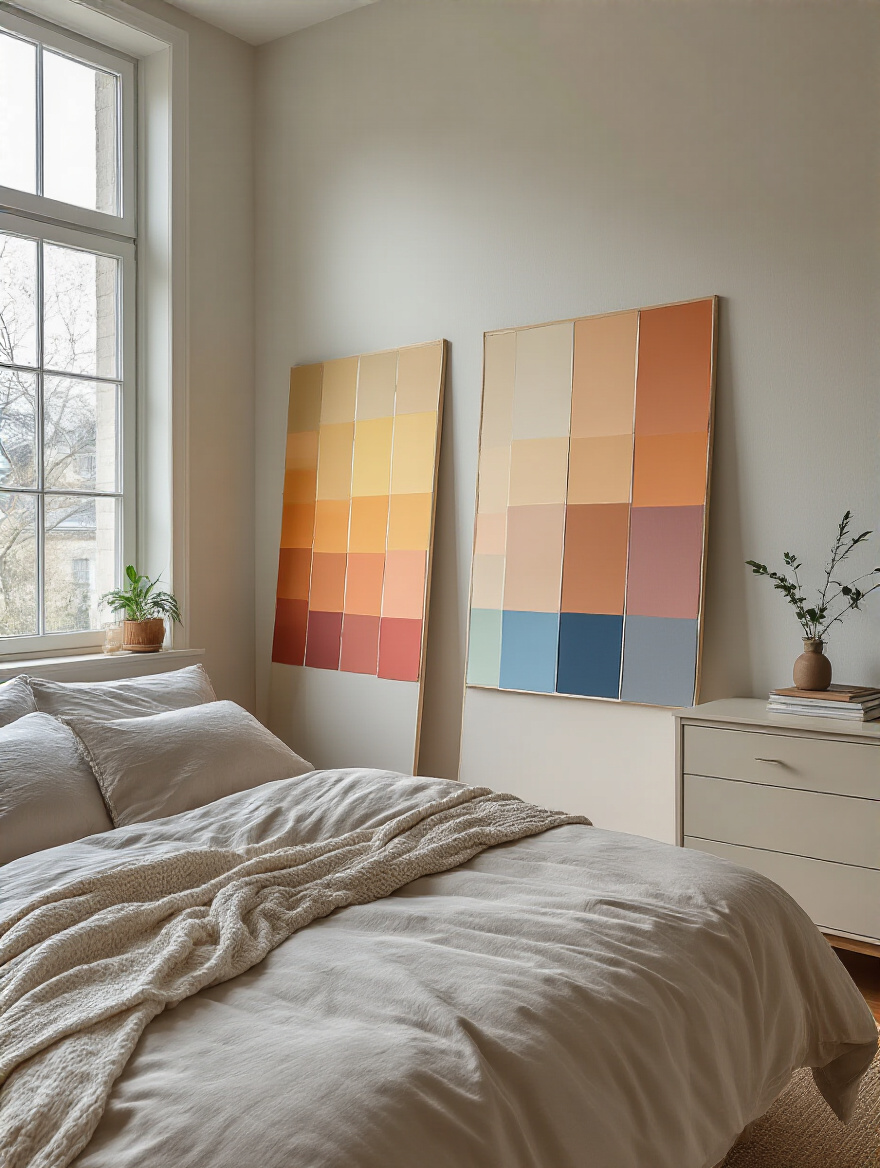
Live with these swatches for at least two days. See how they greet you in the soft light of Fajr and how they deepen as evening falls. Notice how the color on the wall with the window looks different from the color on the wall opposite it. This is how you truly get to know a color and avoid expensive surprises. It’s a slow courtship, not a hasty decision, and it’s the only way to ensure you’ll love the color every hour of every day.
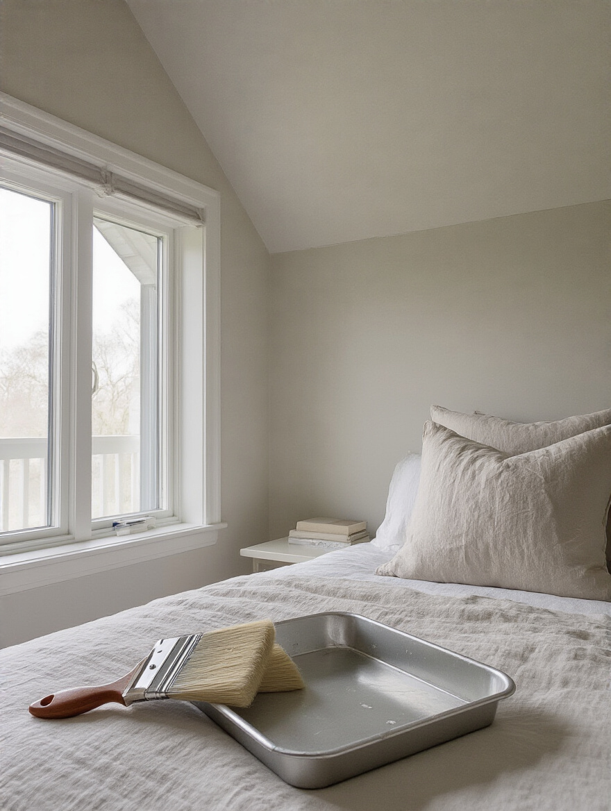
This part isn’t glamorous, but it is the foundation of true craftsmanship. To ignore wall preparation is to create beautiful art on a crumbling canvas. The paint simply won’t look or last as it should. Your reverence for the final outcome must begin with reverence for the preparation.
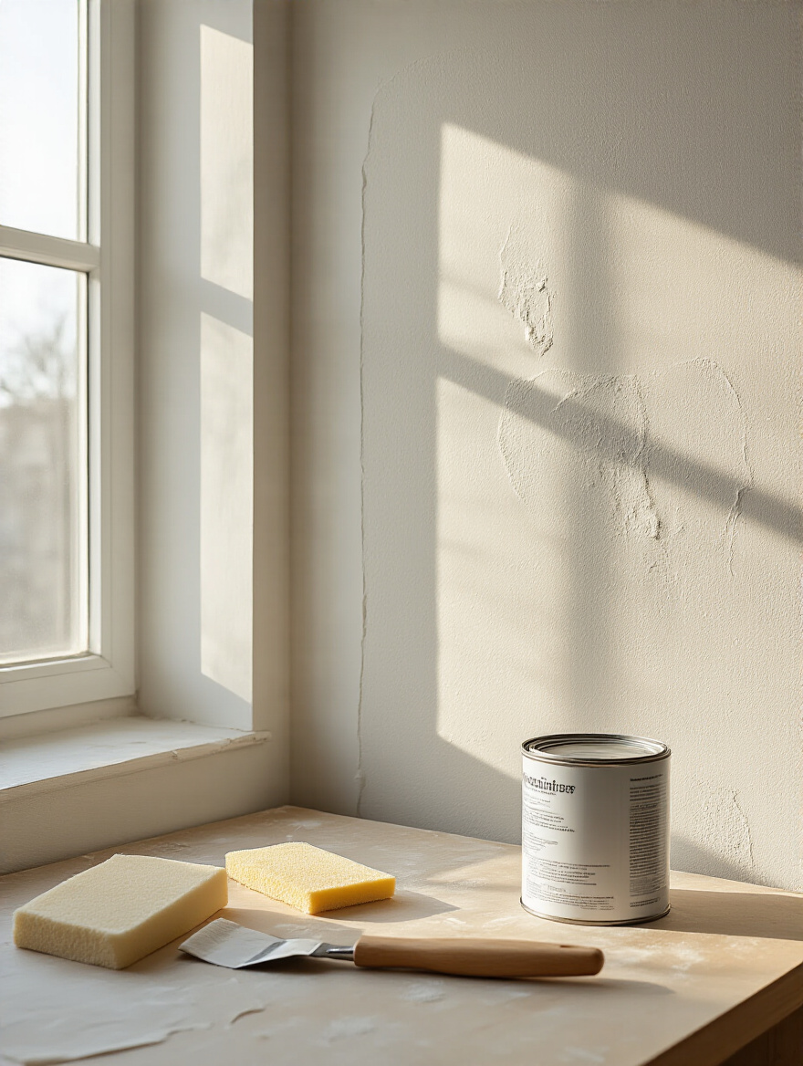
Wash your walls to remove any unseen dust or oils. Fill every tiny nail hole and smooth over any cracks. Sand these patches until they are seamless to the touch. And finally, prime. Primer is essential—it ensures the color you so carefully chose will be true and even, not distorted by the old color beneath. This process is an act of respect for your home and for the beautiful transformation to come.
Now we arrive at the heart of the matter: choosing the right colors and applying them with the care of an artisan. This is where we translate our foundational planning work into a living, breathing space that is both visually stunning and spiritually nourishing.
There are certain colors that have spoken to the human soul for millennia, and they are perfect for a place of rest. Blues, in their infinite variations, are profoundly calming. Think of the deep lapis lazuli of ancient mosques or the soft blue-grey of a misty morning. They create a sense of peace and protection.
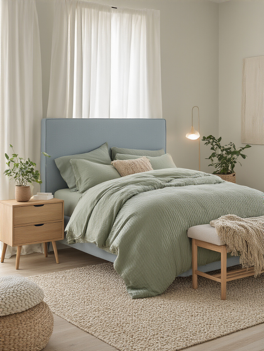
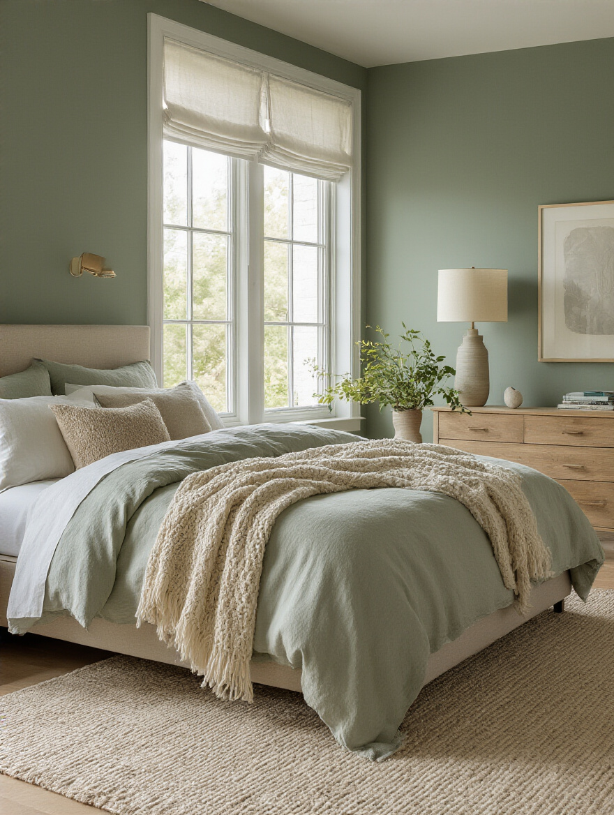
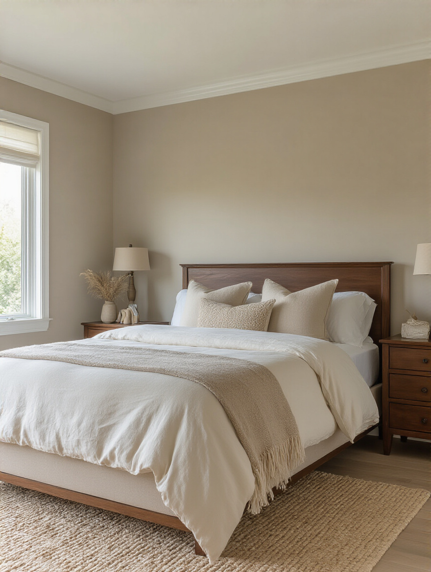
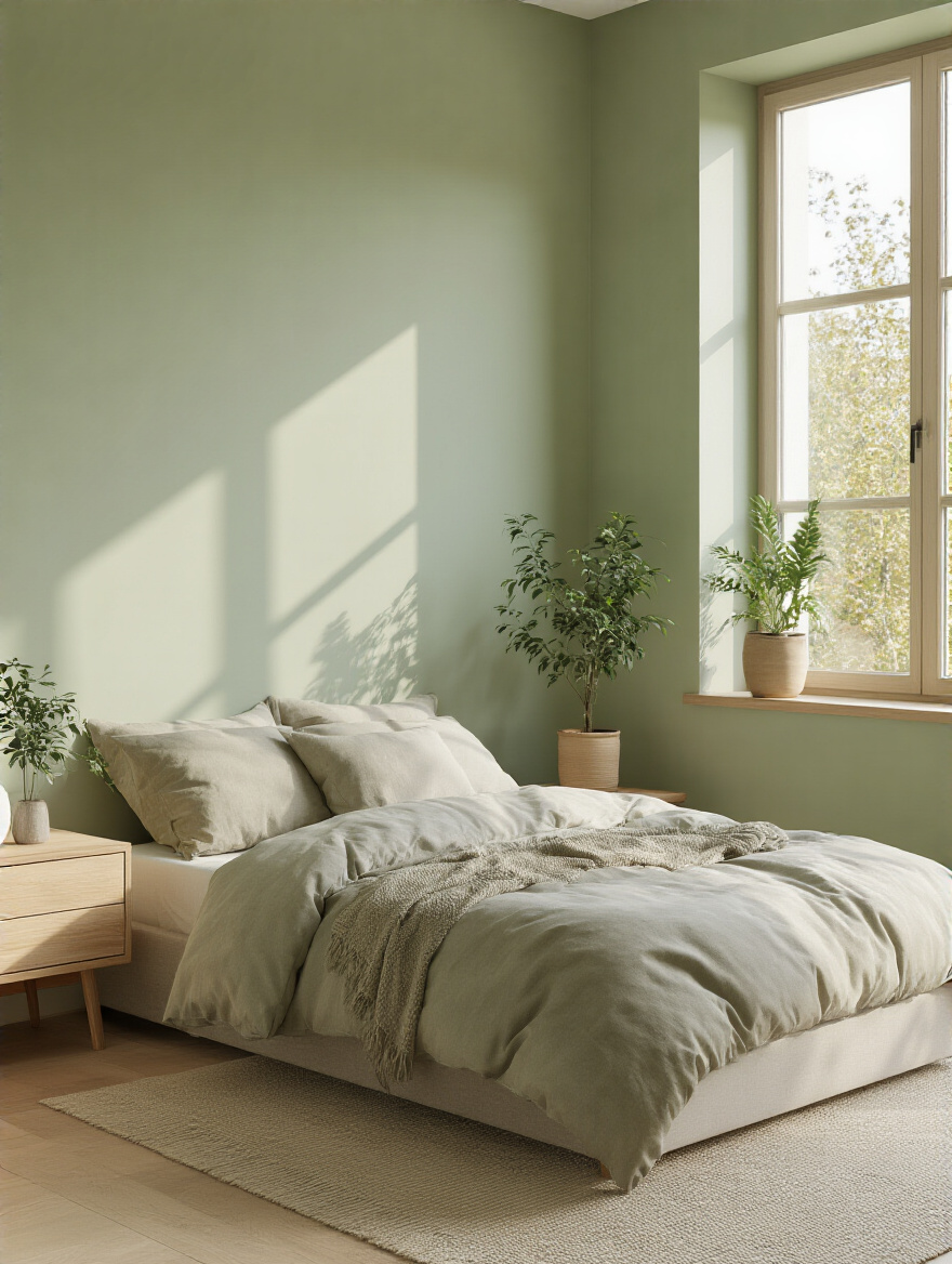
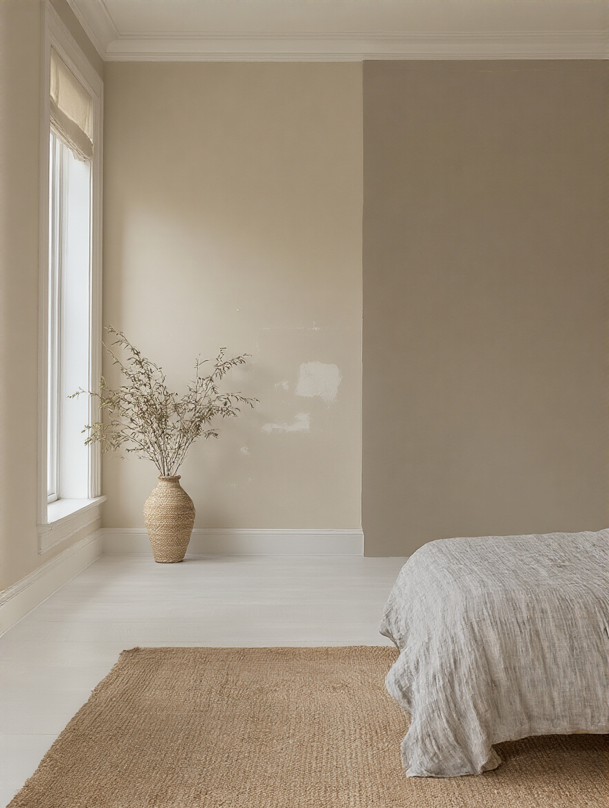
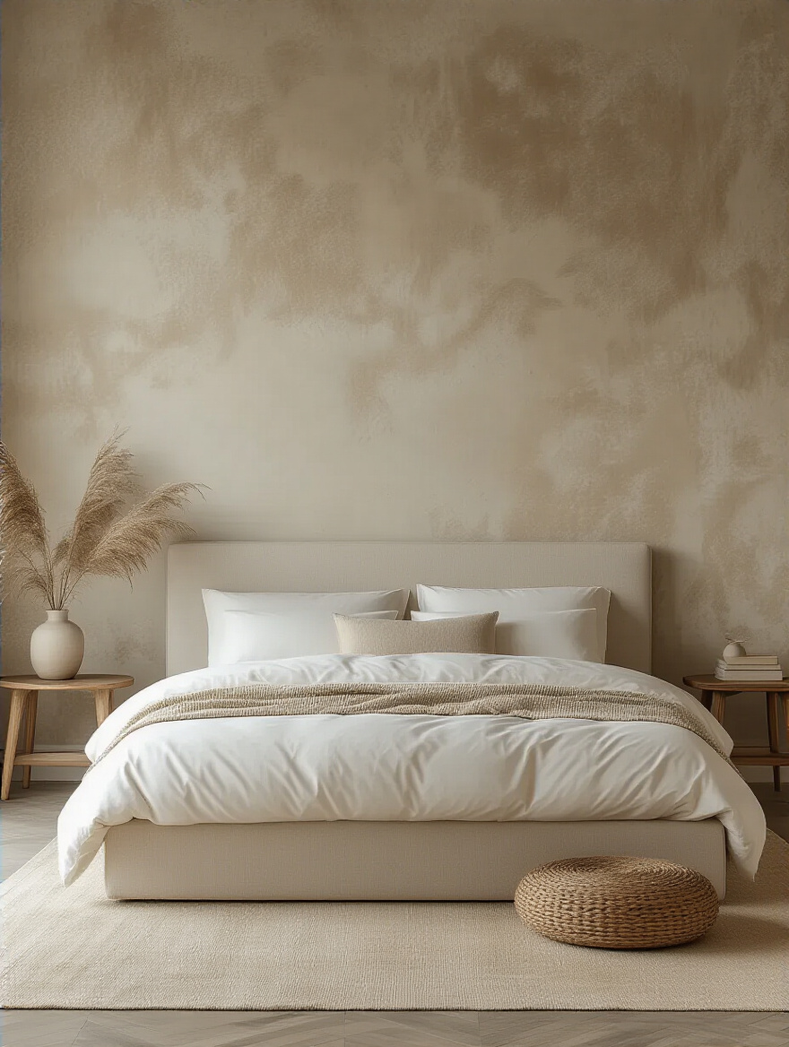
Greens connect us to nature, to the gardens of paradise described in the Qur’an. A soft sage, a muted olive, or a deep forest green can bring a sense of life and tranquility into your room. And of course, the neutrals—the warm whites, soft sands, and earthy clays. These colors are honest and grounding. They create a quiet, minimalist backdrop that allows for spiritual contemplation, free from distraction.
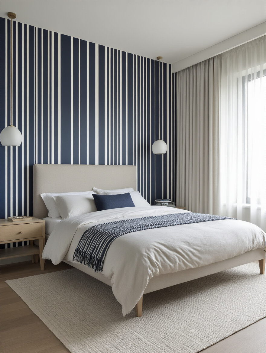
An accent wall can serve a beautiful purpose, much like a mihrab in a mosque that indicates the direction of prayer. It creates a powerful focal point. The wall behind your bed is the most natural place for this. It anchors the most important piece of furniture and gives the room a sense of considered design.
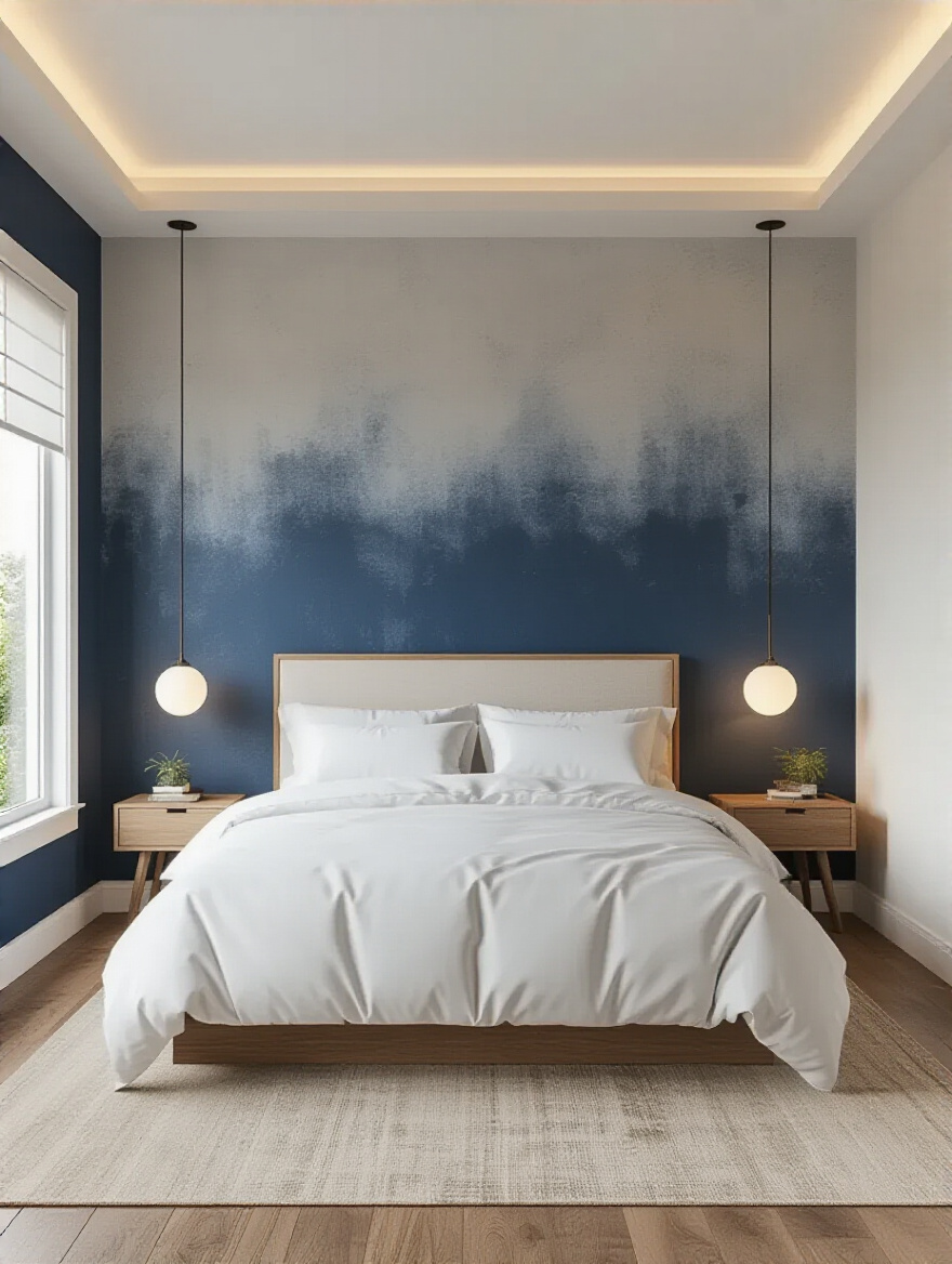
Don’t be afraid to use a deep, saturated color here. A rich indigo, a warm terracotta, or a dramatic charcoal can add incredible depth without overwhelming the entire space. It’s a way to be bold with intention. This single wall can carry the emotional weight of the room, allowing the other walls to remain serene and quiet, creating a beautiful balance.
The tools of a craft are sacred. Using a cheap, flimsy brush is a recipe for frustration and a sloppy finish. Invest in high-quality tools, and they will reward you with a beautiful result. A good angled brush for cutting in edges and a roller with the right nap (the thickness of the roller cover) are essential.
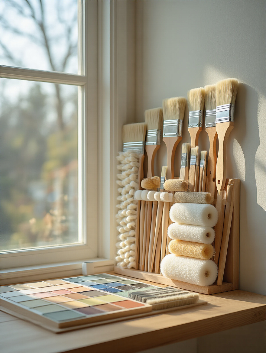
For smooth walls, you’ll want a roller with a short nap for a flawless finish. If your walls have a bit of texture, a slightly thicker nap will ensure the paint gets into all the tiny crevices. Think of your brush as a calligraphy pen—it needs to have a sharp, precise edge to create those clean lines where the wall meets the ceiling. This attention to detail shows care and elevates the entire project.
This is the skill that separates an amateur from a professional. “Cutting in” is painting the edges—along the ceiling, trim, and corners—freehand, without relying on tape. It may seem intimidating, but with practice, it’s faster and yields a much crisper line. The trick is to load your angled brush properly, with just enough paint, and use a steady, confident stroke.
Use the very tip of the brush bristles to draw the line. Don’t press too hard. Let the tool do the work. It takes patience, but the result is a seamless, professional finish that looks incredibly sharp and intentional. A perfectly crisp line is a small detail that makes a monumental difference in the final perception of quality.
We continue with the hands-on wisdom that ensures your vision is realized flawlessly. These final application details are what separate a good paint job from an exceptional one, guaranteeing beauty and longevity for years to come.
Patience is a virtue, especially in painting. The biggest mistake people make is trying to cover the wall in one thick, heavy coat. This leads to drips, an uneven texture, and a finish that never quite cures properly. The professional approach is to apply two, sometimes even three, thin and even coats.
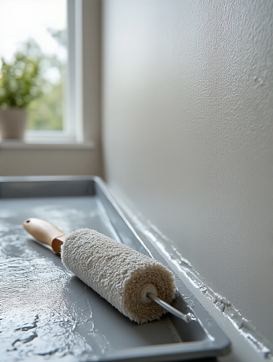
Each thin layer dries faster and harder, creating a more durable and beautiful finish. This layering process builds the color’s richness and depth. Allow each coat to dry completely before starting the next. It’s a meditative process, not a race. The final result will be a smooth, luminous wall that looks like it was dyed, not just coated, with color.
In Islamic tradition, we are taught to avoid wastefulness (israf). This principle applies beautifully to our homes. Calculating your paint needs accurately is not only practical but also an act of good stewardship. Running out of paint mid-project is a disaster, as different batches can have slight variations in color.
Measure your walls, subtract the area of the windows and doors, and consult the paint can for its coverage estimates. Always buy a little extra for touch-ups, but don’t overbuy needlessly. A little thoughtful mathematics at the beginning saves so much stress and waste later. And boxing your paint—mixing all gallons of the same color into one large container—ensures perfect consistency from start to finish.
Now, let us explore ways to use paint not just as a color, but as an architectural and artistic element. These techniques add layers of personality and sophistication, turning your walls into a deliberate work of art.
Stripes have a beautiful rhythm and order, much like the geometric patterns found in Islamic art. They can be used to subtly manipulate the feeling of a space. Vertical stripes draw the eye upward, giving an illusion of height and grandeur to a room with a low ceiling.
Horizontal stripes can make a narrow room feel wider and more expansive. You can be bold with high-contrast stripes or incredibly subtle with tone-on-tone stripes, where you use the same color in two different finishes (like a matte stripe next to a satin one). This creates a delicate, shimmering texture that only reveals itself as the light changes. It’s a beautifully understated way to add intricate detail.
An ombré or gradient wall is pure poetry. It is the soft transition of color you see in the sky at dawn or dusk. It’s an incredibly serene and dreamy effect for a bedroom, creating a wall that feels weightless and ethereal.
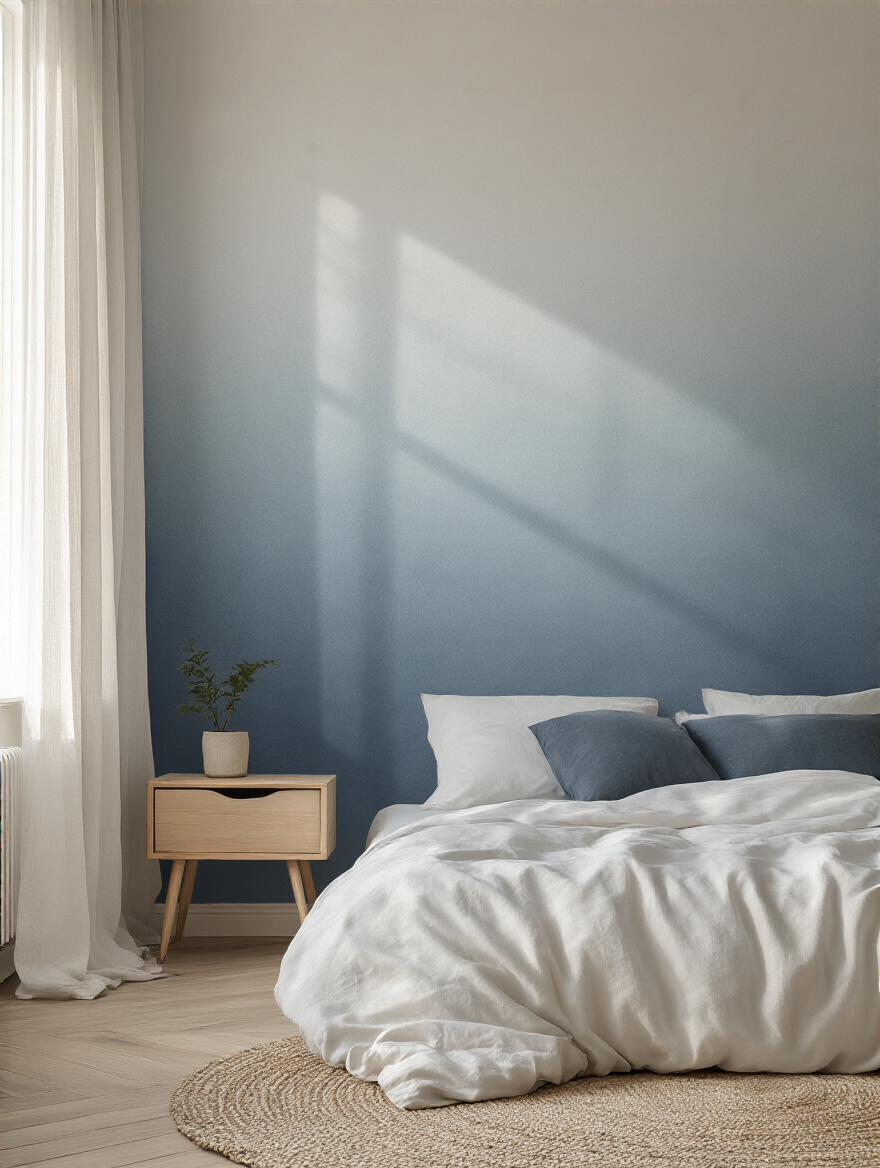
The key is to choose colors that are close to each other in tone and to blend them seamlessly while the paint is still wet. Fading a soft color up into an even lighter shade near the ceiling can make the room feel infinitely tall and open. It’s a more artistic approach, but the result is a truly unique space that feels gentle and deeply calming.
For those who love intricate detail, stenciling is a wonderful way to bring the spirit of Islamic art into a modern home without it feeling overwhelming. A simple geometric trellis pattern or a delicate arabesque design can be used to create a stunning accent wall behind the bed.
You can use a color just a shade or two darker than your base wall color for a subtle, textural effect, or a metallic paint like soft gold or pewter for a touch of quiet luxury. It allows for a level of personalization that wallpaper cannot offer, creating a space that is truly and uniquely yours.
So often the ceiling is forgotten—a flat, white expanse. But I call it the “fifth wall,” the heavens of the room. Painting the ceiling can completely change the atmosphere. A very simple and elegant technique is to take your wall color and have it mixed with about 50% white.
Painting this lighter tint on the ceiling creates a soft, cohesive glow. It makes the line between wall and ceiling disappear, lifting the room and making it feel more expansive. Alternatively, a very soft, pale blue on the ceiling can evoke the feeling of an open sky, which is wonderfully serene to wake up to.
We conclude our creative exploration with two powerful techniques that use simple lines and color blocking to define and refine the architecture of your room, adding a final layer of bespoke elegance.
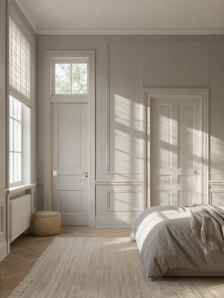
The trim and doors are the defining lines of your room’s geometry. How you treat them has a huge impact. The classic choice is crisp white trim against a colored wall. It’s timeless and architectural, outlining the structure of the space beautifully.
However, for a very modern and serene look, consider painting the trim and doors the exact same color as the walls. This creates an uninterrupted plane of color that is incredibly calming and sophisticated. It makes a small room feel larger because there are fewer lines to break up the space. The visual “noise” disappears, leaving only peace.
This technique has its roots in classical architecture and is a wonderfully grounding design choice. By painting the lower portion of the wall a darker or richer color and the upper portion a lighter one, you create a sense of stability and height. It’s like creating your own wainscoting with paint.
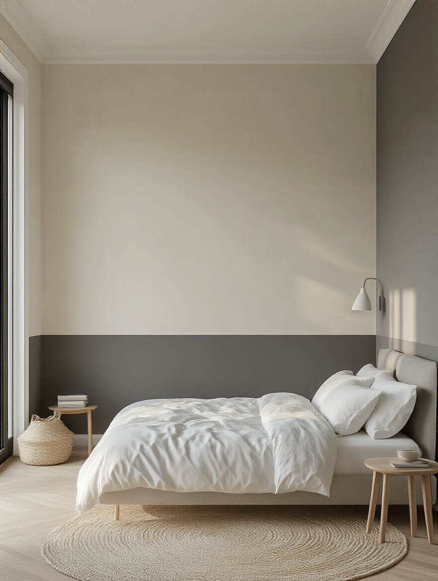
The horizontal line can create a visual anchor behind your bed or around the entire room. Typically, the divide looks best at about one-third or two-thirds of the way up the wall, rather than directly in the middle. This creates a pleasing proportion that adds a custom, sophisticated feel to the bedroom.
Our final thoughts turn to the health, function, and preservation of your beautiful new space. These are the considerations that ensure your sanctuary is not only beautiful today but remains a healthy and pristine haven for years to come.
The air we breathe in our bedroom, where we spend so much of our time, should be as pure as possible. Low-VOC or Zero-VOC (Volatile Organic Compounds) paints are a non-negotiable for me. These are paints made without the harsh chemical solvents that release harmful fumes into your home.
Choosing a healthier paint is an act of care for yourself and your family. The smell is minimal, and you can rest easy knowing you’ve created a space that is not only spiritually serene but also physically healthy. It is a choice that aligns the outer beauty of your room with the inner well-being of its inhabitants.
In many modern homes, a bedroom may also need to serve as a small workspace or a quiet reading corner. Paint is the most elegant way to define these zones without building walls. You can paint a nook a different color, or even paint a large rectangle of color on the wall to visually anchor a desk or a comfortable chair.
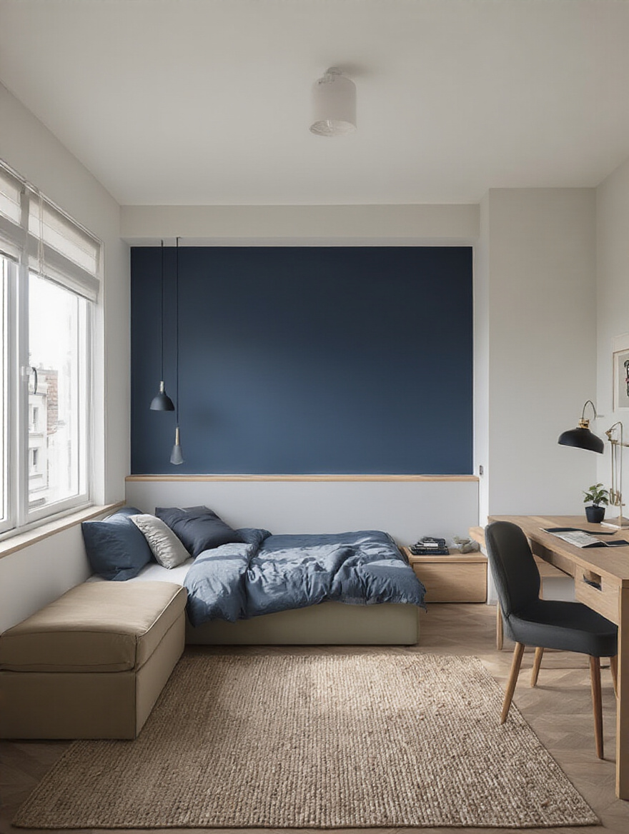
This use of color-blocking creates “rooms within a room.” It brings a sense of order and purpose to a multi-functional space, allowing you to transition mentally from one activity to the next. A soft green for a workspace can aid focus, while a deeper hue in the sleeping area can signal the mind that it is time to rest.
Life happens. Walls get scuffed and marked. The art of the invisible touch-up is essential for maintaining the pristine beauty of your room. Always save a small, well-sealed jar of your leftover paint for this very purpose.
When a scuff appears, clean the spot gently, and then use a tiny artist’s brush to dab a small amount of paint directly onto the imperfection. Feather the edges out slightly. A little care and attention can keep your walls looking freshly painted for years, preserving the feeling of a new, cherished sanctuary. This is an act of stewardship for the beauty you’ve created.
For a final touch of artistry or practicality, consider specialized coatings. If you desire a rich, textural wall, a lime wash or a plaster-effect paint can bring an old-world depth and movement to the space that regular paint cannot. These finishes interact with light in a beautifully organic way.
For a child’s bedroom or a high-traffic area, there are incredibly durable scuff-resistant paints that are almost completely washable. These modern formulations offer peace of mind, knowing that the walls can withstand daily life while still looking elegant. It is the perfect marriage of beauty and practical, modern living.
As you can see, painting your bedroom is so much more than a weekend project. It is an act of intention, an opportunity to craft a space that truly nourishes and restores you. By looking to the light, defining your desired mood, and applying these thoughtful techniques, you are not just changing a color; you are changing the entire spirit of your room.
Don’t be swayed by fleeting trends that will feel dated in a year. Instead, create a space that feels like a reflection of your own soul—a timeless sanctuary that offers you peace every time you walk through the door. The power to create this haven is in your hands, waiting on the end of a paintbrush. Embrace it with confidence, and build the refuge you deserve.