Physical Address
304 North Cardinal St.
Dorchester Center, MA 02124
Physical Address
304 North Cardinal St.
Dorchester Center, MA 02124
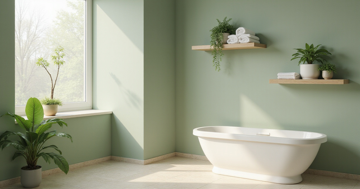
Discover the 18 best bathroom paint colors to transform your space into a dream oasis! From calming blues to dramatic jewel tones, find the perfect shade for your sanctuary.
Stepping into a bathroom should feel like entering a personal sanctuary—a place where you can wash away the day’s stress and reconnect with yourself. The quickest way to transform this essential space? Color! The right bathroom paint colors can dramatically shift the energy of the room, creating anything from a serene retreat to a vibrant personal statement.
As someone who’s spent years exploring how design influences our spiritual and emotional wellbeing, I’ve discovered that color is one of our most powerful tools for creating meaningful spaces. Whether you’re drawn to the geometric harmony of traditional Islamic patterns or the clean lines of contemporary design, your bathroom’s color palette sets the foundation for everything else.
White evokes feelings of cleanliness, purity, and tranquility—all essential elements for a spa-like atmosphere. It reflects light beautifully, making even the smallest bathrooms feel more spacious and airy. But contrary to what many believe, not all whites are created equal.
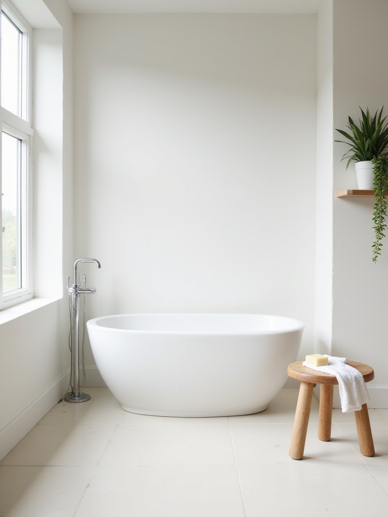
The secret lies in the undertones. Cool whites with blue or gray undertones create a crisp, modern feel, while warm whites with yellow or cream undertones bring a softer, more inviting atmosphere. For bathrooms with limited natural light, those warmer whites can prevent the space from feeling cold or sterile. Consider using a slightly textured finish to add subtle depth without sacrificing that clean aesthetic.
Here’s where it gets interesting—by layering different shades and textures of white, you can create a richly detailed space that never feels flat or boring. Try a slightly off-white for walls, bright white for trim, and incorporate white accessories with varying textures for a sophisticated monochromatic look.
Gray has emerged as the chameleon of bathroom paint colors, offering extraordinary versatility while maintaining a sophisticated edge. What makes gray so special is its ability to act as a neutral backdrop that allows other elements—fixtures, tiles, accessories—to truly shine. From light and airy to deep and dramatic, the gray spectrum offers endless possibilities.
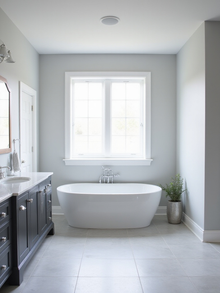
The key to choosing the right gray lies in understanding undertones. Some grays have warm undertones (yellow, brown, red) that create a cozy feeling, while others have cool undertones (blue, green) that feel more refreshing. Before committing, test your chosen gray under different lighting conditions—natural daylight, evening lamp light, and your bathroom’s specific lighting fixtures. You might be surprised how dramatically the color can shift!
The tricky part is getting the shade right for your space. For smaller bathrooms, lighter grays maximize light and create a sense of spaciousness. Larger bathrooms can handle deeper, more dramatic grays that create an enveloping sense of luxury. Remember—colors often appear darker on the wall than on a paint chip, so consider going one shade lighter than you initially planned.
Blue bathroom paint colors tap into something primal in our psyche—the vastness of sky and ocean. This psychological connection explains why blue consistently ranks as one of the most relaxing colors for bathrooms. The right shade of blue can lower blood pressure, slow breathing, and genuinely help you unwind after a hectic day.
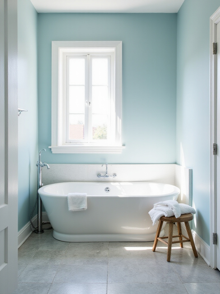
Different blues create distinctly different moods in your bathroom:
What complicates this is lighting—the same blue can look dramatically different depending on your bathroom’s exposure and lighting fixtures. Paint large swatches on different walls and observe them throughout the day before making your final decision. Consider incorporating natural elements like driftwood, pebbles, or shells to enhance that ocean-inspired tranquility.
Green stands as nature’s neutral—a color that simultaneously soothes and revitalizes. In bathroom design, green paint creates a bridge between indoor functionality and outdoor serenity. This connection to nature makes green especially powerful in creating bathrooms that feel like personal sanctuaries.
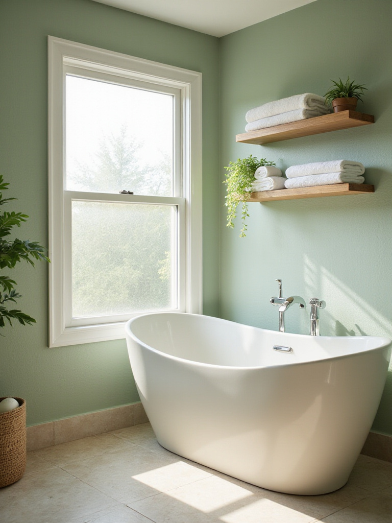
The green spectrum offers remarkable variety:
Let me paint you a picture of green’s unique advantage: it’s actually the easiest color for our eyes to process, which contributes significantly to its calming effect. This makes green bathroom paint colors particularly effective in creating spaces that help you transition from hectic activity to peaceful relaxation. For an authentic nature-inspired bathroom, incorporate live plants that thrive in humidity—ferns, snake plants, or orchids not only enhance the aesthetic but improve air quality.
Beige has been unfairly maligned as boring, but in bathroom design, it offers something invaluable—a warm embrace that feels both timeless and comforting. Unlike stark white or cool grays, warm beige creates an instantly inviting atmosphere that never feels clinical or cold.
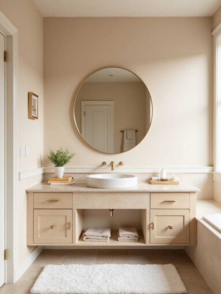
This versatile neutral works wonders in various bathroom types. In smaller spaces, its light reflective qualities help expand visual dimensions. In bathrooms with limited natural light, beige prevents that dreaded cave-like feeling. For traditional or transitional bathrooms, beige provides the perfect backdrop for classic fixtures and accents. When aiming for a spa-like atmosphere, its warmth contributes to that essential sense of relaxation and comfort.
The game-changer happened as I began pairing warm beige with natural elements. The combination of beige walls with wood vanities and woven textures creates a harmonious, organic feel that transcends trends. This earthy neutral—whose name derives from the French word for natural wool—serves as a foundation that allows other elements to shine while maintaining its own quiet beauty.
Soft pink brings an unexpected sense of tranquility to bathroom spaces. Far from being overly feminine or juvenile, the right shade of pink creates a nurturing cocoon that feels sophisticated and timeless. The psychological effects are remarkable—soft pink has been shown to lower heart rate and reduce stress, making it ideal for a space dedicated to self-care.
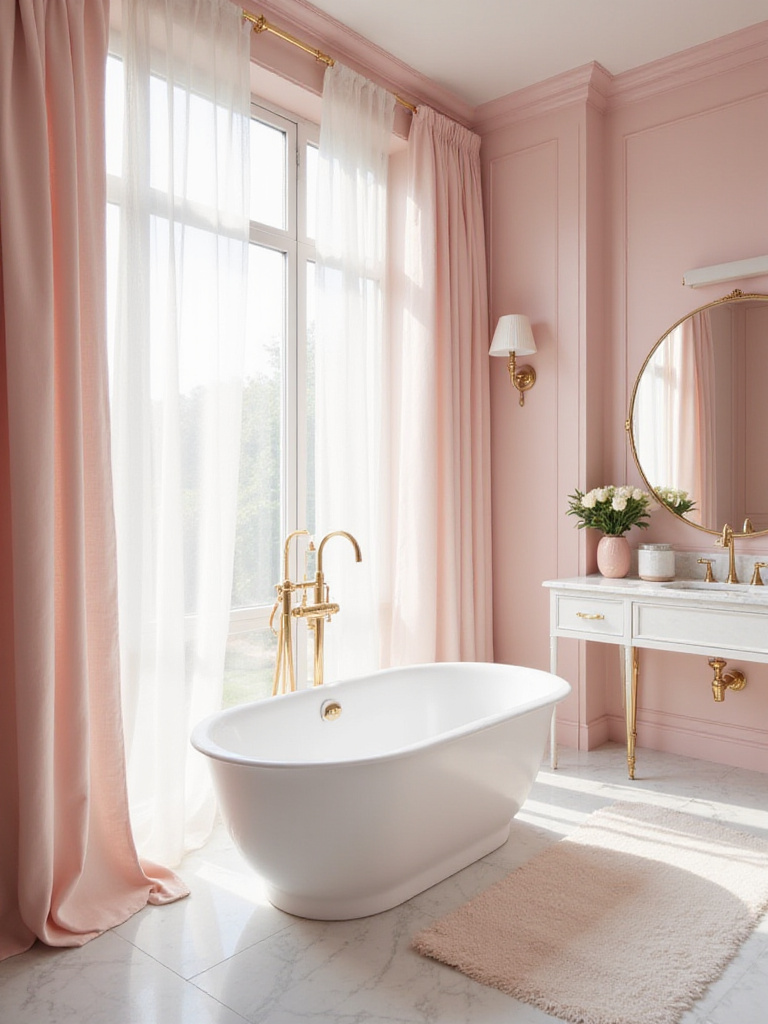
This gentle hue proves surprisingly versatile across design styles. In vintage or romantic bathrooms, it enhances the delicate, charming appeal. In modern and minimalist designs, it adds a necessary touch of softness that prevents the space from feeling stark. The most striking combinations pair soft pink with unexpected elements—gold or brass fixtures for luxury, natural wood for organic warmth, or even black accents for dramatic contrast.
Here’s what’s happening when you use soft pink in a bathroom—you’re creating a space that feels both refreshing and nurturing. It’s a color that encourages you to slow down and care for yourself. Interestingly, pink wasn’t always considered feminine; in the 18th century, it was often worn by boys as a lighter shade of red. This historical context reminds us that our color associations are fluid, and soft pink deserves consideration regardless of gender preferences.
Yellow bathroom paint colors work like sunshine in a bottle, infusing your morning routine with optimism and energy. This naturally uplifting color brightens spaces that might otherwise feel small or dark, reflecting light in a way that makes the room feel larger and more welcoming. For early risers, yellow creates the perfect energizing start to the day.
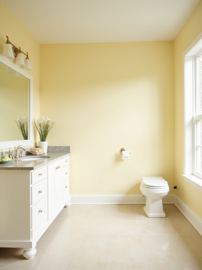
The key is choosing the right shade of yellow for your specific space:
My breakthrough came when I realized that yellow pairs beautifully with white fixtures and accents, creating a clean, airy feel that prevents the color from becoming overwhelming. This combination feels fresh rather than childish, sophisticated rather than simplistic. Yellow—the color most associated with happiness and optimism—deserves serious consideration for bathroom spaces where you begin and end your day.
Black in a bathroom? Absolutely! This daring choice creates spaces of unmatched sophistication and unexpected tranquility. While conventional wisdom might suggest avoiding dark colors in bathrooms, black can actually create a cocooning effect that feels luxurious rather than confining.
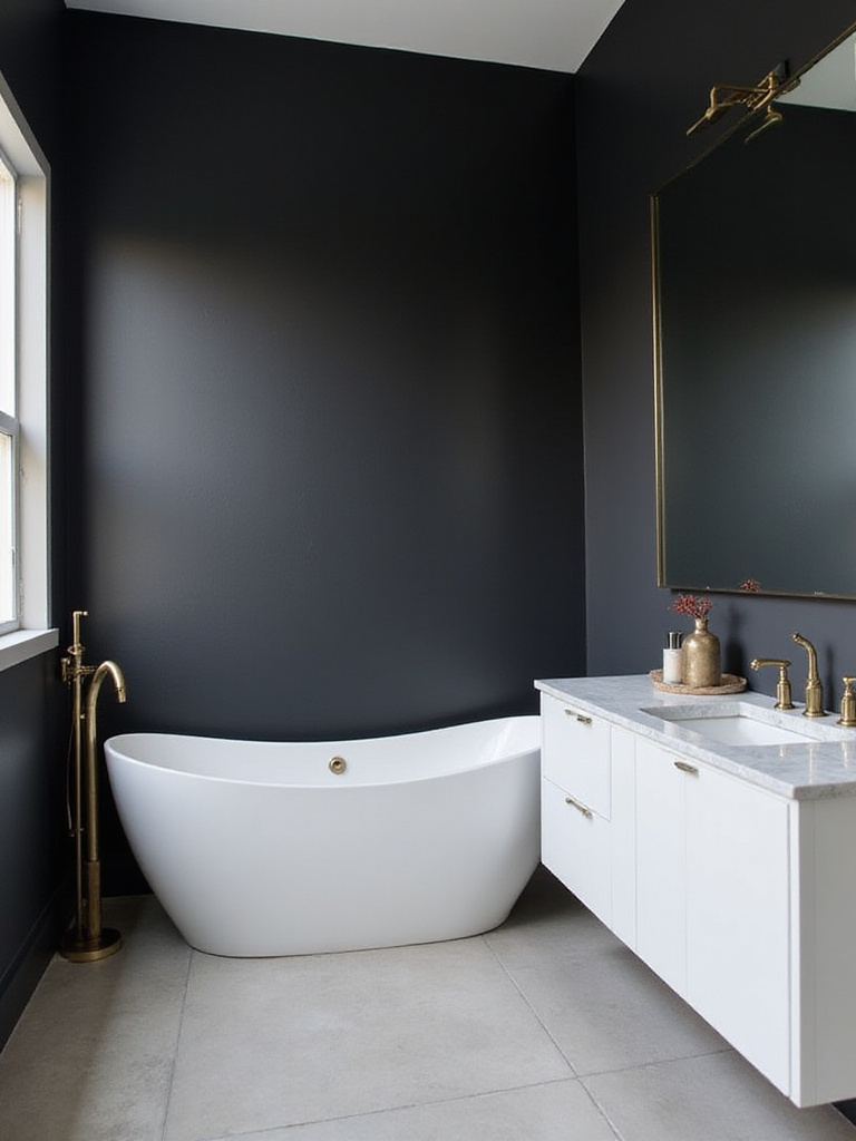
The catch is that black requires thoughtful implementation. Larger bathrooms with good natural or artificial light make ideal candidates. Powder rooms, which we typically use for shorter periods, also work beautifully with black walls, creating memorable spaces for guests. To prevent that dreaded cave-like feeling, counterbalance with bright, contrasting elements—white fixtures, light-colored flooring, and plenty of mirrors to reflect light throughout the space.
The missing piece is often in the finish—choose black paint with a slight sheen (satin or semi-gloss) rather than matte to help reflect light better. Consider painting only an accent wall or the lower half of walls if you’re hesitant about going completely dark. When done right, black bathroom paint colors create spaces that feel like exclusive spa retreats rather than ordinary bathrooms.
Navy blue brings the depth of black with a touch more approachability, creating bathrooms that feel both timeless and current. This sophisticated hue evokes the tranquility of deep waters while maintaining a classic elegance that transcends passing trends. Navy’s rich saturation adds luxurious drama without the heaviness that sometimes accompanies true black.
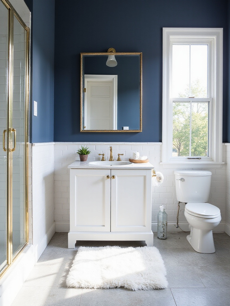
When working with navy blue bathroom paint colors, consider your space carefully. In smaller bathrooms, balance is crucial—pair navy with lighter fixtures, ample lighting, and reflective surfaces like mirrors and glossy tiles to offset the darkness. Pay attention to the undertones in your chosen navy; some lean toward gray while others might have hints of purple or green. These subtle variations make a significant difference in how the color interacts with your existing fixtures and materials.
It works something like this: navy walls create a sophisticated backdrop that makes white fixtures pop dramatically. The contrast creates a crisp, clean aesthetic that feels simultaneously classic and contemporary. For those drawn to nautical themes, navy provides the perfect foundation, but it’s equally at home in modern, transitional, or even traditional spaces when paired with appropriate accents.
Teal sits at the magical intersection of blue’s tranquility and green’s rejuvenation, creating bathroom spaces that feel simultaneously energizing and relaxing. This vibrant jewel tone brings undeniable personality to bathrooms, transforming ordinary spaces into expressions of individual style.
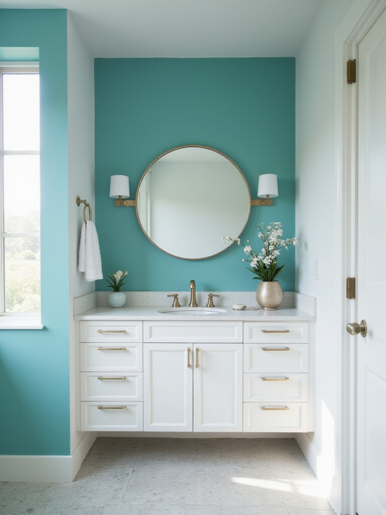
This versatile color complements various bathroom styles—from modern and eclectic to coastal and bohemian. Its depth works particularly well with natural wood elements, brushed gold fixtures, or crisp white accents for a balanced look. In smaller bathrooms, use teal strategically—perhaps on a single accent wall or vanity cabinet—to prevent overwhelming the space. Good lighting becomes essential to showcase teal’s complexity rather than letting it feel dark or heavy.
Here’s the unexpected twist: despite its boldness, teal creates remarkably serene bathrooms. Its association with both water and vegetation taps into primal connections with nature, explaining why people find it both sophisticated and soothing. Before committing to teal bathroom paint colors, test samples under various lighting conditions—teal’s appearance shifts dramatically from daylight to evening illumination.
Light blue has an almost magical ability to make bathroom walls recede visually, creating an enhanced sense of spaciousness. This optical illusion occurs because cool colors like light blue appear to retreat from the viewer, while warmer colors seem to advance. For smaller bathrooms or those with limited natural light, this quality makes light blue an ideal choice.
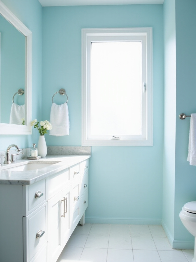
When selecting light blue bathroom paint colors, consider the undertones carefully:
The stumbling block is often finding the perfect shade that works throughout changing light conditions. Paint large swatches on different walls and observe them at various times of day before making your final decision. For maximum spaciousness, consider carrying the same light blue onto the ceiling—this blurs the boundaries between walls and ceiling, creating the illusion of endless space.
Light green brings the restorative power of nature indoors, creating bathroom spaces that feel inherently fresh and tranquil. These subtle hues—seafoam, mint, sage, and celery—mimic the gentlest tones found in natural landscapes, explaining their remarkable ability to reduce stress and promote wellbeing in bathroom environments.
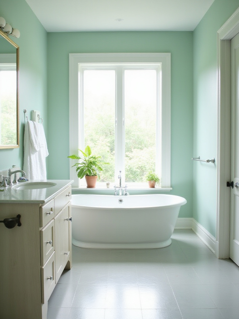
The beauty of light green lies in its adaptability. It pairs effortlessly with various design elements—natural wood for an earthy feel, white fixtures for crisp cleanliness, or even metallic accents for unexpected sophistication. Look for greens with slightly gray or blue undertones to enhance their calming effect and prevent the color from feeling too bright or stimulating. The goal is a muted, sophisticated green that whispers rather than shouts.
You might be wondering why green feels so instinctively right in bathrooms. Beyond its natural associations, green occupies the center of the visible spectrum, making it the easiest color for our eyes to process. This physical reality translates to psychological ease—precisely what we seek in spaces dedicated to personal care and relaxation. Light green bathroom paint colors create environments that feel like gentle exhales.
Greige—that perfect marriage of gray and beige—offers sophisticated neutrality without the starkness of pure gray or the potential yellowness of some beiges. This chameleon-like color adapts beautifully to changing light conditions and complements virtually any fixture finish or accent color you might choose for your bathroom.
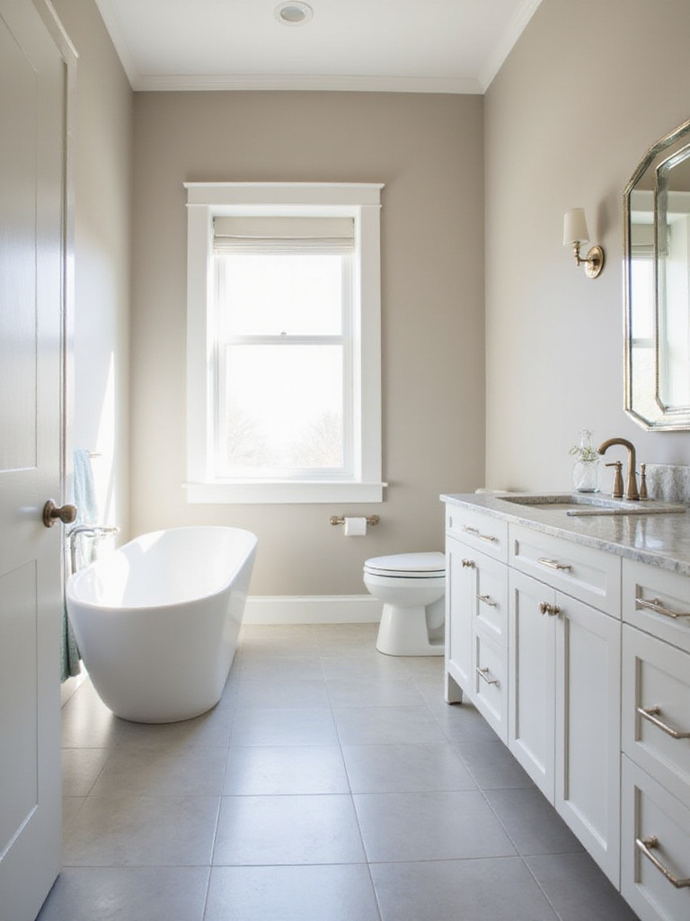
The crucial element is understanding undertones. Some greiges lean warmer with hints of brown or yellow, while others pull cooler with blue or green undertones. Your bathroom’s existing elements—tile, countertops, fixtures—will influence how the greige appears on your walls. Test several options under different lighting conditions before committing. Generally, cooler greiges work beautifully with warmer-toned tiles and fixtures, while warmer greiges balance cooler-toned elements.
Do you see how huge that is? Greige bathroom paint colors provide the perfect backdrop for nearly any design style—from farmhouse to modern minimalist, traditional to transitional. This adaptability explains why designers frequently turn to greige when creating timeless bathrooms that won’t feel dated in a few years. Since gaining popularity in the late 2000s as an alternative to stark grays, greige has proven its staying power as a sophisticated neutral that bridges warm and cool palettes.
Off-white brings all the brightness and cleanliness of white without the potential sterility. These subtle, warm-leaning neutrals create inviting bathroom environments that feel sophisticated rather than clinical. They’re particularly valuable in bathrooms with harsh lighting or northern exposure, where pure whites can appear cold and unwelcoming.
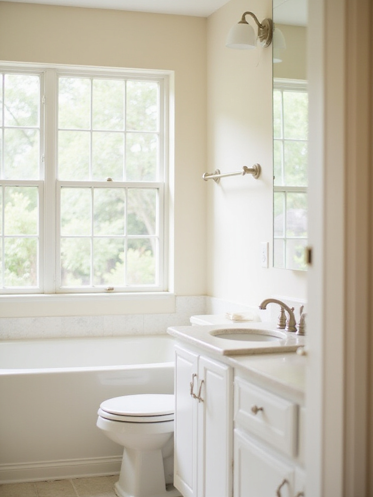
Popular off-white bathroom paint colors include options with subtle undertones of cream, beige, gray, or even the faintest hint of yellow. Benjamin Moore’s White Dove, Sherwin-Williams’ Alabaster, and Farrow & Ball’s Pointing exemplify this category. The perceived color shifts dramatically depending on lighting—north-facing bathrooms pull cooler tones, while south-facing spaces enhance warmth. This sensitivity to light means testing samples in your specific bathroom is essential.
My experience went like this: pairing soft off-white walls with natural wood accents (vanity, shelving, or mirror frame) creates a bathroom that feels simultaneously fresh and grounded. The combination avoids the coldness of stark white while maintaining that coveted sense of cleanliness and light. Off-whites also hide imperfections better than pure whites, making them more forgiving in older bathrooms or those with textured walls.
Pastel bathroom paint colors create spaces that feel like gentle daydreams—soft, light, and quietly uplifting. Their high light reflectance values bounce illumination throughout the room, making these colors particularly effective in smaller bathrooms or those with limited natural light. Unlike their more saturated counterparts, pastels lack visual weight, preventing the space from feeling cramped or enclosed.
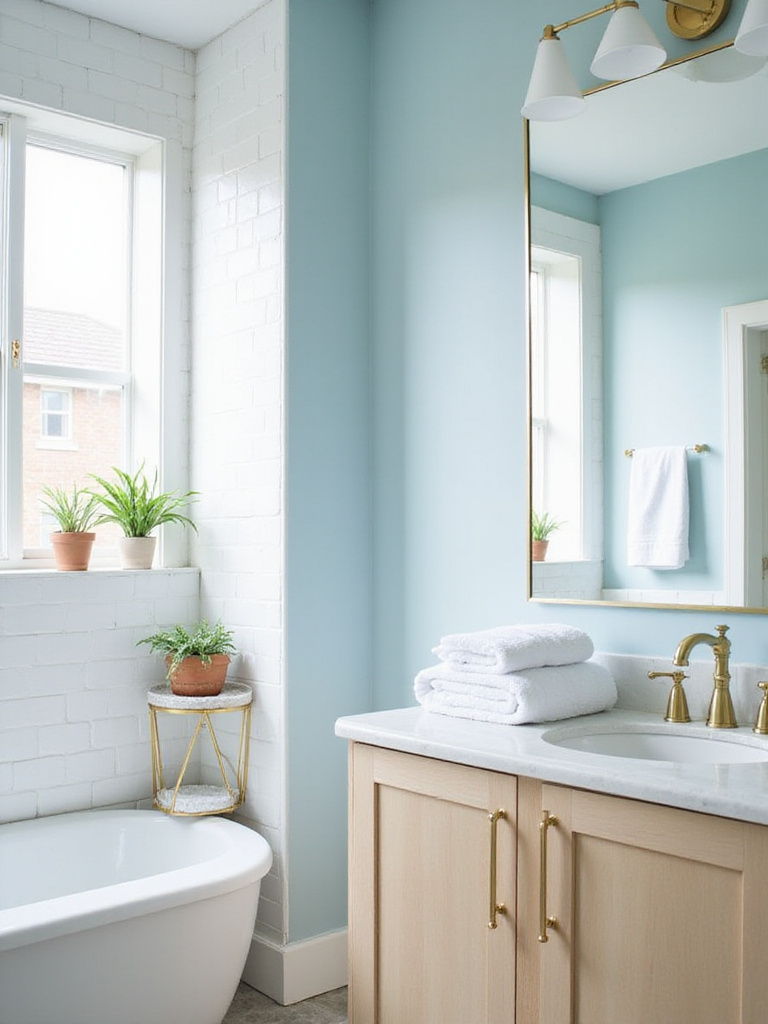
The pastel palette offers beautiful options for bathrooms:
What many people overlook is the sophisticated potential of pastels. By creating monochromatic schemes—layering different shades and tints of the same color—you can develop surprisingly complex and elegant bathroom designs. The term “pastel” comes from artists’ crayons made with pigments ground and mixed with binders to create soft, light colors. This artistic heritage reminds us that pastels can be used with intention and sophistication rather than appearing childish or dated.
Earthy bathroom paint colors connect us to the grounding elements of nature, creating spaces that feel inherently calming and authentic. This palette includes warm beiges, sandy tans, muted browns, calming greens (sage, olive, moss), and even dusty rose or terracotta shades. The key is choosing muted, slightly desaturated versions that evoke natural landscapes rather than bright, synthetic-feeling colors.
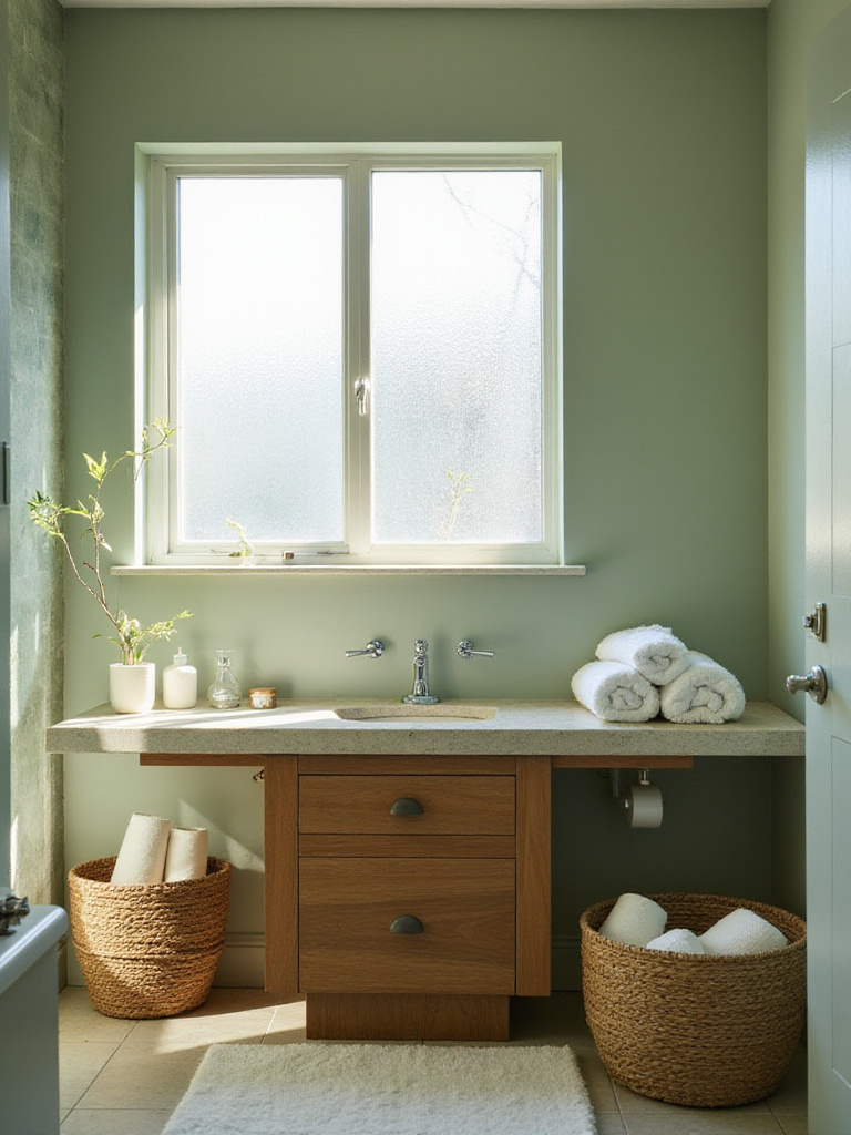
These nature-inspired hues offer practical advantages beyond their aesthetic appeal. They create a sense of warmth and relaxation ideal for bathroom environments. They work harmoniously with various design styles—from rustic and farmhouse to modern and minimalist. Perhaps most importantly, earthy tones have remarkable staying power, less likely to feel dated quickly compared to trendier color choices. They also hide imperfections and wear better than brighter, lighter colors—a practical consideration for high-use spaces like bathrooms.
The heart of the matter is that earthy bathroom paint colors connect us to something timeless and fundamental. The use of earth pigments dates back to prehistoric cave paintings, demonstrating humanity’s longstanding relationship with these colors. By bringing them into our most private spaces, we create environments that feel authentically human and deeply comforting.
Jewel-toned bathroom paint colors—emerald green, sapphire blue, amethyst purple, ruby red—transform ordinary bathrooms into opulent retreats. Unlike lighter, airier colors, these deep, saturated hues create a sense of enclosure and intimacy reminiscent of high-end spas and luxury hotels. Their inherent drama makes even modest bathrooms feel special and indulgent.
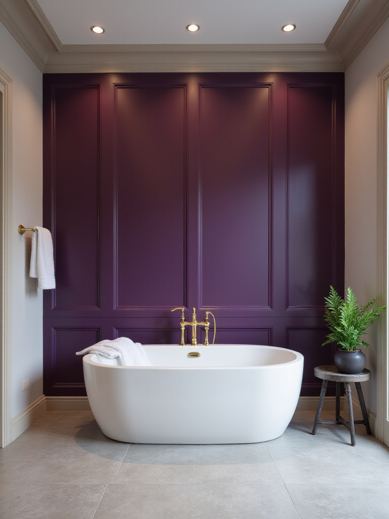
In bathrooms with limited natural light, jewel tones require careful handling. Opt for lighter, more reflective variations like teal blue or lighter amethyst rather than the deepest shades. Consider paint with higher sheen (satin or semi-gloss) to maximize light reflection. Strategic lighting becomes essential—layer recessed lights, sconces, and vanity lights to brighten the space and showcase the color’s richness. Without adequate lighting, even the most beautiful jewel tone can make a bathroom feel smaller and darker.
Let that sink in for a moment—historically, jewel tones were associated with royalty and opulence because the pigments were rare and expensive. By incorporating these colors into your bathroom, you’re connecting with a rich design heritage that signifies luxury and sophistication. For a truly stunning effect, paint your bathroom vanity in a deep emerald green and pair it with brass hardware for a touch of glamour that transforms daily routines into indulgent rituals.
Not ready to commit your entire bathroom to a bold color? An accent wall offers the perfect compromise—dramatic impact without overwhelming the space. This approach allows you to incorporate vibrant or deep colors that might be too intense for an entire room while creating a focal point that draws the eye and adds personality.
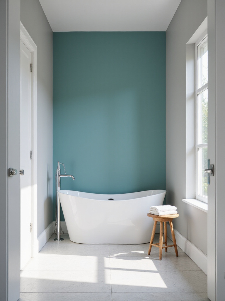
The best wall for an accent color is typically the one that naturally draws attention when entering the bathroom. This might be the wall behind the vanity mirror, the wall opposite the door, or one that highlights a key architectural feature like a window or alcove. Avoid walls that are already visually busy with multiple doors or windows—the goal is a relatively uninterrupted surface that showcases the color effectively. The chosen color should contrast with but complement your primary bathroom color, creating harmonious tension rather than visual discord.
The breakthrough came when I realized accent walls work particularly well behind bathtubs, creating a colorful backdrop for this focal point of relaxation. This strategic placement transforms your bathing experience into something special—a moment of color-enhanced tranquility. Before painting, thoroughly clean and prime the wall to ensure proper adhesion and a smooth finish that showcases your chosen color at its best.
Choosing bathroom paint colors transcends mere decoration—it’s about creating a space that nurtures your wellbeing and elevates daily rituals into moments of self-care. Whether you’re drawn to the serene tranquility of whites and blues, the energizing vibrancy of yellows and teals, or the luxurious depth of jewel tones, your color choice shapes how you experience this intimate space.
As you consider these options, remember that color is deeply personal. The perfect bathroom color is one that resonates with you, complements your existing fixtures, and creates the atmosphere you desire—whether that’s energizing, calming, or somewhere in between. Don’t be afraid to test several options, observe them in different lighting conditions, and trust your intuitive response.
Your bathroom is more than a functional space—it’s a personal sanctuary where you begin and end each day. The right color transforms it from ordinary to extraordinary, creating a haven of peace and rejuvenation right in your own home. So grab those paint samples, embrace your creativity, and prepare to transform your bathroom into the oasis you deserve.