Physical Address
304 North Cardinal St.
Dorchester Center, MA 02124
Physical Address
304 North Cardinal St.
Dorchester Center, MA 02124
Explore 20 harmonious kitchen cabinet color ideas for multi-generational homes. Sarah's expert guide blends cultural wisdom with practical design for lasting family harmony.
Since the beginning of settled life, color in our homes has done more than just decorate; it has spoken of our identity, our beliefs, and the harmony we seek in our shared spaces. From the deliberate palettes that defined ancestral dwellings to the nuanced selections guided by Eastern philosophies like Feng Shui, color has long been understood as a quiet but powerful force. Today, as our families beautifully blend generations and heritage under one roof, choosing from the vast world of kitchen cabinet color ideas becomes less about passing trends and more about creating a true family sanctuary.
The most soulful multi-generational kitchens I have designed always understand this dual purpose: a color must please the eye, certainly, but it must also foster a deep sense of belonging and reflect the wisdom of those who gather there. This thinking lifts our choices out of the cycle of what’s fashionable and into the realm of the timeless. As a designer who works at the intersection of cultural integration and practical family living, I believe the true art of kitchen design lies in this balance. These 20 principles will guide you, moving from the foundational meaning of color to its tactile expression, its effect on space, and finally, its ability to create an enduring legacy.
The soul of a multi-generational kitchen is woven from the stories and traditions of the family it serves. Before we ever pick up a paint chip, we must start here, with the colors that hold meaning. This is about selecting kitchen cabinet color ideas that honor heritage and create an environment of natural, easy balance.
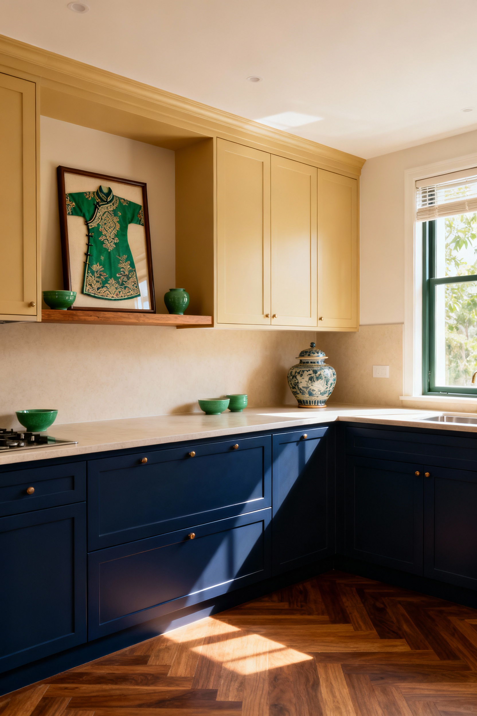
Color is never neutral; it’s a language rich with cultural meaning and memory. A vibrant red may signify celebration and prosperity in an East Asian context, while a deep, calming blue might evoke tranquility and stability in a home with Scandinavian roots. The first step is to listen to these stories. In my multi-generational home expert practice, I often begin by simply asking families about the colors of their childhood homes or the hues present in meaningful celebrations. This isn’t just about aesthetics; it’s about embedding the space with a sense of identity that resonates across generations.
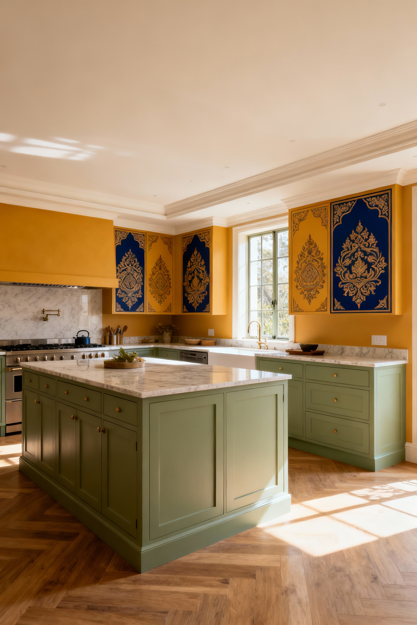
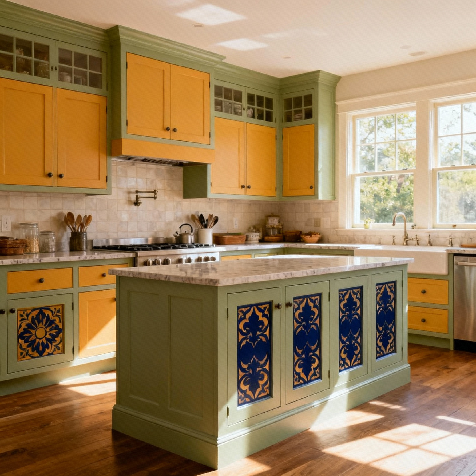
When you integrate these hues, the kitchen becomes more than a room—it becomes a testament to your family’s journey. This might mean choosing a warm, terracotta hue for a lower bank of cabinets that echoes Mediterranean heritage, or incorporating a serene jade green as an accent that speaks to a prized family heirloom. This approach ensures the kitchen feels inherently welcoming, a space where every family member feels seen and celebrated in the visual narrative of their home.
Moving from cultural stories to energetic harmony, we can look to principles like Feng Shui. At its core, this practice is about balancing the five elements—Wood, Fire, Earth, Metal, and Water—to cultivate positive energy, or Qi. Your kitchen is a powerful hub of Fire (the stove) and Water (the sink), and your cabinet colors can be the key to bringing the other elements into balance.
For example, introducing Earth tones—like soft clays, taupes, or warm sand colors—on your cabinetry can provide a grounding, stabilizing energy that nurtures the family. Green, the color of the Wood element, fosters creativity and vitality, a wonderful energy for a space of nourishment. By thoughtfully choosing kitchen cabinet color ideas that represent these elements, you’re doing more than decorating; you are consciously creating a space that supports the well-being and prosperity of everyone in the household.
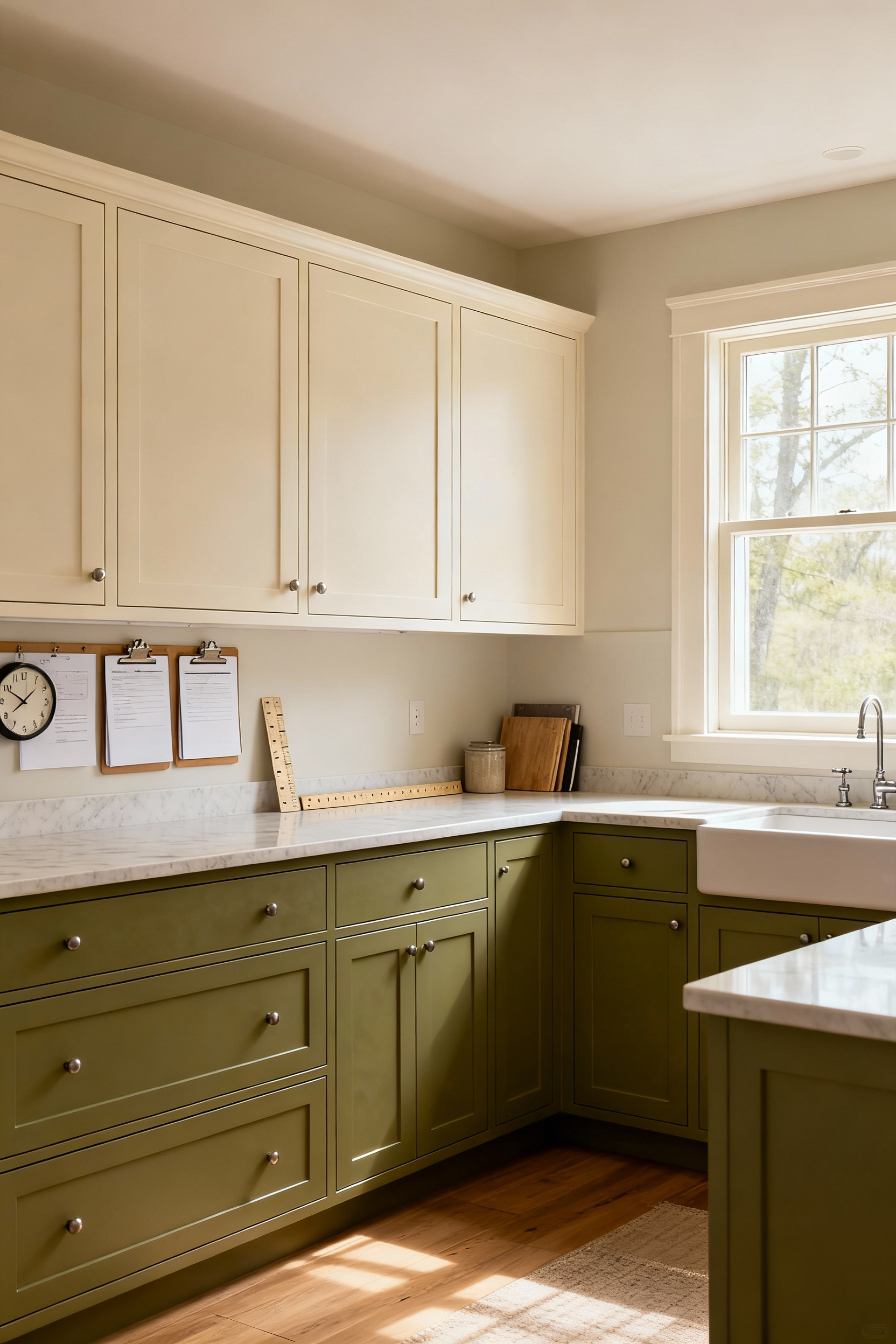
A kitchen that serves multiple generations should visually tell their collective story. This means crafting a palette that feels both historic and current, weaving together the tastes of different eras into a cohesive whole. It can be a delicate dance, but the result is a space with incredible depth and character. I’ve found this works best when a “bridging color”—often a timeless, sophisticated neutral—is used as the main cabinet color.
Think of an elegant off-white or a deep, soft charcoal as your foundation. Then, you can introduce other colors in specific zones. Perhaps a display hutch holding grandmother’s china is painted in a heritage blue, while a vibrant, playful color is used inside the pantry where grandchildren find their snacks. This layering allows the space to honor everyone’s story, creating a visual history book that fosters respect and a powerful sense of continuity.
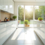
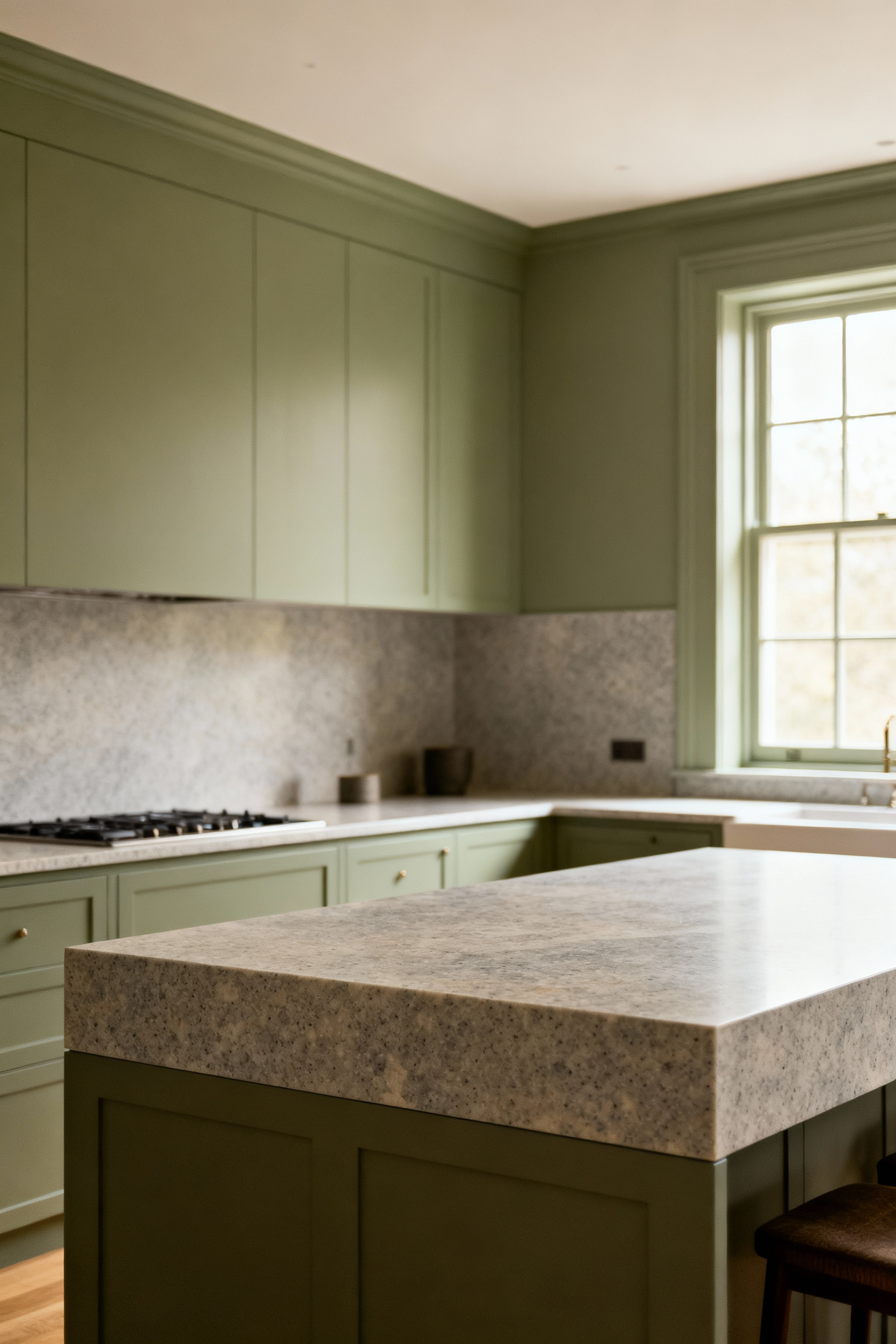
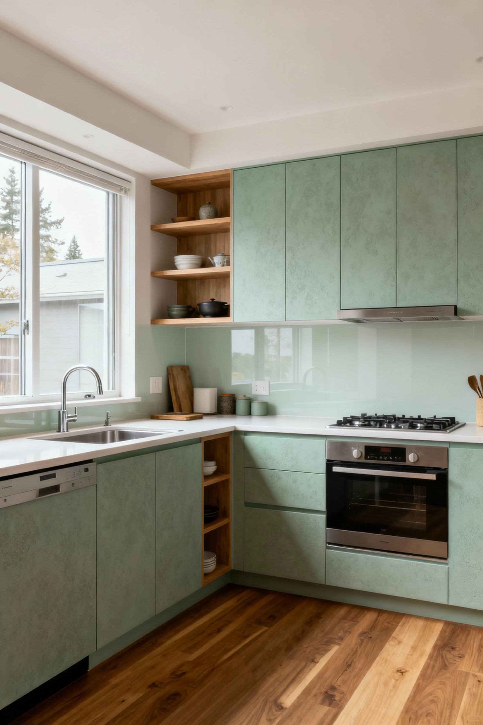
There is an unmatched grace in a palette of ethereal neutrals. Earth tones and the perfect, pure white—what designers sometimes call bianchissimo—offer a quiet strength that outlasts any trend. These colors are the ultimate foundation for a multi-generational home because of their incredible versatility and timeless appeal. They create a serene backdrop that can gracefully evolve with the family.
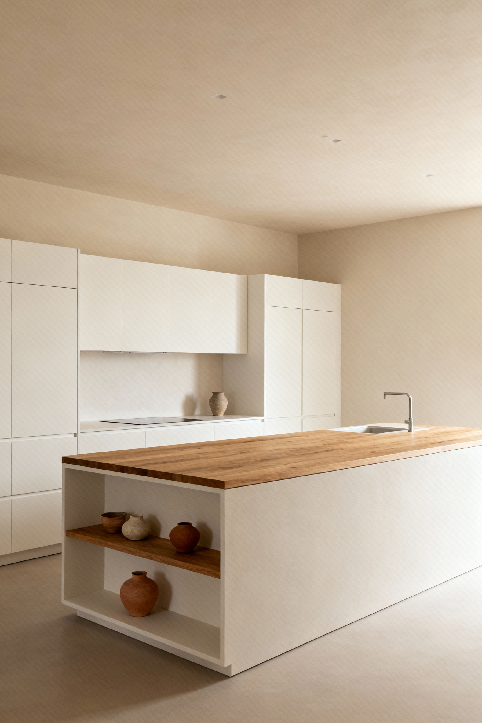
An earthy palette of terracotta, ochre, soft clay, or warm grey connects the home to nature, providing a sense of grounding and stability. A pure white, on the other hand, maximizes light and creates a feeling of clean, open possibility. By using these as your core kitchen cabinet color ideas, you allow other elements—a vibrant piece of art, a collection of colorful pottery, the changing seasons outside your window—to take center stage. This is a choice for longevity, ensuring your kitchen remains a place of calm and beauty for decades to come.
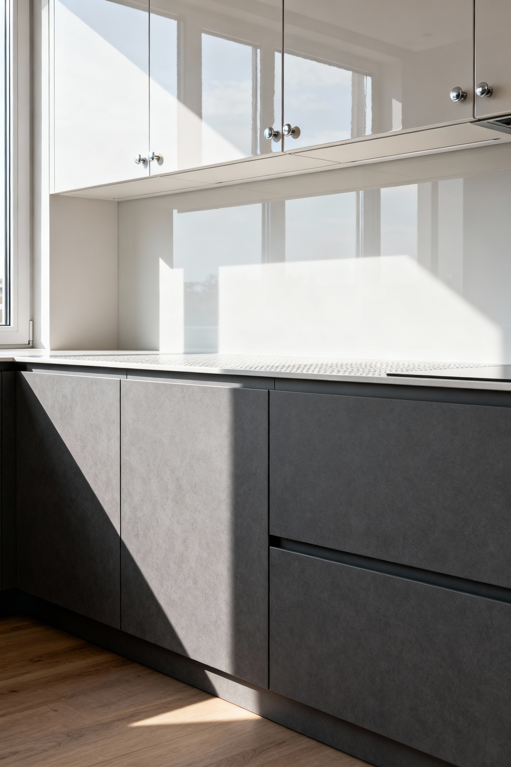
Beyond the hue itself, the intensity—or saturation—of a color plays a critical role in shaping the kitchen’s atmosphere. A highly saturated, vibrant color brings energy and excitement, while a desaturated, muted tone fosters calm and tranquility. In a bustling home with many people, understanding this can be the key to creating emotional balance.
In my professional experience with creating flexible spaces, I often use saturation to define zones without building walls. For example, a deeply saturated navy blue on a central island can create an energetic hub for cooking and conversation, signaling it’s a place of activity. Meanwhile, the perimeter cabinets might be finished in a much softer, desaturated grey-blue, providing a visual sense of calm and openness. This careful modulation prevents a space from feeling either too chaotic or too sterile, allowing it to support both lively family gatherings and quiet moments of solitude.
Once the foundational colors are chosen, their story is told through finish and texture. The way a surface feels, how it catches the light, and how it ages over time are all part of the narrative. This is where we master the art of turning a simple color into a rich, sensory experience.
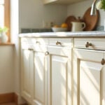
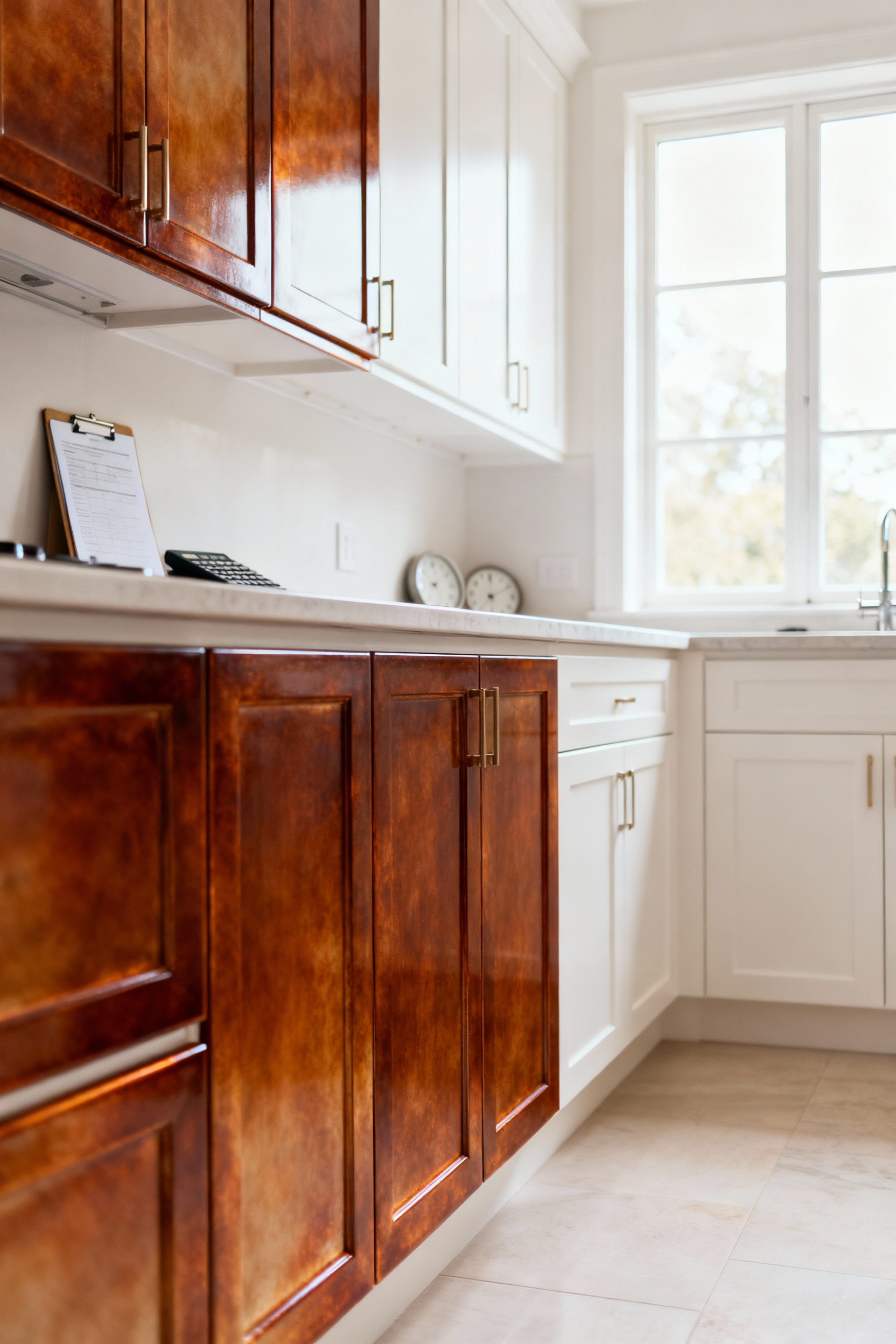
Natural wood cabinets carry a sense of history and warmth that is almost primal. A stain is a conversation with the wood; it enhances the grain, celebrating the material’s unique character and history. It speaks of authenticity and tradition. Paint, in contrast, is a declaration. It offers an opaque veil that provides uniform color, allowing for a bold, modern statement or a historically precise hue.
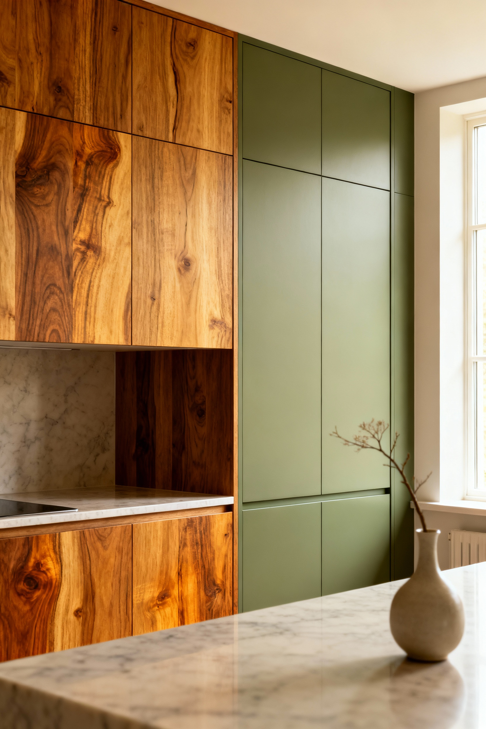
Neither is better, but they serve different purposes. I learned this when working with a family who wanted to incorporate a cherished antique dining table into their new kitchen. We chose a stain for the cabinets that picked up the warm tones of the heirloom piece, creating a beautiful dialogue between old and new. For another project, a family wanted a clean, bright space for their children with severe allergies, so we chose a durable, zero-VOC paint in a cheerful white, which provided a non-porous surface that was easy to keep pristine. The choice between them depends entirely on the story your family wants to tell.
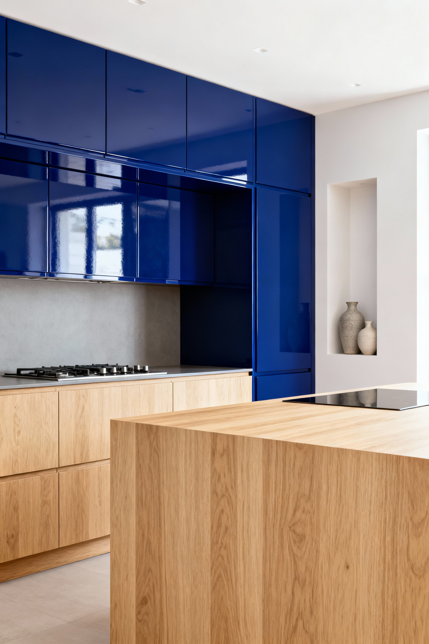
For a more contemporary or high-impact aesthetic, lacquer and laminate offer incredible performance. Lacquer provides a depth and smoothness that paint can’t quite replicate. Applied in multiple layers, its seamless finish can feel incredibly luxurious and is wonderful for reflecting light in smaller kitchens. It creates a polished, refined look that speaks of modern elegance.
Laminate, on the other hand, is the quiet workhorse. Modern laminates are a world away from their ancestors, offering stunningly realistic textures and an almost indestructible surface. I’ve used matte, fingerprint-resistant laminates in deep charcoal for families with young children, and it has been a game-changer. It offers a sophisticated, uniform look while standing up to the beautiful chaos of family life, making it a truly practical choice for a high-traffic hub.
The finish on your cabinets choreographs the light in your kitchen, and this simple choice can dramatically alter the feel of the space. A gloss finish is like a mirror—it bounces light around the room, making a space feel larger, brighter, and more energetic. It’s a wonderful tool for small or dark kitchens, instantly creating a sense of expansiveness.
A matte finish, however, absorbs light. It creates a soft, velvety surface that feels calm, sophisticated, and understated. I love using matte finishes in large, open-plan kitchens to create a sense of intimacy and warmth, preventing the space from feeling cavernous. Matte surfaces are also incredibly forgiving of fingerprints and smudges, making them an excellent choice for darker kitchen cabinet color ideas in a busy family home. The decision between them is about whether you want your kitchen to feel vibrant and expansive or serene and grounded.
Glazing is an artisan technique that adds a layer of history and character to new cabinets. A glaze is a semi-transparent layer of color applied over a base coat and then partially wiped away. It settles into the crevices and corners of the cabinet doors, accentuating their details and creating a subtle, multi-tonal effect. It’s a way of giving a brand-new kitchen a sense of gentle age and timeless quality.
A dark glaze over a light paint can give cabinets an heirloom feel, which is perfect for integrating a new kitchen into an older home. A light glaze over a dark stain can soften the look, adding a whisper of luminosity. Because a glazed finish has inherent variations, it’s remarkably forgiving of the minor nicks and scratches that happen in a well-loved kitchen, making it both beautiful and practical for family life.
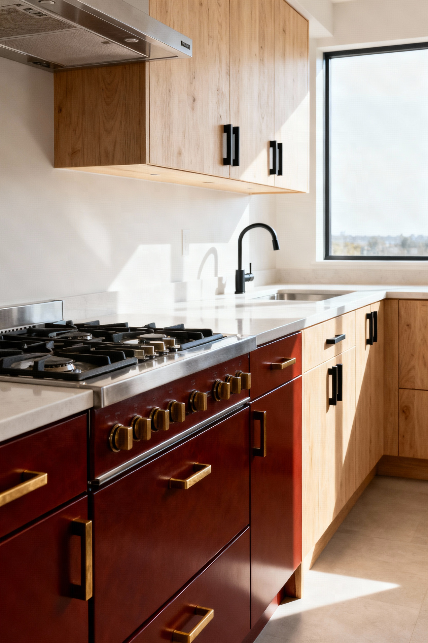
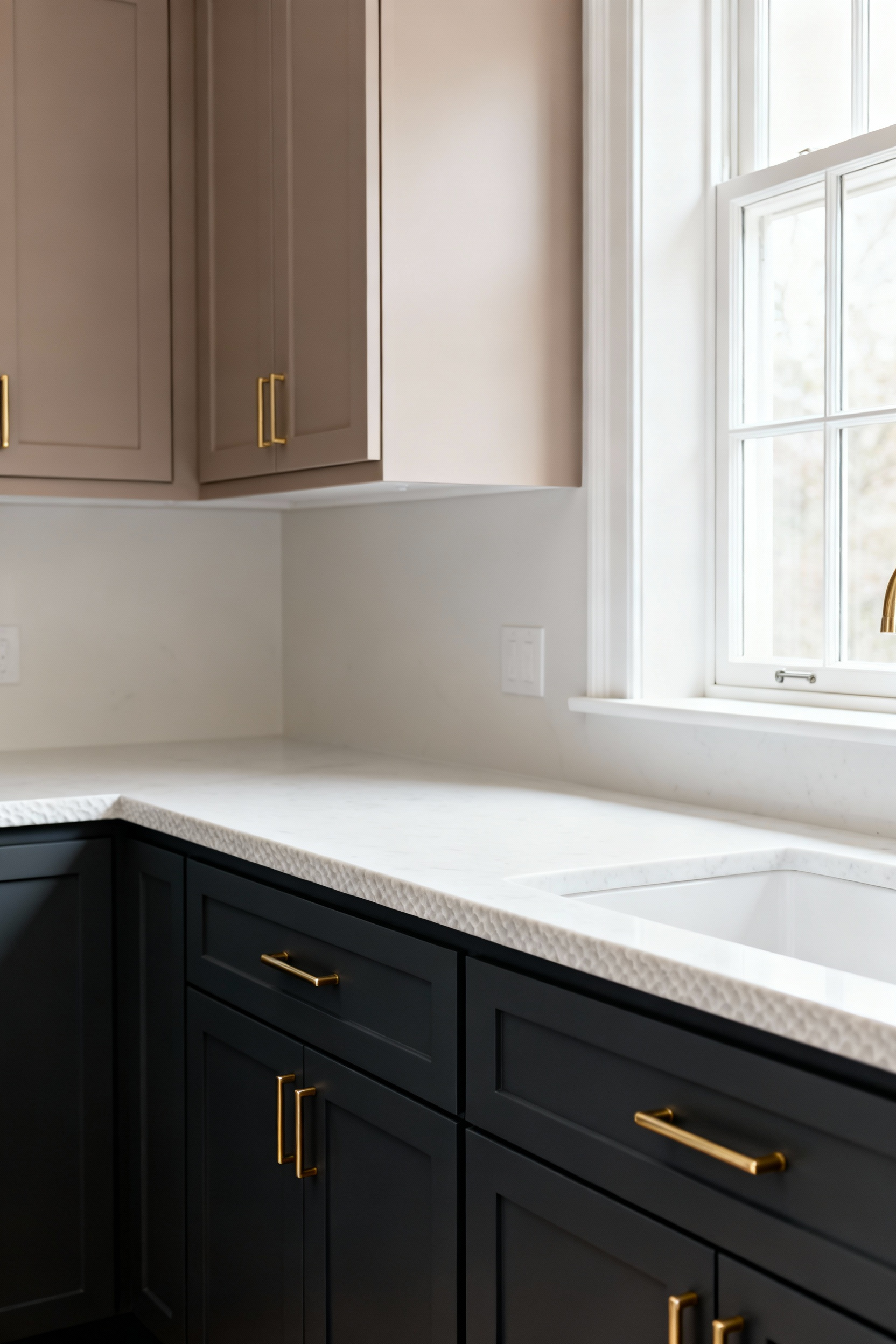
The final texture comes from the materials you pair with your cabinets. The hardware, backsplash, and fixtures are not afterthoughts; they are integral to the story. Aged brass hardware can bring a sense of warmth and history to deep green or blue cabinets, while sleek, matte black pulls can provide a modern, graphic contrast to light wood or white cabinets.
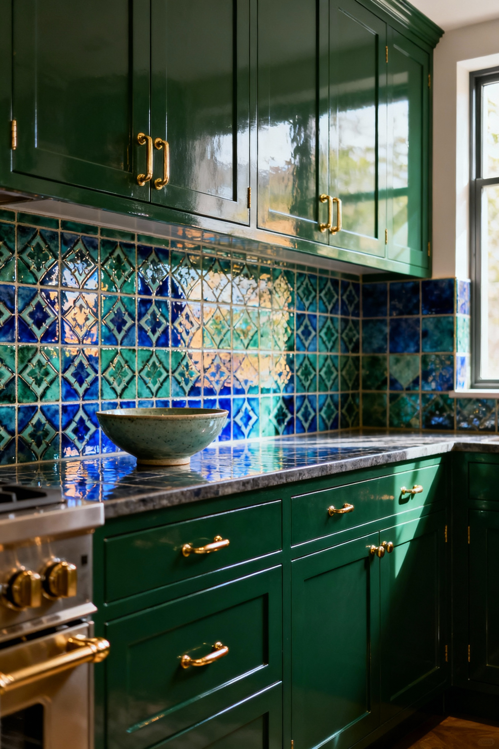
A handcrafted ceramic backsplash offers an opportunity to introduce pattern, texture, and personal artistry. In one of my favorite projects, a family from Portugal wanted to honor their heritage, so we designed the kitchen around a beautiful panel of blue and white azulejo tiles. We chose a simple, classic white for the kitchen cabinet color ideas to let the tile work become the undisputed star. These non-wood elements complete the narrative, turning a collection of functional objects into a cohesive, sensory experience.
How we perceive the size and comfort of a room has everything to do with the strategic use of color. In a multi-generational home where a kitchen might be crowded at one moment and quiet the next, using color to shape the space is essential for creating a sense of harmony for everyone.
In a compact kitchen, light colors are your greatest ally. It’s a simple principle of physics: light hues reflect light, while dark hues absorb it. Using soft creams, pale grays, or gentle off-whites on your cabinets effectively ‘pushes’ the walls outward, making the space feel more open and airy. This is about more than just aesthetics; it’s about creating psychological comfort.

For an older family member who might feel easily overwhelmed in tight quarters, an open-feeling kitchen can be a true gift. Using a light, unifying color across both upper and lower cabinets creates a seamless, expansive look. I often pair this with a satin or semi-gloss finish to further amplify the light, turning even a small galley kitchen into a bright, welcoming space where multiple people can work together without feeling crowded.
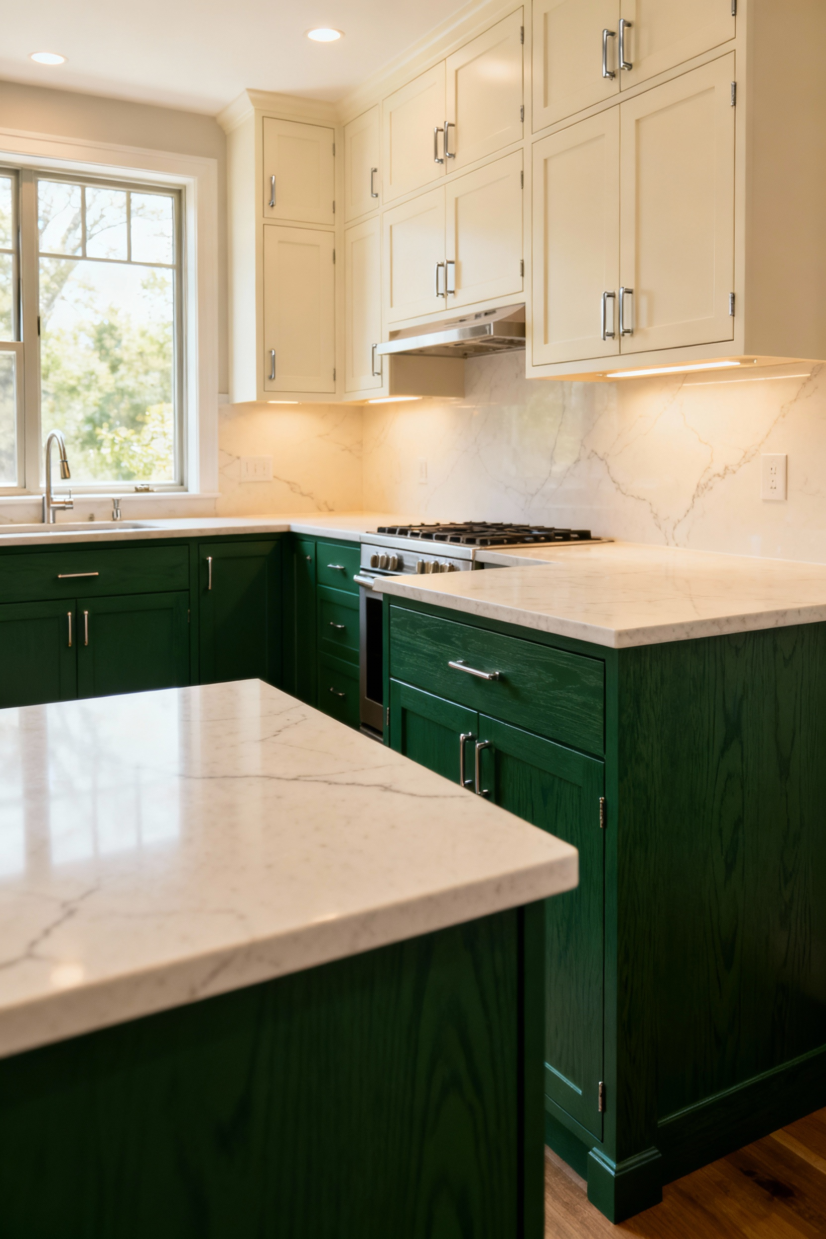
Just as a small kitchen can feel cramped, a very large, open-concept kitchen can feel cold and impersonal. Here, deeper colors are the solution. Rich hues like forest green, deep navy, or warm charcoal have a wonderful ability to absorb light and create a sense of intimacy and enclosure. They don’t shrink the room; they ground it.
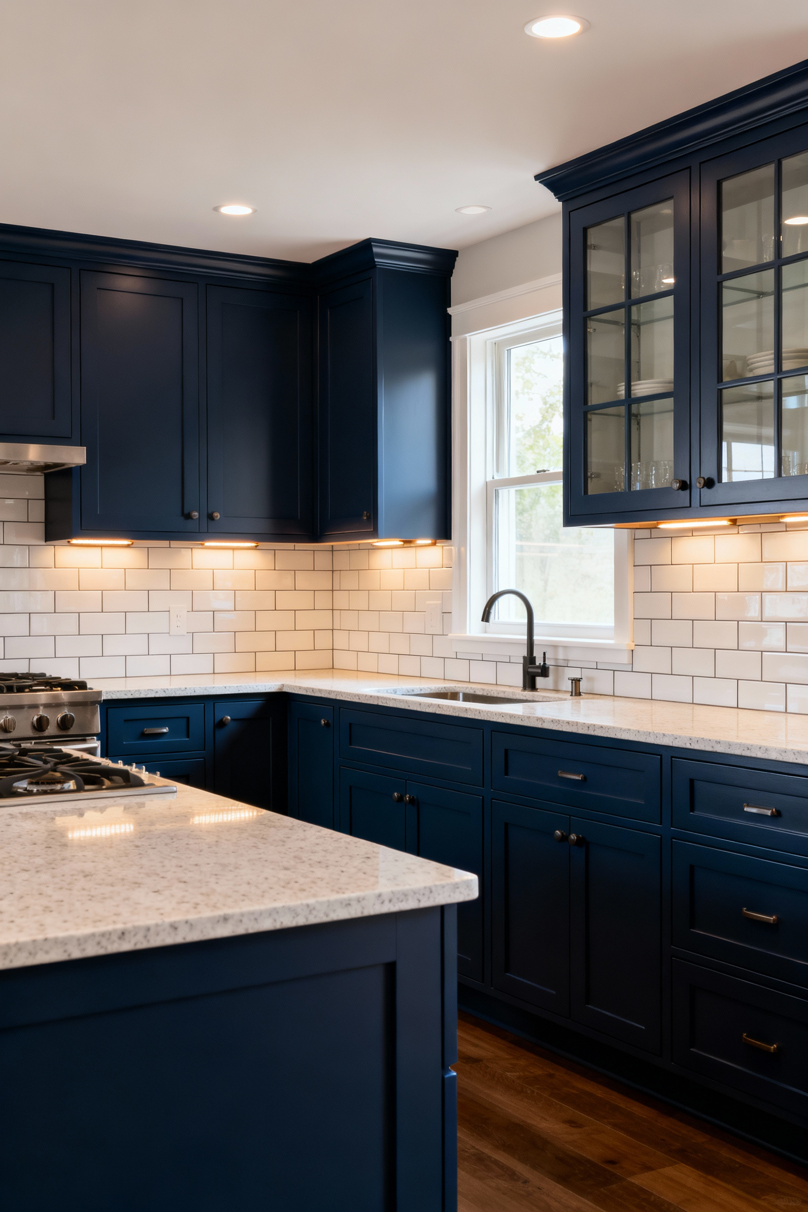
Using a deep, saturated color on a long wall of cabinets or a large central island can create a powerful focal point that anchors the entire space. It draws people in and encourages them to gather, turning a cavernous room into a cozy hub. In my professional experience, this strategy is key to making large, modern homes feel welcoming for every generation, providing a sense of stability and comfort that grand, open spaces sometimes lack.
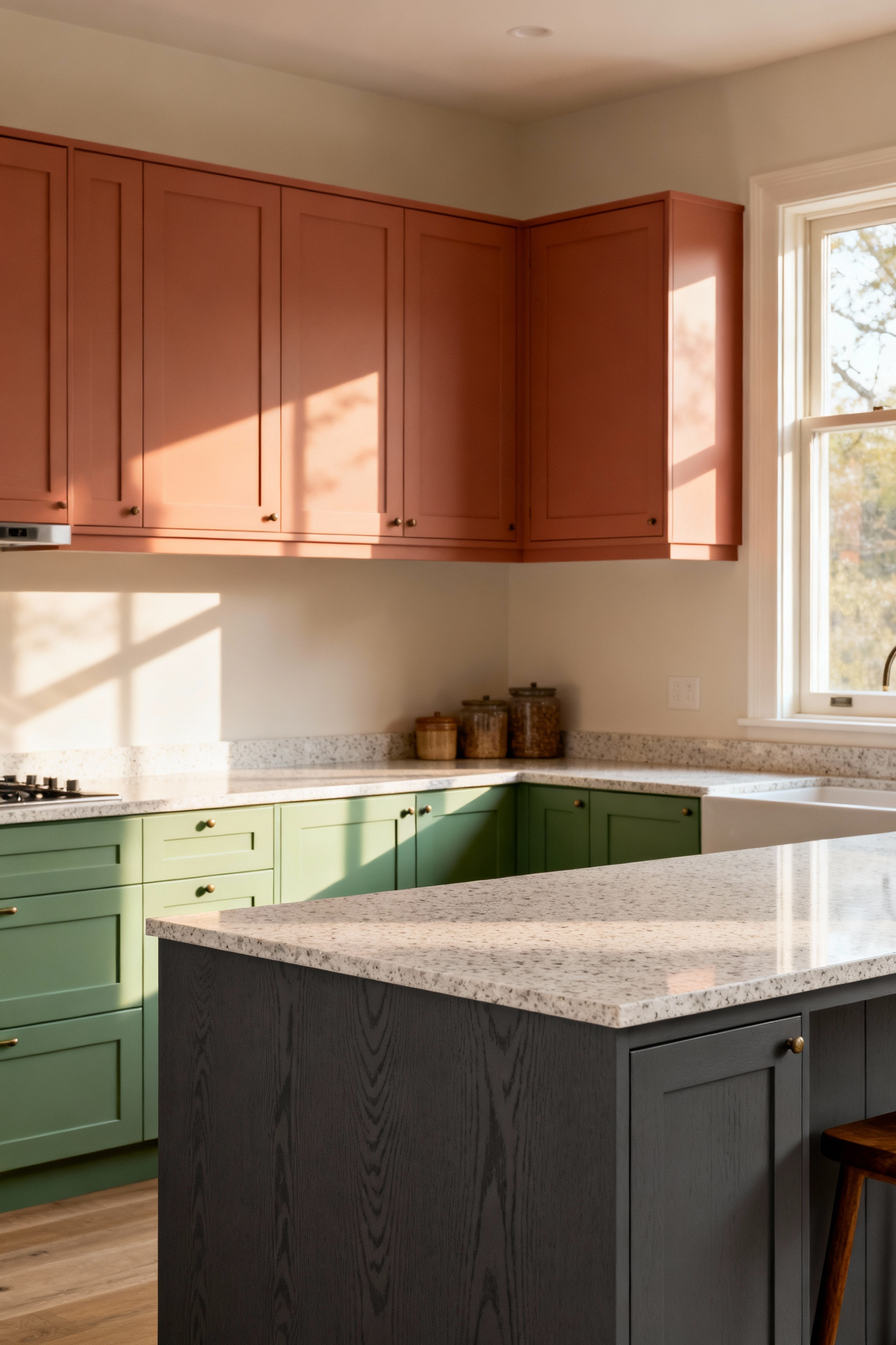
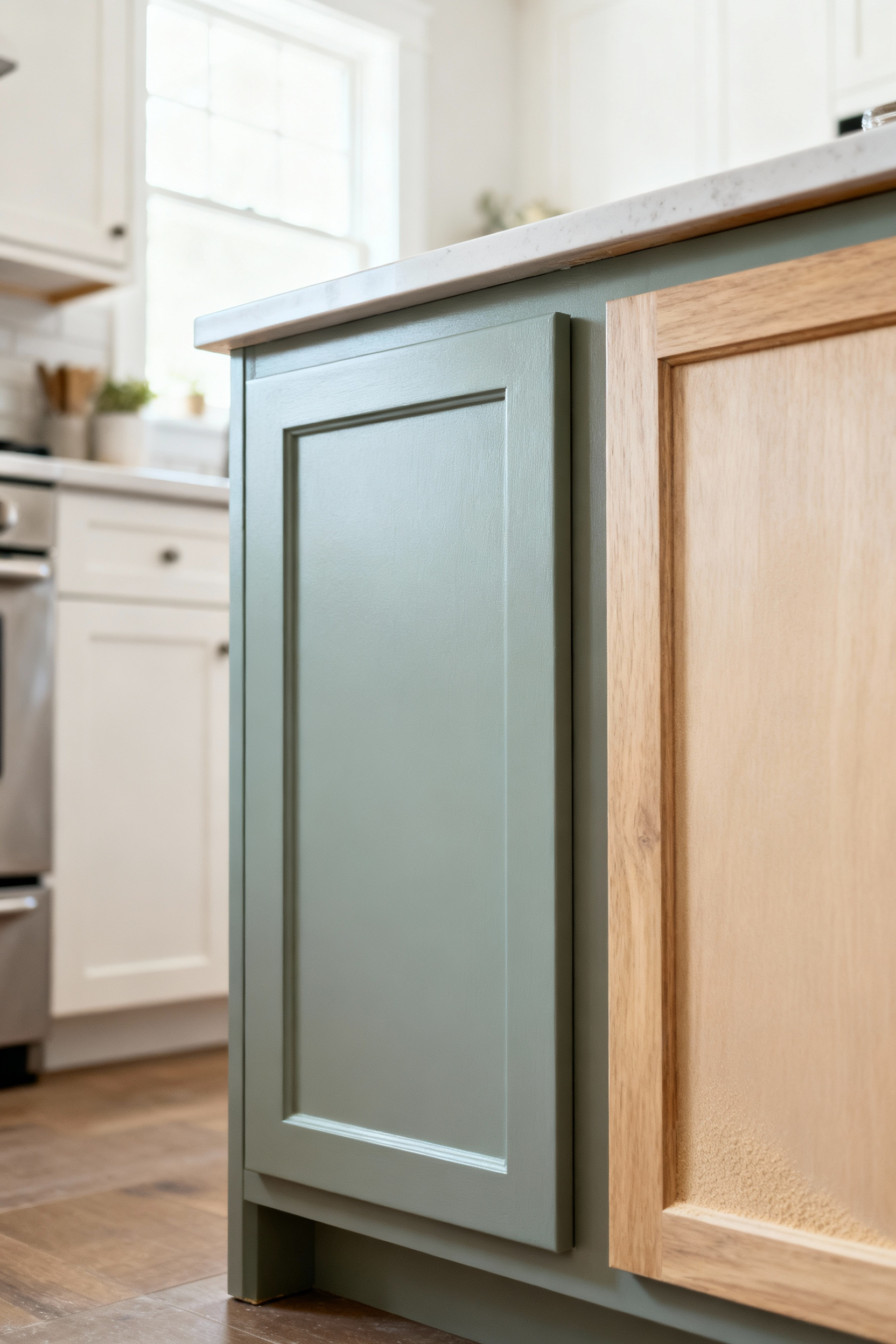
In a kitchen that serves many purposes at once—cooking, homework, conversation—defining different zones with color can bring a sense of order and calm. Using two-toned kitchen cabinet color ideas is a wonderfully effective way to do this without adding walls. A classic approach is to use a darker color for the base cabinets and a lighter color for the uppers.
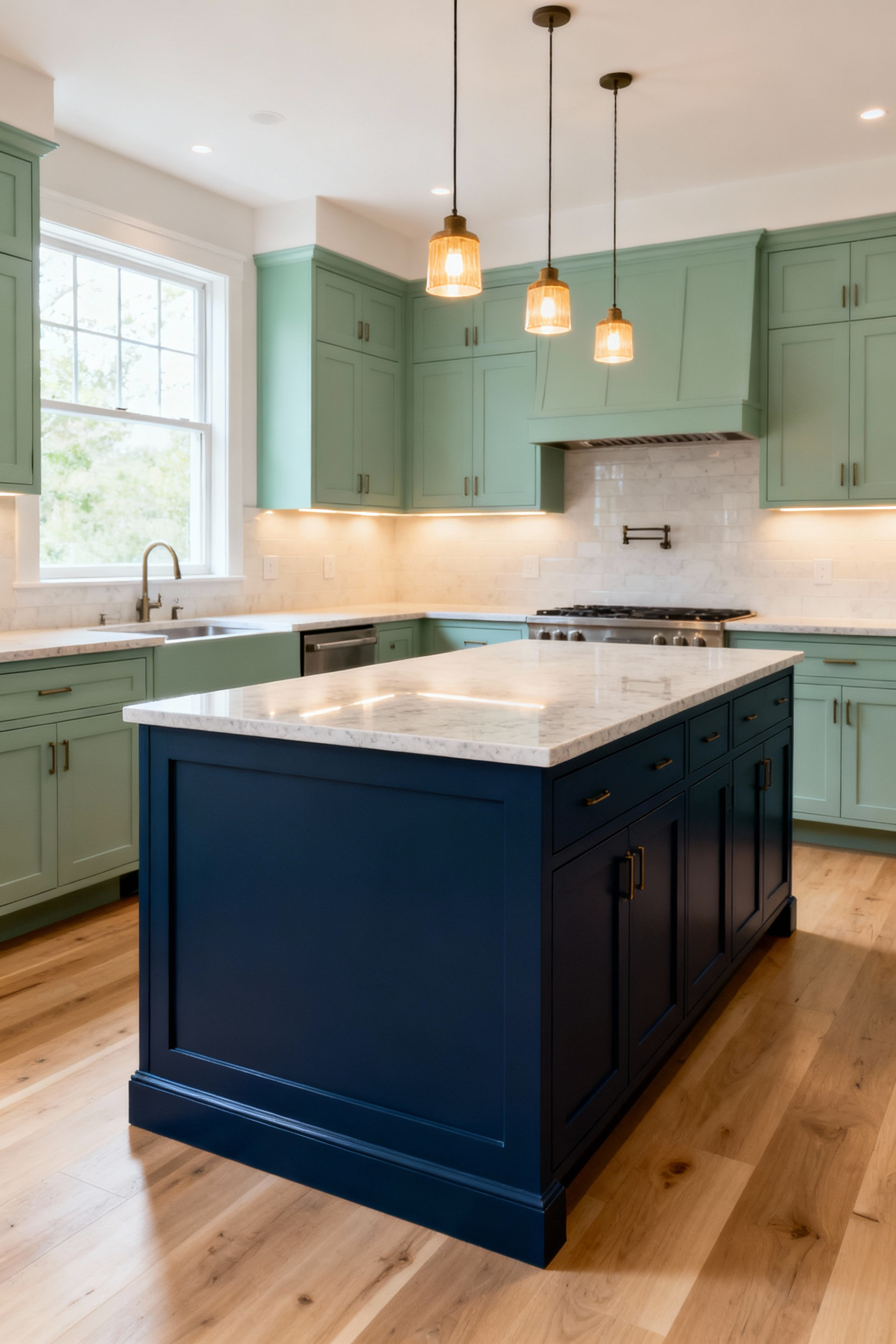
This strategy grounds the kitchen visually while keeping the upper half of the room feeling light and open. It can also be used to define function. The main perimeter of cabinets might be a soft neutral, while the island, the social hub, is painted a more vibrant, inviting color. This visual cue helps direct traffic and allows for multiple activities to happen simultaneously in a harmonious way, which is essential for the fluid dynamics of a multi-generational family.
There is a deep, restorative power in connecting our homes to the natural world. Biophilic design is about bringing the outdoors in, and your cabinet colors are a perfect way to do this. A palette drawn from nature—soothing sage greens, watery blues, earthy terracottas, and the organic tones of natural wood—can transform your kitchen into a tranquil sanctuary.
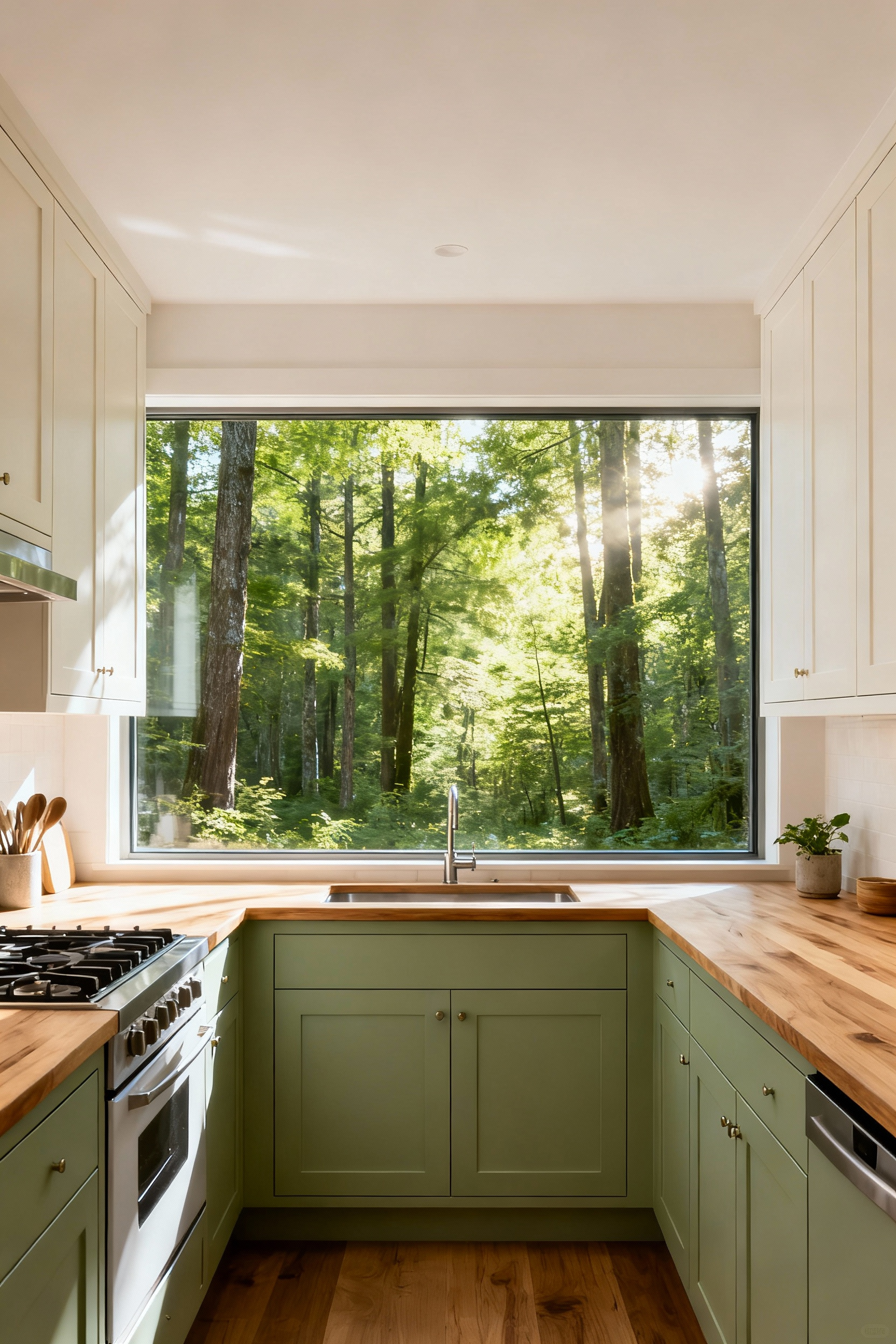
These colors have a universally calming effect, reducing stress and promoting well-being for all ages. I love to use a soft green on cabinets in a kitchen that overlooks a garden, blurring the line between inside and out. Even in a city apartment, a cabinet color that echoes the sky or the forest can provide a much-needed sense of peace and connection to the larger world, nourishing the family in more ways than one.
Beyond aesthetics, color can be a powerful tool for universal design, enhancing safety and ease of use for everyone. A clear contrast in color between the cabinets and the countertops, for instance, helps people with low vision clearly distinguish edges, reducing accidents. It’s a subtle but deeply thoughtful design choice.
Years of professional experience taught me to also consider the contrast between the cabinet color and the hardware. For an older adult with arthritis, a handle that is easy to see against the cabinet door is also easier to grasp. These kitchen cabinet color ideas are about empathy, about designing a space that anticipates needs and provides silent support, fostering independence and confidence for every member of the family.
A truly great kitchen is not a static design; it’s a living space that grows and adapts with the family. The final piece of the puzzle is to select colors that are not only beautiful today but are also resilient, forgiving, and ready for the future.
The most enduring kitchen cabinet color ideas are often the most subtle. Liminal hues—colors that sit gracefully in between distinct categories, like greige (a mix of grey and beige) or a dusty blue-green—have a chameleon-like quality. They are timeless because they refuse to be pinned down to a single trend. These are the colors that provide a sophisticated, resilient backdrop for family life.
These “in-between” shades are incredibly versatile. They harmonize beautifully with a wide range of materials and accent colors, allowing you to easily update the look of your kitchen over the years with new textiles, art, or accessories without ever needing to repaint the cabinets. It’s a choice for longevity, ensuring the heart of your home feels serene and relevant for generations.
In a high-traffic family kitchen, cabinets will be touched, bumped, and splattered. It’s a sign of a well-loved home. A proactive design choice is to select kitchen cabinet color ideas that are inherently forgiving. While a stark white or a very dark, solid color can show every fingerprint and smudge, mid-tones and colors with a bit of complexity are brilliant at concealing the minor imperfections of daily life.
Consider a deep forest green, a warm charcoal, or a richly stained wood. Colors with natural variation or a subtle texture help to mask wear and tear, meaning the kitchen looks composed and clean even when life is messy. This reduces the stress of constant upkeep and allows the whole family to use the space freely and without worry.
The most sustainable design is one that can be adapted rather than replaced. When you choose your cabinets and your initial color, it’s wise to think about their potential for a future refresh. Solid wood or high-quality MDF cabinets are an excellent investment because they can be easily repainted or restained down the line, giving your kitchen a new life for a fraction of the cost of a full renovation.
In contrast, some materials like thermofoil or certain laminates cannot be refinished. What I tell my clients and readers is to think of their cabinets as a long-term canvas. Choosing a material that allows for future change is a gift to your future self—and perhaps to the next generation who will one day make that kitchen their own.
Often, the most meaningful “color” in a kitchen isn’t on the cabinets at all; it’s in a cherished family heirloom. A beautiful piece of furniture, a collection of pottery, or a treasured piece of art can be the perfect starting point for your entire palette. By drawing a color from that piece for your cabinets, you elevate it and weave it into the very fabric of the room.
Imagine pulling a soft, buttery yellow from a grandmother’s hand-painted china for your cabinet color. Or using a deep, moody blue that echoes a beloved painting. This approach ensures your kitchen is deeply personal and unique. It transforms the space from a designer showcase into a gallery of your family’s story, creating a kitchen with unparalleled heart and soul.
Ultimately, the perfect cabinet color is the one that reflects your family. After all the principles and theories, the final choice should feel right in your gut. It should be a color that makes you happy to see every morning, one that provides a welcoming backdrop for countless meals and memories. In my work helping families create homes that truly fit them, this is always the most important step.
Walk through your home, look at the art you love, the clothes you wear, the dishes you inherited. Your color story is already there. The goal of using these kitchen cabinet color ideas is not to find a “correct” color, but to find the one that is true to you. Trust that instinct, because a kitchen designed from the heart is a kitchen that will be loved for a lifetime.
Our journey through these twenty principles reveals that choosing kitchen cabinet color ideas is an act of storytelling. It’s a chance to weave together threads of culture, memory, and daily life into a harmonious whole. From honoring ancestral palettes to selecting finishes that can withstand the beautiful chaos of family, each decision contributes to a kitchen that is more than just a functional room—it is a living, breathing reflection of your family’s unique journey.
This is design that looks beyond today’s trends to create a legacy of warmth, connection, and belonging. It’s about creating a space where every generation feels not only welcome but celebrated. As you consider the colors for your own kitchen, I encourage you to see it not as a task to be completed, but as an opportunity for thoughtful creation. Choose colors that honor your past, support your present, and will gracefully evolve into the future. By doing so, you are building more than a beautiful kitchen; you are curating the enduring heart of your home.