Physical Address
304 North Cardinal St.
Dorchester Center, MA 02124
Physical Address
304 North Cardinal St.
Dorchester Center, MA 02124
Elevate your bedroom from a simple room to a personal sanctuary with 18 strategic design ideas from a luxury retail expert.
You know what people always ask me? They have these beautiful things—art they’ve collected, heirlooms, books they adore—but their bedroom still feels… random. They ask for a decorating trick, a paint color, a quick fix. But the real problem is that they’re thinking about decorating, when they should be thinking about storytelling.
Your bedroom isn’t just a room; it’s the most intimate expression of your personal brand. In luxury retail, we don’t just put beautiful things on a shelf. We build a world. We tell a story. We create a feeling the second you walk in. That’s the secret. You need to stop buying things for your bedroom and start curating the story of you. And yes, there are professional secrets to making that happen.
Before you even think about buying a pillow, we have to lay the groundwork. This is the strategic part—the part everyone skips. In retail, this is where we’d create the entire brand concept before a single display is built. Get this right, and everything else falls into place effortlessly. Miss this, and you’ll just be rearranging clutter forever.
Let’s be honest, “defining your aesthetic” sounds terribly vague. Most people think it means picking a label like “bohemian” or “mid-century.” That’s noise. The real work is defining how you want the room to feel. Think of it as your room’s mission statement. In retail, a brand knows if it’s “rebellious and edgy” or “serene and timeless.” That core feeling dictates everything, from the music they play to the material of the shopping bags. Your bedroom deserves that same clarity.
Forget the labels. Instead, pick three to five keywords. Are you aiming for “restorative, earthy, and quiet” or “dramatic, sophisticated, and moody”? Write them down. This is your compass. Every single decision—from the wall color to the doorknob—gets checked against these words. A client once told me she wanted a “calm” room but kept buying busy, high-contrast art. It never felt right. We finally defined her feeling as “soft, hazy, and peaceful.” The change was immediate. She stopped fighting her own vision because she finally had the language for it.
Everyone knows that blue is calming. That’s surface-level information. The secret isn’t the color itself, but the story you tell with it. High-end boutiques don’t just splash one color on the walls; they build a complex palette that makes you feel a certain way, encouraging you to linger. We’re going to do the same for sleep. The goal is to create a full sensory experience, and that starts with understanding undertones.
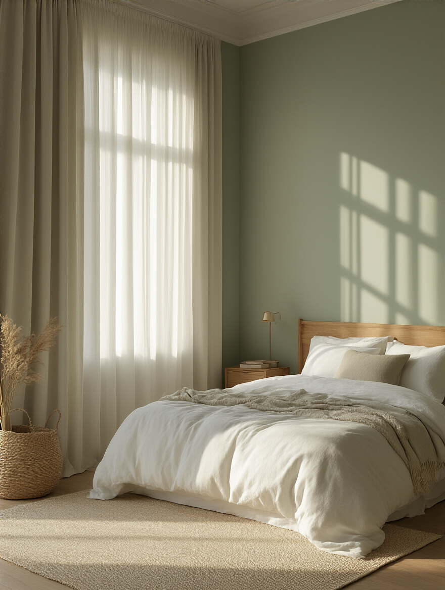
A gray can be cool (with blue or purple undertones) or warm (with yellow or brown undertones). If you mix a warm gray on the walls with a cool gray in your bedding, something will always feel slightly off, even if you can’t put your finger on it. That’s visual friction. The shortcut? Once you have a color you love, hold the swatch up to other potential colors in your palette. Do they harmonize or do they fight? Trust that first gut reaction. Stick to a family of undertones—all warm, or all cool—to create a room that feels cohesive and profoundly peaceful. It’s the difference between a designer room and one that just feels… painted.
In retail, we obsess over “traffic flow.” We map out every inch of a store to guide a customer on an intuitive journey, making it easy and pleasurable to move through the space. Your bedroom needs the same thinking. It’s not about shoving furniture against the walls; it’s about creating graceful pathways that make using the room effortless. Your daily routines—from getting dressed to getting into bed—should feel fluid, not like an obstacle course.
The biggest mistake I see is prioritizing a huge bed in a small room, leaving skinny little goat paths on either side. You need a minimum of 30 inches for a main pathway. Grab some painter’s tape and mark the exact footprint of your furniture on the floor before you commit. Walk the “room.” Can you open the dresser drawers completely? Do you have to turn sideways to get to the closet? That tape will tell you the truth, and it’s much cheaper than realizing your new king-sized bed has just made your room unusable.
Budgeting isn’t about restriction; it’s about strategy. In luxury fashion, a brand invests heavily in a timeless handbag that will last for decades, but might spend less on a trendy scarf for the season. You need to apply this same “investment vs. trend” logic to your bedroom. Identify your “handbag”—the piece that offers the most value for your comfort and well-being over the long haul.

Your mattress is always the handbag. Always. It’s a health investment, not a decor item. Your bed frame and any foundational storage, like a quality dresser, are your other investment pieces. Everything else—pillows, throws, lamps, art, even paint—is a “seasonal accessory.” You can update those inexpensively over the years to keep the room feeling fresh without having to re-buy the expensive core items. People get this backwards all the time. They’ll drop a fortune on trendy decor and then buy a cheap mattress that ruins their sleep. Be strategic.
Mood boards are not just for Pinterest daydreaming. For us, they are the single most important tool for ensuring a project’s success. It’s the visual blueprint that prevents expensive mistakes. A mood board forces you to see how everything—color, texture, material, light—will actually work together before you spend a dime. It’s where you spot the clashes.
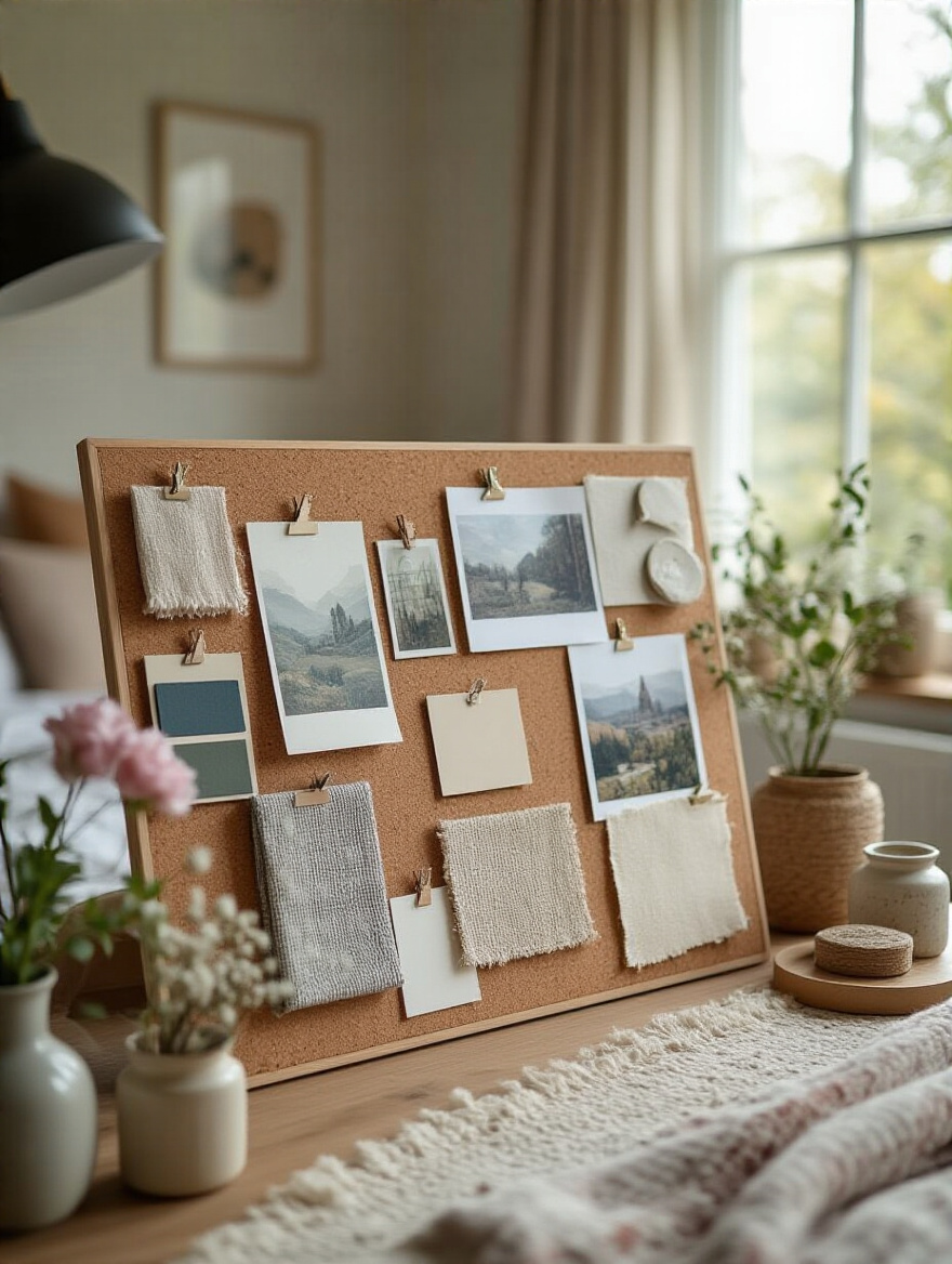
The key is to include physical samples. A digital board is a starting point, but a fabric swatch next to a paint chip and a wood sample tells the real story. Take a photo of them together in your room’s natural light. I once saved a client from painting her entire bedroom a deep charcoal she loved on a screen. When we put the paint chip next to the swatch of her beautiful warm linen headboard, it looked dead and flat. The undertones were fighting. That simple physical check led us to a warmer, softer deep green that brought the whole room to life. That’s the power of a real, tactile mood board.
With the master plan in place, it’s time to bring in the key players. These are the major pieces that will anchor your story and define the space.
Think of your room like a store window. It needs a “hero” item that grabs your attention and tells you what the story is. This section is about choosing those heroes and the supporting cast that makes them shine. Every piece should have a purpose.
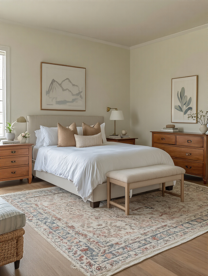
The bed is the hero of the bedroom. It’s the one piece that sets the entire tone. Choosing the right frame isn’t about what’s trendy; it’s about selecting an anchor with the right “visual weight.” A spindly metal frame in a large room with high ceilings will look lost and insignificant, whereas a heavy, dark wood sleigh bed can completely overpower a small space.
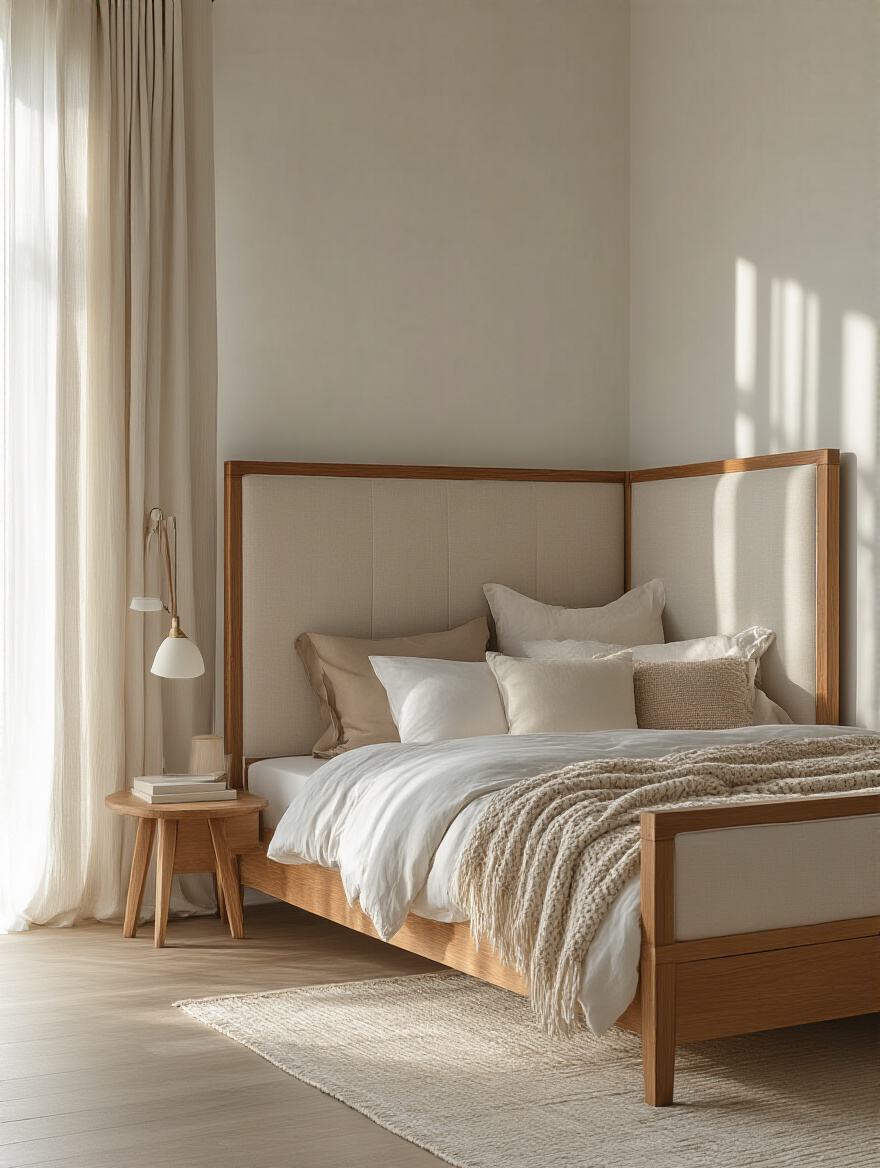
I had a client with a lovely, airy bedroom who bought a massive, tufted headboard because it looked so luxurious in the showroom. In her room, it felt like a giant, plush wall that was slowly eating the space. We swapped it for an elegant, beautifully carved antique wooden frame. It had the same presence and feeling of quality, but because you could see the wall through the carvings, it felt light and graceful. It anchored the room without suffocating it. Look for a frame that commands attention but feels in perfect proportion to the space it occupies.
Your nightstand is not a storage unit for junk. Think of it as your personal valet. It should be an incredibly functional, highly curated surface that serves your evening and morning rituals. The single biggest mistake is choosing a nightstand based on looks alone, without considering its height. An awkward reach for your water or book creates friction right when you should be relaxing.
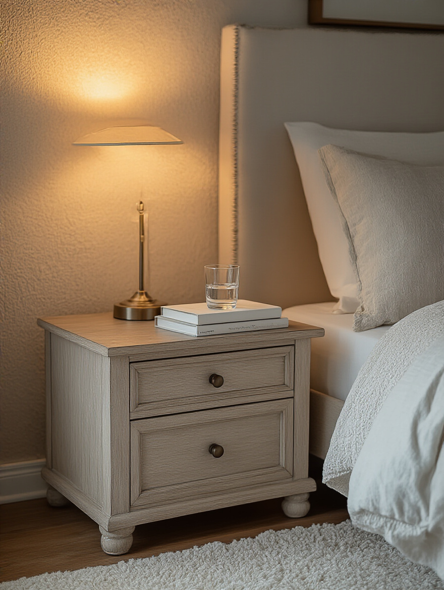
The rule is simple: the top of your nightstand should be level with, or just slightly lower than, the top of your mattress. No more than an inch or two either way. This makes everything easily accessible without you having to be a contortionist. And please, find one with at least one drawer. The top surface is for three things, max: a lamp, something you love to look at (like a small photo or plant), and what you’re currently reading. Everything else—charging cords, hand cream, tissues—goes in the drawer. It’s an instant room upgrade.
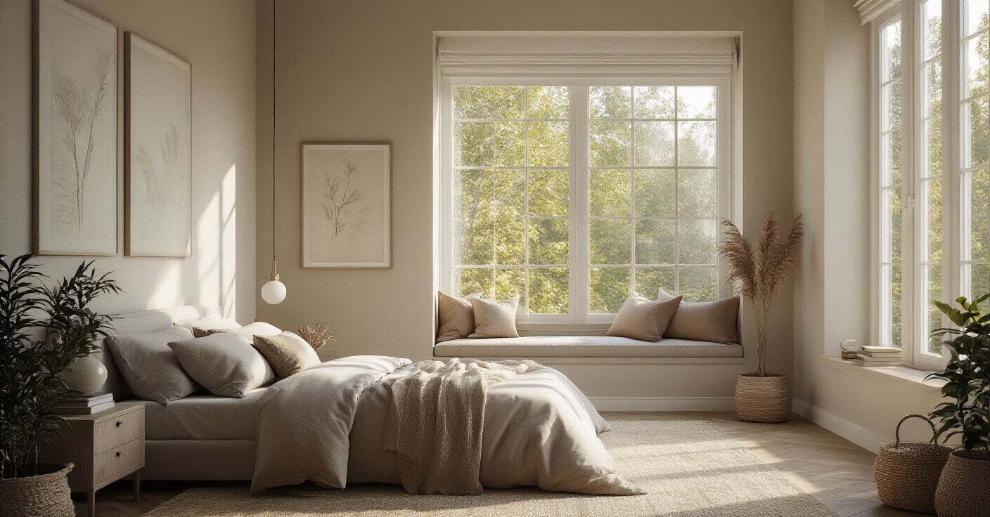
Every well-designed space tells your eyes where to look first. In the bedroom, that focal point is almost always the wall behind your bed. Creating impact here gives the entire room a sense of purpose and confidence. Without it, the eye wanders aimlessly and the room feels disjointed. A focal point isn’t about loudness; it’s about intention.
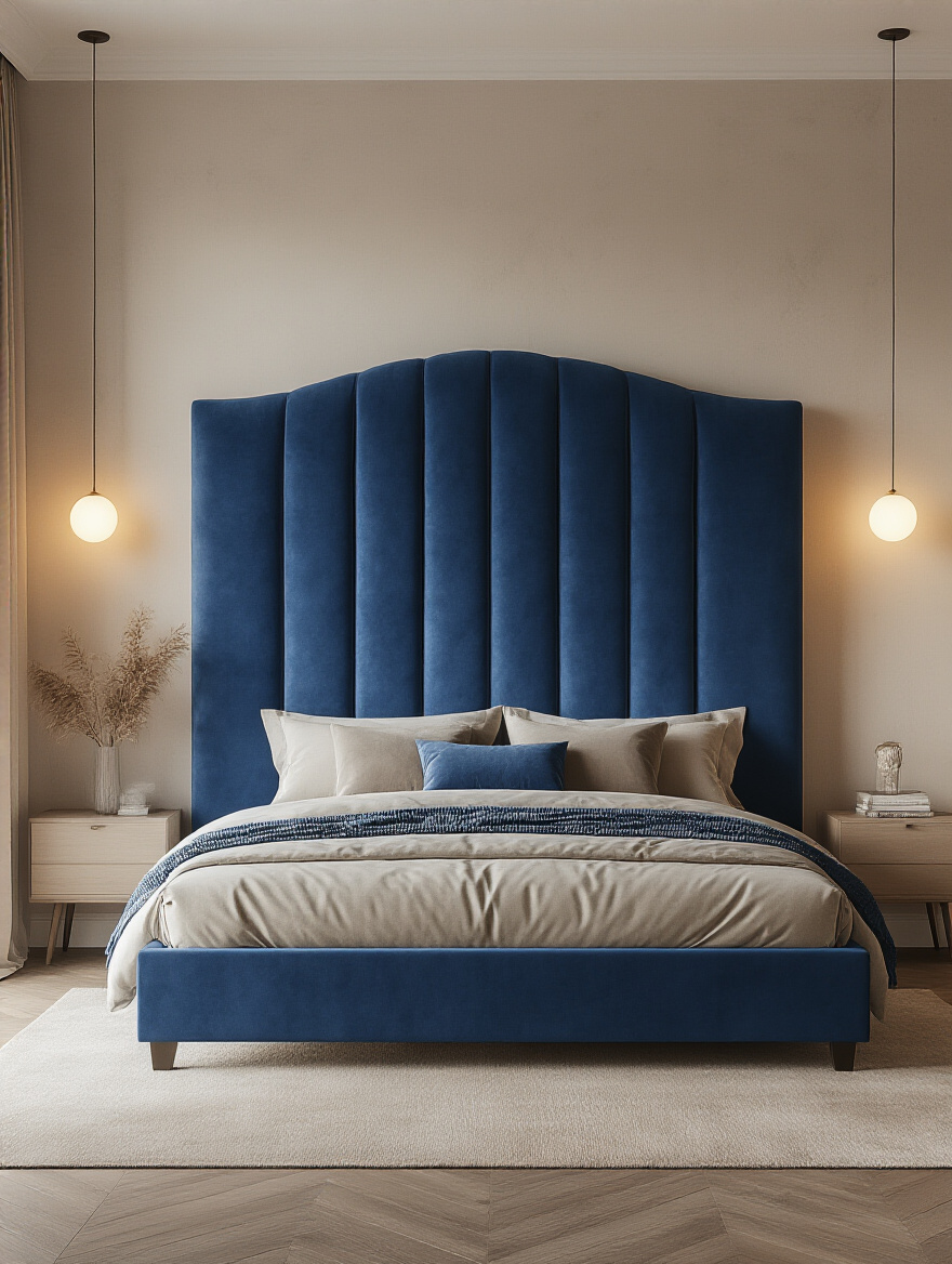
It could be a dramatic statement headboard, a large piece of art, or a feature wall. My personal favorite technique from the retail world is using wallpaper. It’s the fastest way to add pattern, texture, and a complete narrative to a single wall. One client felt her bedroom was “nice, but boring.” We papered the wall behind her simple upholstered bed with a gorgeous, large-scale botanical print in moody greens and blues. It cost less than a new bed, but the impact was monumental. The room suddenly had a soul.
This is a place where so many people go wrong, and it’s a lesson straight from the trenches of retail design. You have to respect the negative space. A room jam-packed with furniture, even beautiful furniture, feels stressful and cheap. You need “breathing room” to appreciate the pieces themselves. Scale isn’t just about the footprint; it’s about visual heft.
For instance, if you have a small room, resist the urge to fill it with lots of small furniture. It just looks cluttered. Instead, opt for fewer, more substantial pieces. A proper dresser is better than two tiny, wobbly chests. And think vertically. In a room with low ceilings, use low-slung furniture to create an illusion of height. In a room with soaring ceilings, a tall bookcase or armoire can draw the eye upward and make the space feel grand and balanced, rather than empty. It’s all a game of proportions.
Now that the major pieces are in place, we start layering. This is where the magic happens, where we add the details that engage all the senses and make the room feel rich and personal.
This is the part I love. It’s the final styling, the “visual merchandising” that transforms a collection of furniture into a cohesive, inviting world. It’s about adding the sensory details—light, texture, and personality—that make you want to stay.
Never, ever rely on a single overhead light. We call that “interrogation lighting” in the business. A luxury space uses layers of light to create mood, highlight features, and make everything—and everyone—look better. Your bedroom needs the same treatment. Think in three layers: Ambient (the general overhead light), Task (for reading or getting dressed), and Accent (for highlighting art or creating a soft glow).
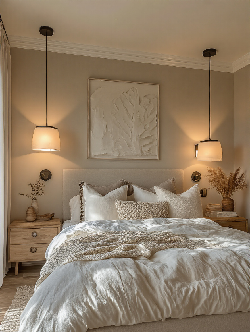
Every single one of these lights should be on a dimmer. This is not a suggestion; it’s a rule. Dimmers are the single most effective tool for changing the mood of a room. You can take a room from bright and functional for cleaning, to a soft, warm, relaxing glow for winding down, all with the slide of a finger. A great shortcut is to use wall-mounted reading sconces on either side of the bed. It frees up space on your nightstands and gives you perfect, focused light for reading without flooding the whole room.
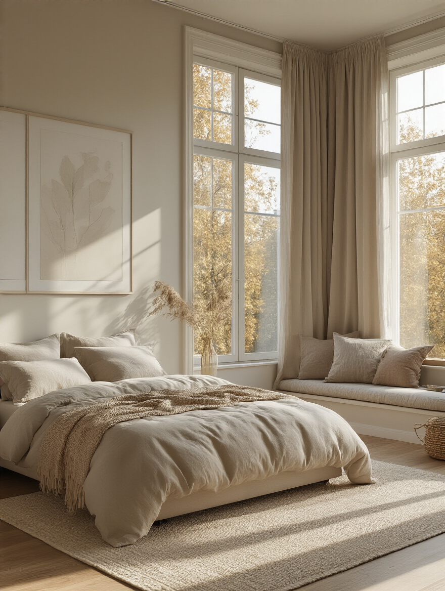
Texture is the secret weapon of high-end design. It’s what makes a space feel expensive and deeply comforting. A room with only flat, smooth surfaces will always feel cold and sterile, no matter how beautiful the furniture is. We’re wired to respond to tactile sensations, so layering different textures is a direct line to creating a cozy, sanctuary-like feeling.
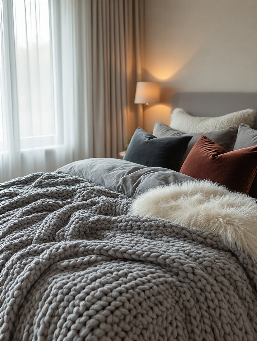
Think beyond just a throw blanket. Mix a crisp linen duvet with velvet accent pillows, a chunky knit blanket, and a plush wool rug underfoot. Don’t be afraid to combine different materials. The contrast between something smooth and cool (like silk) and something nubby and warm (like boucle) is what creates visual and tactile interest. I once worked on a minimalist, all-white display that felt stark. We added a single, incredible sheepskin throw, and it changed everything. The space suddenly felt human and inviting.
Window treatments are not an afterthought; they are a critical piece of functional architecture for your bedroom. In a retail environment, we control the light with surgical precision to set a mood. You need that same control for sleep. The goal is two-fold: absolute darkness for sleeping, and soft, filtered light for waking.
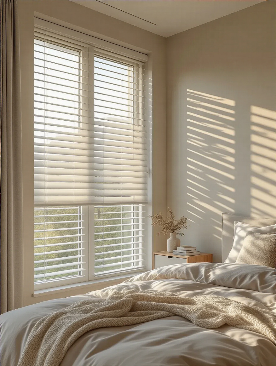
Smart, motorized shades are a game-changer and a worthy investment. Programming your blackout shades to rise slowly with the sun is a far more civilized way to wake up than a jarring alarm clock. If that’s not in the budget, the professional solution is to layer. Install a simple, functional blackout roller shade inside the window frame for total darkness. Then, hang soft, beautiful curtains or linen sheers on a rod outside the frame for daytime privacy and that lovely, diffused light. You get the best of both worlds: perfect function and beautiful form.
Art is the soul of a room. It’s the purest expression of your personality. Please, do not buy generic, mass-produced “art” just to fill a wall. An empty wall is better than a meaningless one. Your art should be a collection of things that genuinely move you—whether it’s a photo from a favorite trip, a piece from a local artist, or even a beautifully framed page from a beloved book.
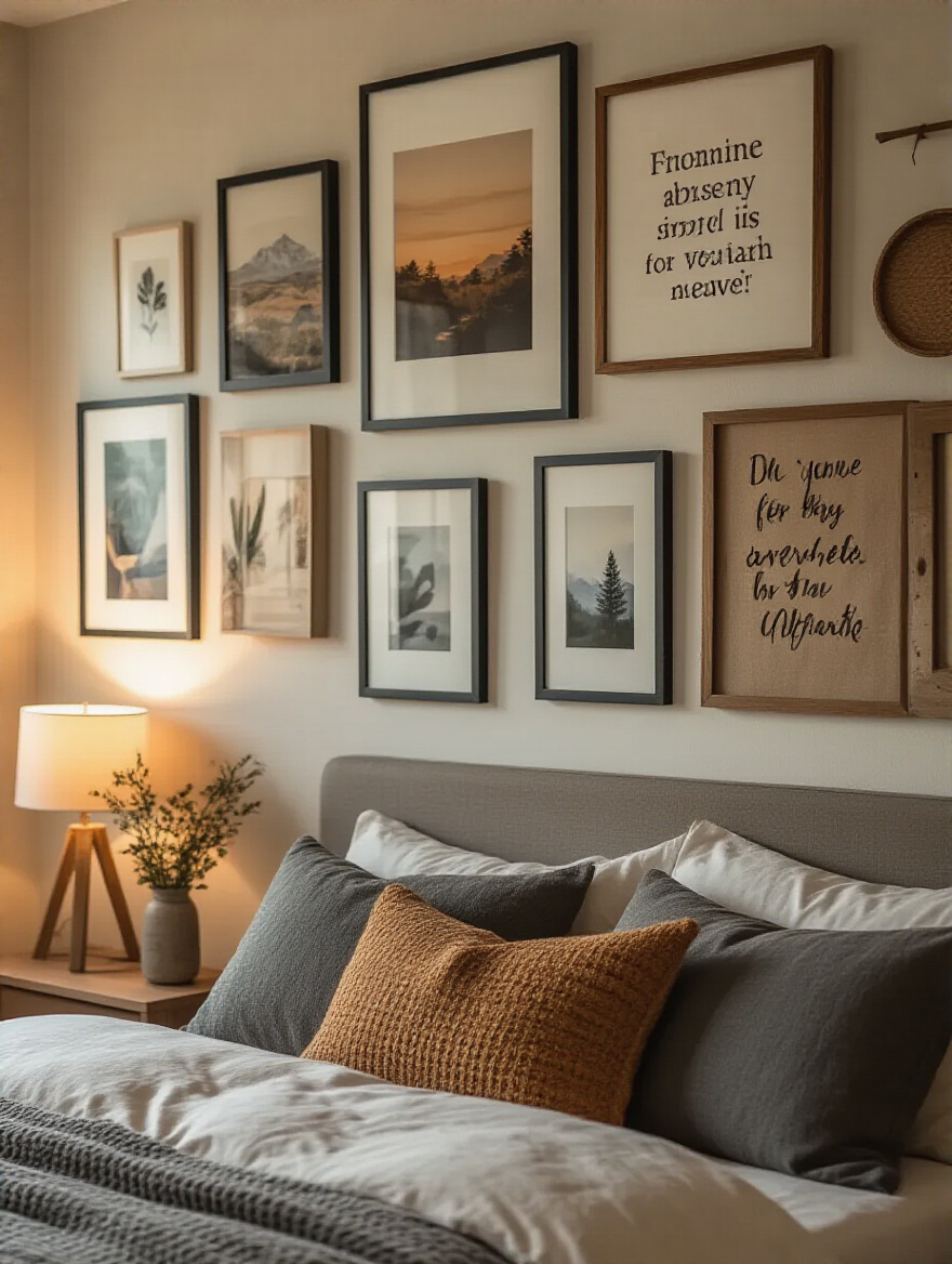
When hanging your art, here’s the rule that decorators live by: the center of the piece (or the entire gallery wall grouping) should be at 57 inches from the floor. That’s the average human eye level, and it ensures the art connects to the viewer, not to the ceiling. If you’re hanging a piece above a headboard, leave a comfortable 6 to 8 inches of breathing room between the bottom of the frame and the top of the headboard. It makes the pairing feel intentional, not crowded.
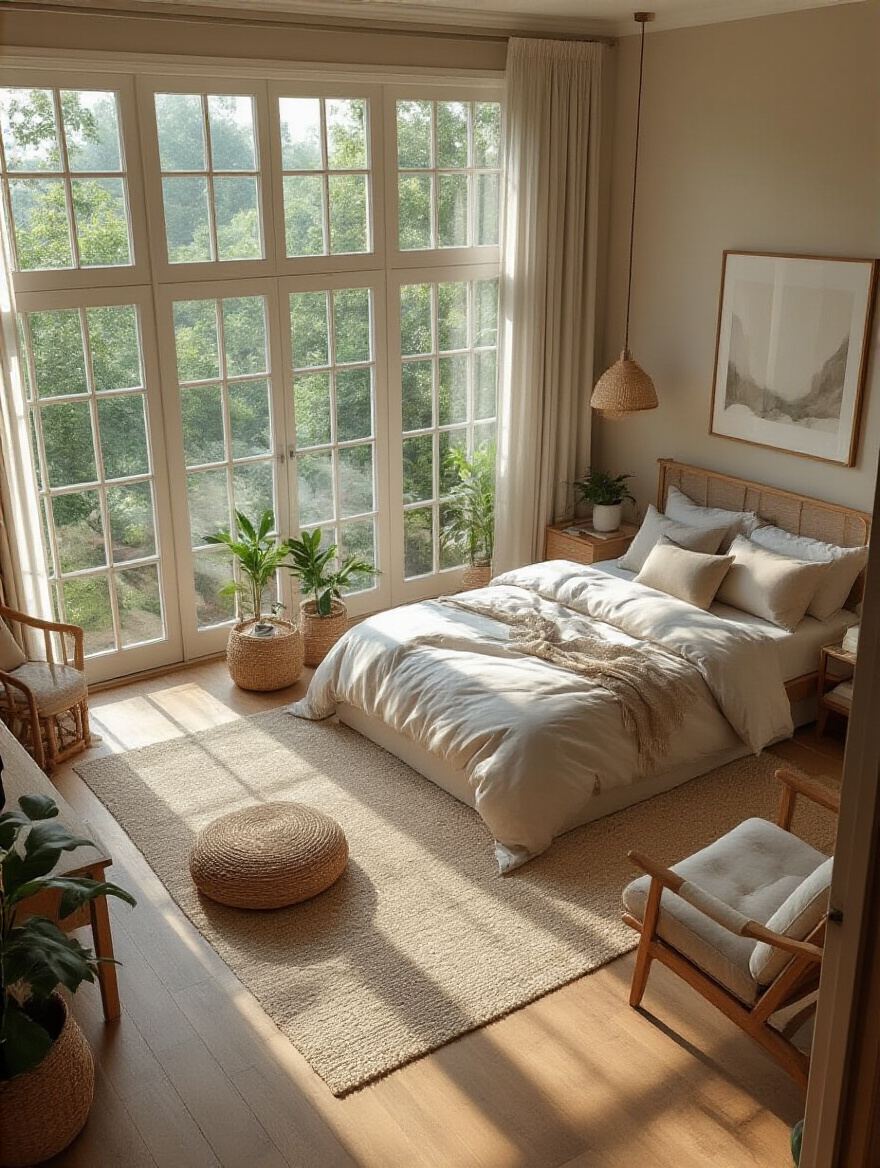
Every luxury boutique I’ve ever designed has live greenery. Plants are living sculptures. They add an organic, graceful element that breaks up all the hard lines of furniture and architecture. They bring life into a space, literally. In a bedroom, they can also contribute to a feeling of calm and purify the air.
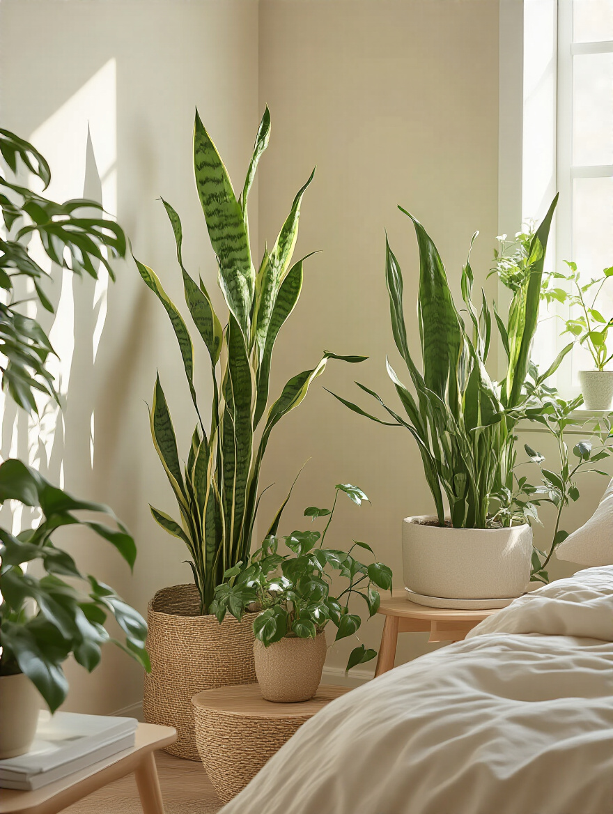
The key is to treat them as design elements. Choose plants with interesting shapes and scale. A tall, dramatic Fiddle Leaf Fig can anchor a corner with the same authority as a piece of furniture. A trailing Pothos cascading from a high shelf adds vertical interest and a sense of romance. And choose a beautiful pot! The vessel is just as important as the plant. A cheap plastic pot can undermine the entire look. Invest in a simple, elegant ceramic or terracotta planter that complements your room’s aesthetic.
With the atmosphere set, the final pass is about refinement. It’s about adding the smart, thoughtful details that make the space not just beautiful, but a joy to live in.
This is the final 10% that makes 90% of the difference. It’s about clever storage, visual tricks, and the highly personal objects that complete your story. These are the touches that signal a space has been curated with care and intelligence.
Clutter is the enemy of serenity. The most effective way to combat it is to go vertical. We use this principle constantly in small retail spaces. Wall space is prime real estate. Think beyond the dresser and use your walls for elegant, efficient storage that doubles as a design feature.
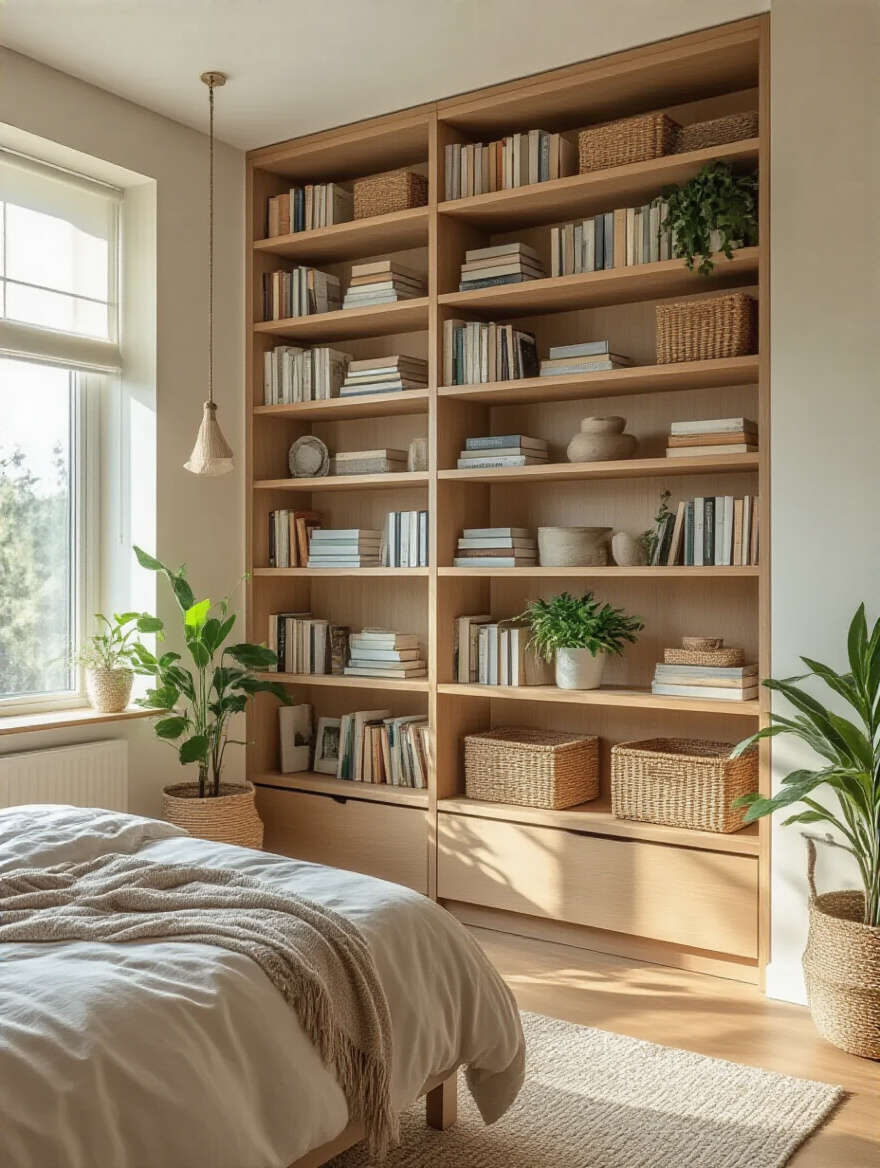
My favorite trick is installing a system of floating shelves. You can use them for books, a few beautiful objects, or stylish storage boxes. A picture ledge is another great option—it’s slim, low-profile, and perfect for displaying a rotating collection of art or photos without putting a million nail holes in your wall. By drawing the storage up the walls, you free up precious floor space, which instantly makes the room feel larger and more organized.
Mirrors are magic. We use them in retail to make small boutiques feel double their size and to bounce light into dark corners. The same tricks work wonders in a bedroom. A large, floor-length mirror leaned against a wall is an instant classic—it not only gives you a full-length view but also creates a powerful vertical line that makes the ceiling feel higher.
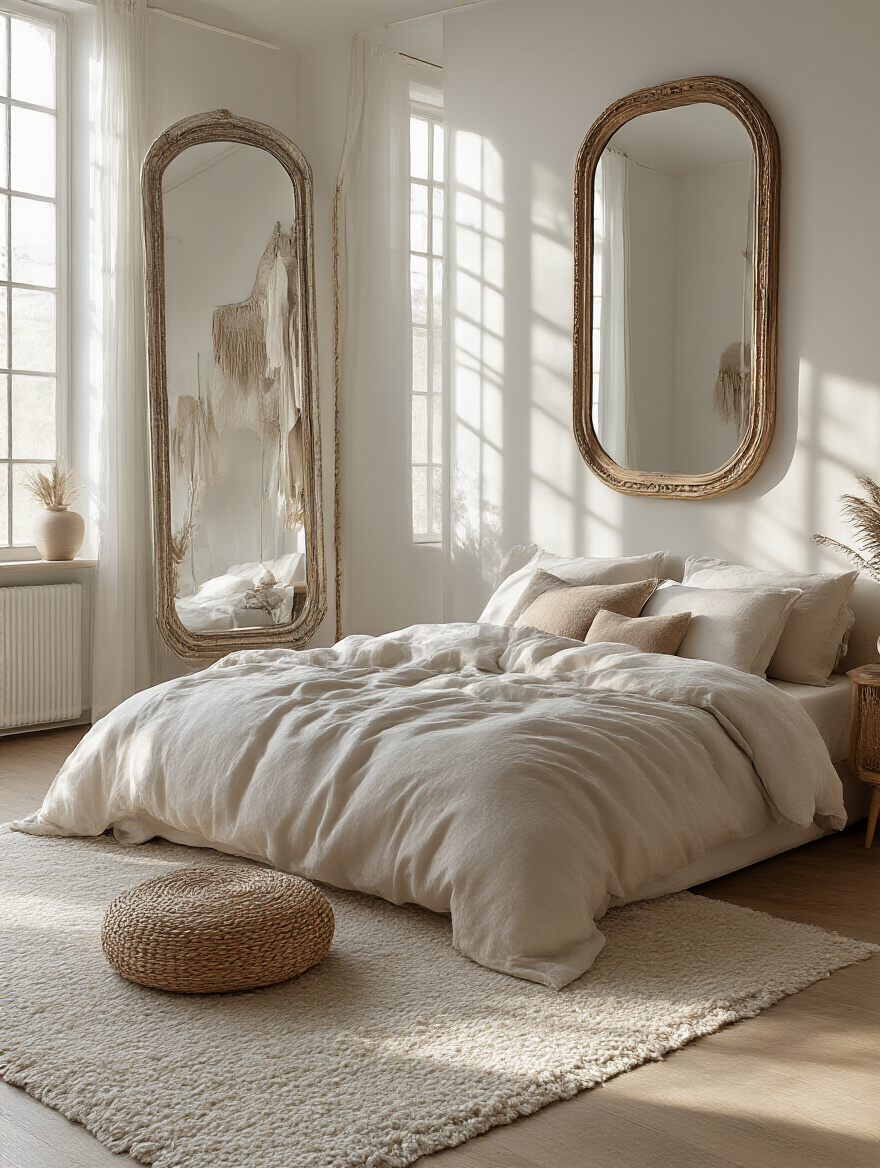
The most strategic placement, however, is directly opposite a window. It will capture the natural light and view, effectively acting like a second window in the room. Just be mindful of what you’re reflecting. I once walked into a client’s bedroom where a beautiful mirror was perfectly reflecting a cluttered treadmill in the corner. It was just magnifying the problem. Always check the reflection from the main vantage points—the doorway and the bed—before you hang it.
A rug is the one item that can single-handedly pull an entire room together. It defines a space and anchors the furniture, preventing it from looking like it’s just “floating” in the room. A common mistake is buying a rug that’s too small. It looks like a postage stamp and fails at its one job.
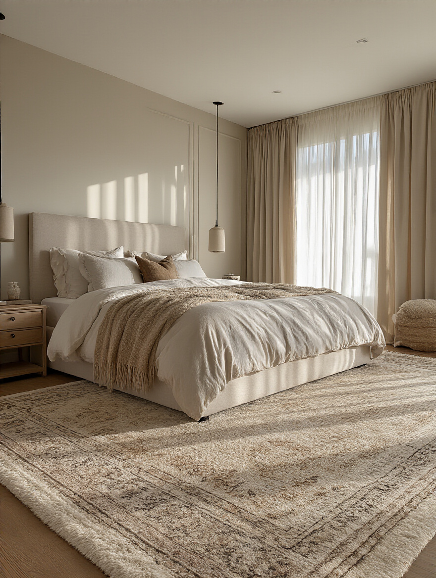
Here’s the non-negotiable rule for the bedroom: your rug should be large enough so that at least the bottom two-thirds of your bed rests on it, and it should extend at least 18-24 inches on either side. This ensures that when you swing your legs out of bed in the morning, your feet land on a soft, warm surface. It creates a defined, cozy “sleep zone” that feels deliberate and luxurious. If you have a sitting area in your bedroom, use a second, smaller rug to define that zone, too. It’s like creating little rooms within the room.
This is the final layer, the finishing touch of your story. These are your treasures. The key is to display them, not just store them. The secret to making a collection of personal items look curated rather than cluttered is to group them together.
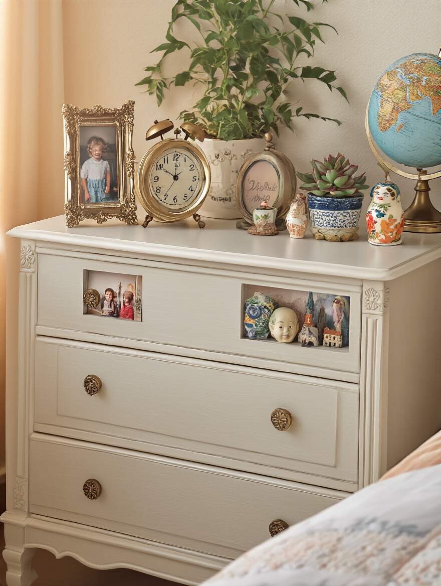
Use a decorative tray on your dresser or nightstand. A tray creates a “stage” for a little collection—a favorite candle, a small vase, a framed photo, a beautiful rock from a beach walk. This grouping, or “vignette,” looks intentional and polished. I learned this on my very first visual merchandising job. We were told to “corral the smalls.” It keeps disparate items from looking like clutter and turns them into a single, cohesive statement piece. Your most personal items deserve to be honored this way.